R中的相对频率直方图,ggplot

8

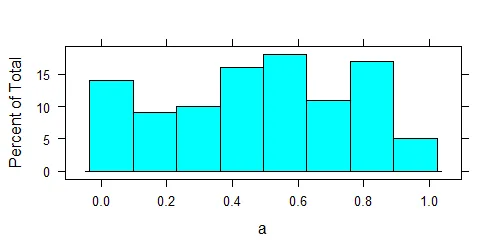
我可以使用 lattice 包在 R 中绘制相对频率直方图:

a <- runif(100)
library(lattice)
histogram(a)

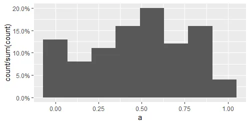
我想在ggplot中获得相同的图形,我尝试过。

dt <- data.frame(a)
ggplot(dt, aes(x = a)) + 
geom_bar(aes(y = ..prop..))+
 scale_y_continuous(labels=percent)

但是实际情况并非如此。我应该在代码中做出哪些更改?在绘制图表之前计算相对频率不是我的选择。

1
我猜你正在寻找 geom_histogram - kath
ggplot(dt, aes(x=a)) + geom_histogram() - Dr. Flow
1
不,我需要相对频率,而不是计数。 - neringab
2个回答

24

你需要一个直方图,而不是一个条形图,因此:

ggplot(dt, aes(x = a)) + 
  geom_histogram(aes(y = after_stat(count / sum(count))), bins = 8) +
  scale_y_continuous(labels = scales::percent)

格点:

enter image description here

ggplot2:

enter image description here

您可以看到,这两个软件包的分箱算法略有不同。


3
另一个选择是直接使用 geom_histogram(aes(y = stat(density)))。https://ggplot2.tidyverse.org/reference/geom_histogram.html#computed-variables - Kiteration
@Kiteration,这会得到一个不同的图。 - Axeman

0
你可以尝试类似这样的代码:
ggplot(data=df, aes(x=a)) + geom_bar(aes(y = (..count..)/sum(..count..)), group = 1)

不,使用这种方法我只能看到三条垂直线,而不是分布。 - neringab

网页内容由stack overflow 提供, 点击上面的
可以查看英文原文,
原文链接