我在为一组对应于幂律的多条线绘制的图中添加色条时遇到了问题。
为了为非图像绘制创建颜色条,我添加了一个虚拟绘图(来自这里的答案:Matplotlib - add colorbar to a sequence of line plots)。
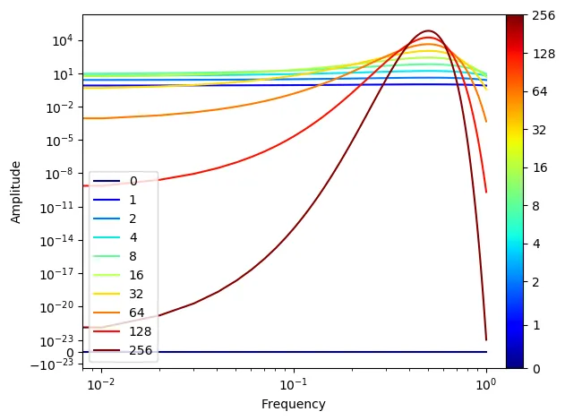
颜色条刻度不对应绘图的颜色。
我尝试更改颜色条的规范,并且可以微调它以使其对于特定情况准确无误,但我无法普遍地做到这一点。
def plot_loglog_gauss():
    from matplotlib import cm as color_map
    import matplotlib as mpl

    """Creating the data"""
    time_vector = [0, 1, 2, 4, 8, 16, 32, 64, 128, 256]
    amplitudes = [t ** 2 * np.exp(-t * np.power(np.linspace(-0.5, 0.5, 100), 2)) for t in time_vector]

    """Getting the non-zero minimum of the data"""
    data = np.concatenate(amplitudes).ravel()
    data_min = np.min(data[np.nonzero(data)])

    """Creating K-space data"""
    k_vector = np.linspace(0,1,100)

    """Plotting"""
    number_of_plots = len(time_vector)
    color_map_name = 'jet'
    my_map = color_map.get_cmap(color_map_name)
    colors = my_map(np.linspace(0, 1, number_of_plots, endpoint=True))

    # plt.figure()
    # dummy_plot = plt.contourf([[0, 0], [0, 0]], time_vector, cmap=my_map)
    # plt.clf()

    norm = mpl.colors.Normalize(vmin=time_vector[0], vmax=time_vector[-1])
    cmap = mpl.cm.ScalarMappable(norm=norm, cmap=color_map_name)
    cmap.set_array([])


    for i in range(number_of_plots):
        plt.plot(k_vector, amplitudes[i], color=colors[i], label=time_vector[i])

    c = np.arange(1, number_of_plots + 1)
    plt.xlabel('Frequency')
    plt.ylabel('Amplitude')
    plt.yscale('symlog', linthreshy=data_min)
    plt.xscale('log')
    plt.legend(loc=3)

    ticks = time_vector
    plt.colorbar(cmap, ticks=ticks, shrink=1.0, fraction=0.1, pad=0)

    plt.show()
通过与图例进行比较,您会发现刻度值与实际颜色不匹配。例如,在色图中,128以绿色显示,而在图例中为红色。
实际结果应该是一个线性色彩条,其上刻度在色彩条上定期间隔(对应于不规则时间间隔)。当然,每个刻度的颜色也应该正确。
(最终图包含多个子图(len(time_vector)〜100),我减少了子图数量来说明并能够显示图例。)
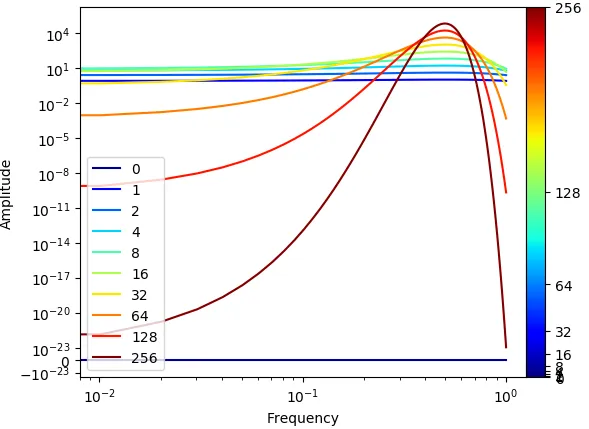
为了澄清,这就是我想要的结果样子。