我正在设计一些室内和室外活动的复杂情节,但遇到了困难。我想在绘图中的
我已经贴出了所有代码,以便其他人构建类似的内容。我最初受到这篇博客文章的启发。
感谢任何帮助!
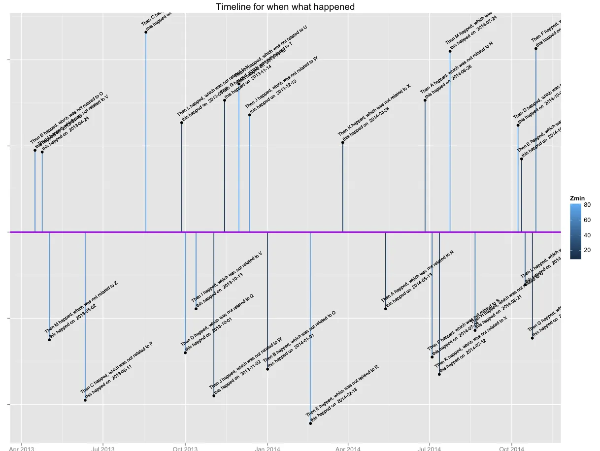
geom_segment步骤中通过(Xmin,Ymin和Zmin)给室内/室外活动的时间增加颜色。目前仅通过Zmin进行染色(使用连续变量,效果不佳)。我已经贴出了所有代码,以便其他人构建类似的内容。我最初受到这篇博客文章的启发。
感谢任何帮助!
df <- data.frame(
  date = seq(Sys.Date(), len= 156, by="4 day")[sample(156, 26)],
  action = paste('Then', LETTERS[1:13], 'happed, which was not related to', LETTERS[14:26]),
  IndoorOutdoor = rep(c(-1,1), 13),
  Xmin = sample(90, 26, replace = T),
  Ymin = sample(90, 26, replace = T),
  Zmin = sample(90, 26, replace = T)
)

df$XYZmin <- rowSums(df[,c("Xmin", "Ymin", "Zmin")])*df$IndoorOutdoor

# install.packages("ggplot2", dependencies = TRUE)
require(ggplot2)

# step 1
plot <- ggplot(df,aes(x=date,y=0))

# step 2, this is where I want to add 'more' color
plot <- plot + geom_segment(aes(y=0,yend=XYZmin,xend=date, colour= Zmin))

# The text is added as follows
plot <- plot + geom_text(aes(y=XYZmin,label=paste(action, '\n this happed on ', date)),size=2.5,hjust=-.01, vjust=-.01, angle = 35)

# points at the end of the line segments
plot <- plot + geom_point(aes(y=XYZmin))

# #raw a vertical line
plot <- plot + geom_hline(y=0,size=1,color='purple')

#drawing the actual arrow
# plot <- plot + geom_segment(x=2011.4,xend=2012.2,y=.2,yend=0,color='purple',size=1) + geom_segment(x=2011.4,xend=2012.2,y=-.2,yend=0,color='purple',size=1)

plot <- plot + theme(axis.text.y = element_blank()) + ylab('') + xlab('')
plot + labs(title = "Timeline for when what happened")
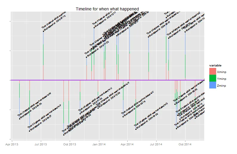
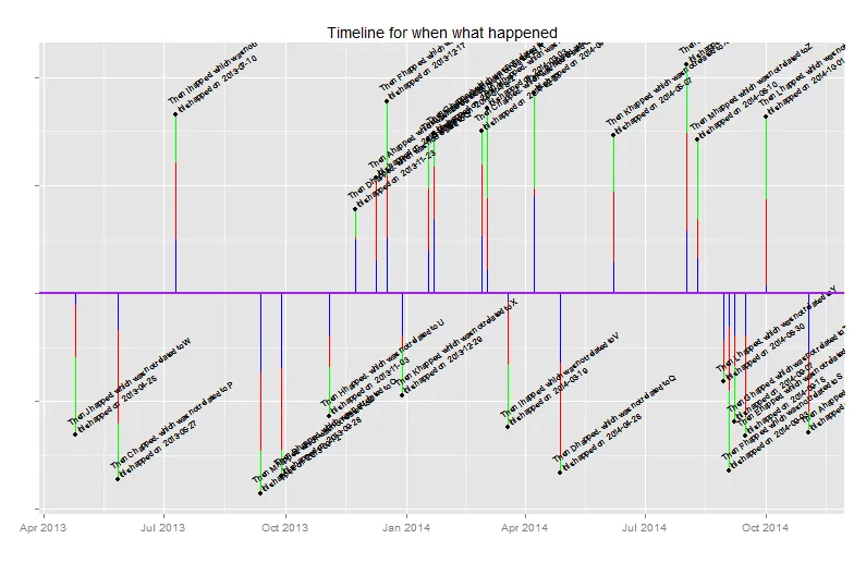
Zmin映射为连续变量,以可定义的方式映射到颜色。如果要将三个数字映射到单一的颜色比例尺中,您想如何实现?如果它们是离散的,我可以看到它们之间的相互作用映射,但对于连续变量来说这是没有意义的。 - Brian DiggsXmin、Ymin和Zmin,并通过三种离散颜色对各个分段进行着色。这样说清楚了吗? - Eric Fail