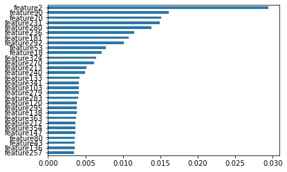
我有一些关于IT技术的数据,其中包含约370个特征。我已经构建了一个随机森林模型来获取重要的特征,但是当我绘图时,由于x轴上显示了太多的特征,我无法确定应该考虑哪些特征。
有没有人能帮助我在Python中绘制图形,就像在R中使用varImpPlot()绘制的图形一样。
我有一些关于IT技术的数据,其中包含约370个特征。我已经构建了一个随机森林模型来获取重要的特征,但是当我绘图时,由于x轴上显示了太多的特征,我无法确定应该考虑哪些特征。
有没有人能帮助我在Python中绘制图形,就像在R中使用varImpPlot()绘制的图形一样。
import numpy as np
import pandas as pd
import matplotlib.pyplot as plt
from sklearn.datasets import make_classification
from sklearn.ensemble import RandomForestClassifier

X, y = make_classification(n_samples=1000,
                           n_features=370,
                           n_informative=16,
                           n_classes=2,
                           random_state=0)

forest = RandomForestClassifier(random_state=0)
forest.fit(X, y)
为了绘制它,我们可以将重要性评分放入 pd.Series 中并绘制前 30 名:
importances = pd.Series(forest.feature_importances_,index=X.columns)
importances = importances.sort_values()
importances[-30:].plot.barh()