使用ggplot2在面板/分面图中添加其他系列

3
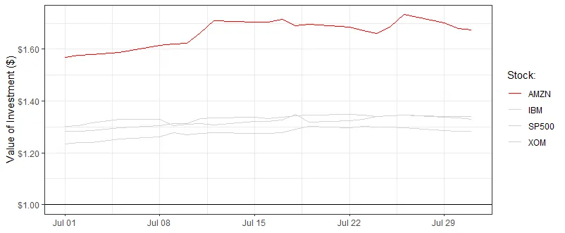
我有一个包含4种股票表现数据的数据框,想用它制作ggplot2中的分面/面板图。该数据是长格式,具体的股票名称在“Stock”列中指示。
dat <- structure(list(date = structure(c(15887, 15888, 15889, 15891, 
15894, 15895, 15896, 15897, 15898, 15901, 15902, 15903, 15904, 
15905, 15908, 15909, 15910, 15911, 15912, 15915, 15916, 15917, 
15887, 15888, 15889, 15891, 15894, 15895, 15896, 15897, 15898, 
15901, 15902, 15903, 15904, 15905, 15908, 15909, 15910, 15911, 
15912, 15915, 15916, 15917, 15887, 15888, 15889, 15891, 15894, 
15895, 15896, 15897, 15898, 15901, 15902, 15903, 15904, 15905, 
15908, 15909, 15910, 15911, 15912, 15915, 15916, 15917, 15887, 
15888, 15889, 15891, 15894, 15895, 15896, 15897, 15898, 15901, 
15902, 15903, 15904, 15905, 15908, 15909, 15910, 15911, 15912, 
15915, 15916, 15917), tzone = "UTC", tclass = "Date", class = "Date"), 
    Stock = c("AMZN", "AMZN", "AMZN", "AMZN", "AMZN", "AMZN", 
    "AMZN", "AMZN", "AMZN", "AMZN", "AMZN", "AMZN", "AMZN", "AMZN", 
    "AMZN", "AMZN", "AMZN", "AMZN", "AMZN", "AMZN", "AMZN", "AMZN", 
    "SP500", "SP500", "SP500", "SP500", "SP500", "SP500", "SP500", 
    "SP500", "SP500", "SP500", "SP500", "SP500", "SP500", "SP500", 
    "SP500", "SP500", "SP500", "SP500", "SP500", "SP500", "SP500", 
    "SP500", "XOM", "XOM", "XOM", "XOM", "XOM", "XOM", "XOM", 
    "XOM", "XOM", "XOM", "XOM", "XOM", "XOM", "XOM", "XOM", "XOM", 
    "XOM", "XOM", "XOM", "XOM", "XOM", "XOM", "IBM", "IBM", "IBM", 
    "IBM", "IBM", "IBM", "IBM", "IBM", "IBM", "IBM", "IBM", "IBM", 
    "IBM", "IBM", "IBM", "IBM", "IBM", "IBM", "IBM", "IBM", "IBM", 
    "IBM"), Index = c(1.56722225555556, 1.57627783888889, 1.57794443888889, 
    1.58822225, 1.61438886666667, 1.61961110555556, 1.62405548333333, 
    1.6647778, 1.70861104444444, 1.70316670555556, 1.70483330555556, 
    1.71494445555556, 1.68949991666667, 1.69572228333333, 1.68600006111111, 
    1.67255554444444, 1.66077778888889, 1.68555552222222, 1.73338894444444, 
    1.70055558888889, 1.68005557777778, 1.67344445, 1.28411941552289, 
    1.28341968826429, 1.28447728661051, 1.29758118025531, 1.30439548792506, 
    1.3138258375152, 1.31406441850532, 1.33187557649396, 1.33598638796492, 
    1.3378232084958, 1.33286154225937, 1.33655896278078, 1.34328581696727, 
    1.34544857496443, 1.34818390698232, 1.34568715595456, 1.34055844350659, 
    1.34398554422587, 1.34509875944111, 1.34007341997622, 1.34057436221127, 
    1.34039149509727, 1.23495622668396, 1.2396060623794, 1.24028991081962, 
    1.25232489391446, 1.26162467471452, 1.2765316215865, 1.26942007920869, 
    1.27557430488617, 1.27735227253752, 1.27530082294991, 1.27598467139013, 
    1.27817280040319, 1.29075482942746, 1.30155900020956, 1.29690916451412, 
    1.30196927098047, 1.29909729352719, 1.29882381159093, 1.29636210490856, 
    1.28596820489737, 1.28295943860943, 1.28213889706761, 1.30335244969176, 
    1.30485150261827, 1.31677573305995, 1.32822294658704, 1.32856365932692, 
    1.30348875386647, 1.30996188709328, 1.31370952281649, 1.3087354425162, 
    1.32188611753496, 1.32086408152303, 1.32563375325817, 1.34907339701122, 
    1.31875170069337, 1.32249933641658, 1.32856365932692, 1.33967026232183, 
    1.3438267083615, 1.3447125424064, 1.33694476481823, 1.33558191385875, 
    1.32897246964338)), class = "data.frame", row.names = c(NA, 
-88L))

这是数据的顶部:

head(dat)
    date Stock  Index
1 2013-07-01  AMZN 1.5672
2 2013-07-02  AMZN 1.5763
3 2013-07-03  AMZN 1.5779
4 2013-07-05  AMZN 1.5882
5 2013-07-08  AMZN 1.6144
6 2013-07-09  AMZN 1.6196

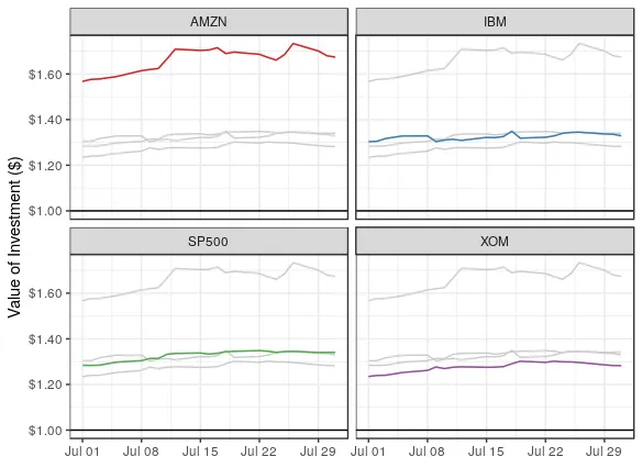
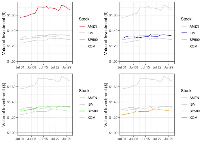
我想制作一个面板图,每个股票一个面板。我已经用以下代码实现了这一部分:
ggplot(dat, aes(x = date, y = Index, group = Stock, color = Stock)) +
  geom_hline(aes(yintercept = 1), color = 'black') + 
  geom_line() +
  theme_bw() +
  facet_wrap(~ Stock) +
  scale_y_continuous(labels = scales::dollar) +
  labs(x = NULL, y = 'Value of Investment ($)') +
  scale_color_brewer(palette = "Set1") +
  guides(color = FALSE)

到目前为止,这是输出结果:

enter image description here

我有一个问题 - 是否有可能将其他股票系列添加到每个面板中,并使它们变成灰色这样的暗淡颜色?
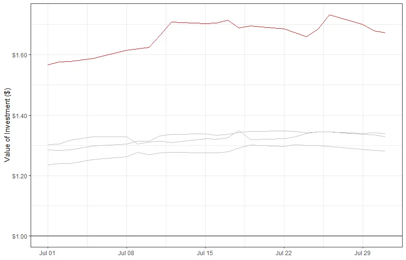
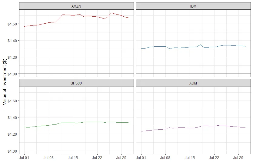
例如,AMZN左上角的面板将类似于此绘图:

enter image description here

3个回答

3
当您想绘制这样的图时,需要一个不用于着色但用于分面的不同变量。
在第4行中,我们创建了一个名为Stock2的变量,仅用于此目的。
ggplot(dat, aes(date, Index)) +
  geom_hline(aes(yintercept = 1), color = 'black') + 
  geom_line(aes(group = Stock), col = "grey80") +
  geom_line(data = transform(dat, Stock2 = Stock), aes(col = Stock)) +
  facet_wrap(~Stock2) + 
  theme_bw() +
  scale_y_continuous(labels = scales::dollar) +
  labs(x = NULL, y = 'Value of Investment ($)') +
  scale_color_brewer(palette = "Set1") +
  guides(color = FALSE)

enter image description here


2
这是如此优雅而简单的解决方案。 - Jim O.

0

可能有更优雅的解决方案,但这里提供一种绘制其中之一的方法:

ggplot(dat) +
  geom_hline(aes(yintercept = 1), color = 'black') + 
  geom_line(data=subset(dat, Stock == "AMZN"), aes(x=date,y=Index, colour=Stock)) +
  geom_line(data=subset(dat, Stock == "SP500"), aes(x=date,y=Index, colour=Stock)) +
  geom_line(data=subset(dat, Stock == "IBM"), aes(x=date,y=Index, colour=Stock)) +
  geom_line(data=subset(dat, Stock == "XOM"), aes(x=date,y=Index, colour=Stock)) +
  scale_colour_manual(values=c("red", "#D3D3D3", "#D3D3D3", "#D3D3D3")) +
  theme_bw() +
  scale_y_continuous(labels = scales::dollar) +
  labs(x = NULL, y = 'Value of Investment ($)', color = "Stock:")

result

编辑:我理解您想要绘制它们全部,不过markus的解决方案非常出色 :)


0
使用 grid.arrangeheds1 解决方案:
a <- ggplot(dat) +
  geom_hline(aes(yintercept = 1), color = 'black') + 
  geom_line(data=subset(dat, Stock == "AMZN"), aes(x=date,y=Index, colour=Stock)) +
  geom_line(data=subset(dat, Stock == "SP500"), aes(x=date,y=Index, colour=Stock)) +
  geom_line(data=subset(dat, Stock == "IBM"), aes(x=date,y=Index, colour=Stock)) +
  geom_line(data=subset(dat, Stock == "XOM"), aes(x=date,y=Index, colour=Stock)) +
  scale_colour_manual(values=c("red", "#D3D3D3", "#D3D3D3", "#D3D3D3")) +
  theme_bw() +
  scale_y_continuous(labels = scales::dollar) +
  labs(x = NULL, y = 'Value of Investment ($)', color = "Stock:")

b <- ggplot(dat) +
  geom_hline(aes(yintercept = 1), color = 'black') + 
  geom_line(data=subset(dat, Stock == "AMZN"), aes(x=date,y=Index, colour=Stock)) +
  geom_line(data=subset(dat, Stock == "SP500"), aes(x=date,y=Index, colour=Stock)) +
  geom_line(data=subset(dat, Stock == "IBM"), aes(x=date,y=Index, colour=Stock)) +
  geom_line(data=subset(dat, Stock == "XOM"), aes(x=date,y=Index, colour=Stock)) +
  scale_colour_manual(values=c("#D3D3D3", "blue", "#D3D3D3", "#D3D3D3")) +
  theme_bw() +
  scale_y_continuous(labels = scales::dollar) +
  labs(x = NULL, y = 'Value of Investment ($)', color = "Stock:")

c <- ggplot(dat) +
  geom_hline(aes(yintercept = 1), color = 'black') + 
  geom_line(data=subset(dat, Stock == "AMZN"), aes(x=date,y=Index, colour=Stock)) +
  geom_line(data=subset(dat, Stock == "SP500"), aes(x=date,y=Index, colour=Stock)) +
  geom_line(data=subset(dat, Stock == "IBM"), aes(x=date,y=Index, colour=Stock)) +
  geom_line(data=subset(dat, Stock == "XOM"), aes(x=date,y=Index, colour=Stock)) +
  scale_colour_manual(values=c("#D3D3D3", "#D3D3D3", "green", "#D3D3D3")) +
  theme_bw() +
  scale_y_continuous(labels = scales::dollar) +
  labs(x = NULL, y = 'Value of Investment ($)', color = "Stock:")

d <- ggplot(dat) +
  geom_hline(aes(yintercept = 1), color = 'black') + 
  geom_line(data=subset(dat, Stock == "AMZN"), aes(x=date,y=Index, colour=Stock)) +
  geom_line(data=subset(dat, Stock == "SP500"), aes(x=date,y=Index, colour=Stock)) +
  geom_line(data=subset(dat, Stock == "IBM"), aes(x=date,y=Index, colour=Stock)) +
  geom_line(data=subset(dat, Stock == "XOM"), aes(x=date,y=Index, colour=Stock)) +
  scale_colour_manual(values=c("#D3D3D3", "#D3D3D3", "#D3D3D3", "orange")) +
  theme_bw() +
  scale_y_continuous(labels = scales::dollar) +
  labs(x = NULL, y = 'Value of Investment ($)', color = "Stock:")


install.packages("gridExtra")
library(gridExtra)
grid.arrange(a, b, c, d, ncol=2, nrow = 2)

enter image description here


网页内容由stack overflow 提供, 点击上面的
可以查看英文原文,
原文链接