在matplotlib中使用文本注释轴

3
我想在绘图中用类似于示例图表的文本注释轴。具体来说,我希望用不同的标题(如红色的XYZ,ABC,MNO等)注释轴的不同区域。
我使用此示例(绘制条形图)生成了图表:http://matplotlib.org/examples/api/barchart_demo.html 请问是否有人能够帮我画出这样的线,并在轴上添加文本?任何指向示例的指针也将不胜感激。除了用图片描述外,我不知道该如何表达我想要做的事情。
1个回答

7
快速阅读文档会有所帮助,可以在这里找到:这里。我使用了文档中描述的annotate函数。
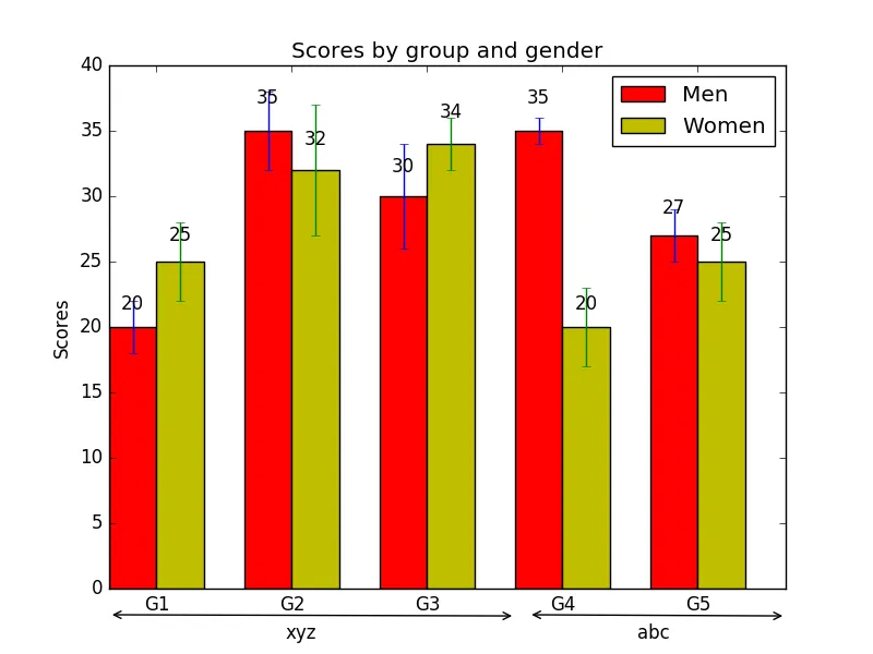
以下是一段代码,它可以为x轴完成您需要的操作。这段代码的大部分来自您在问题中提供链接的示例。
N = 5
menMeans = (20, 35, 30, 35, 27)
menStd = (2, 3, 4, 1, 2)
ind = np.arange(N)  # the x locations for the groups
width = 0.35       # the width of the bars
fig, ax = plt.subplots()
rects1 = ax.bar(ind, menMeans, width, color='r', yerr=menStd)
womenMeans = (25, 32, 34, 20, 25)
womenStd = (3, 5, 2, 3, 3)
rects2 = ax.bar(ind + width, womenMeans, width, color='y', yerr=womenStd)

# add some text for labels, title and axes ticks
ax.set_ylabel('Scores')
ax.set_title('Scores by group and gender')
ax.set_xticks(ind + width)
ax.set_xticklabels(('G1', 'G2', 'G3', 'G4', 'G5'))
ax.legend((rects1[0], rects2[0]), ('Men', 'Women'))

######### annotating the x axis   #########
ax.annotate('', xy=(0, -2),xytext=(3,-2.09),                     #draws an arrow from one set of coordinates to the other
            arrowprops=dict(arrowstyle='<->',facecolor='red'),   #sets style of arrow and colour
            annotation_clip=False)                               #This enables the arrow to be outside of the plot

ax.annotate('xyz',xy=(1.1,-3.8),xytext=(1.3,-3.8),               #Adds another annotation for the text that you want
            annotation_clip=False)


ax.annotate('', xy=(3.1, -2),xytext=(5,-2.09),                   #Repeating for however many arrows you want under the axes
            arrowprops=dict(arrowstyle='<->',facecolor='red'),
            annotation_clip=False)

ax.annotate('abc',xy=(3.6,-3.8),xytext=(3.9,-3.8),
            annotation_clip=False)

######## Can add further annotations for the y-axis here similar to the above ########


# by changing the coorinates of the above you can repeat this for the y axis too
def autolabel(rects):
    # attach some text labels
    for rect in rects:
        height = rect.get_height()
        ax.text(rect.get_x() + rect.get_width()/2., 1.05*height,
                '%d' % int(height),
                ha='center', va='bottom')
autolabel(rects1)
autolabel(rects2)
plt.show()

这将给出下面的图像: enter image description here 您需要复制此内容以便对y轴进行相同操作。

嗯,尝试了一下,对于文本来说可以工作,但我看不到水平轴下面的箭头。我需要使用“autolabel”函数吗?“facecolor='red'”是用来干什么的?我没有看到任何红色。 - CGFoX
@CGFoX,在较新版本的pyplot中,箭头样式是用单词而不是标记指定的。请参见https://matplotlib.org/3.2.2/tutorials/text/annotations.html#plotting-guide-annotation。对我来说,设置`arrowstyle="simple"`有效。 - Rob Romijnders

网页内容由stack overflow 提供, 点击上面的
可以查看英文原文,
原文链接