如何创建一个弯曲的漫画对话气泡?

8
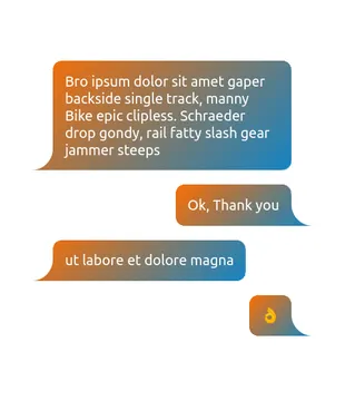
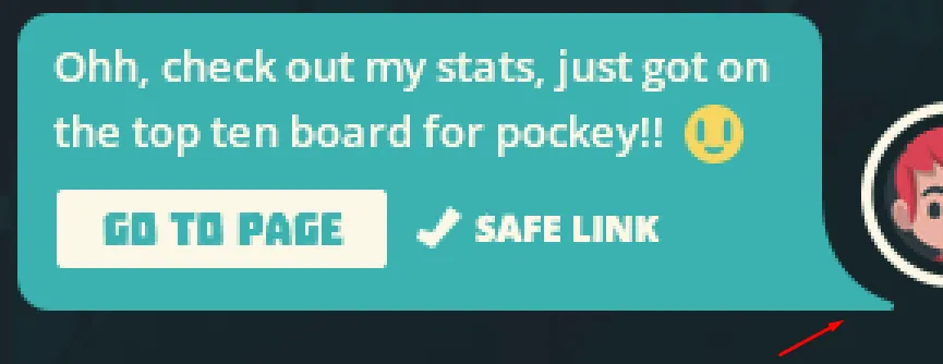
我正在尝试将一个div制作成一个弯曲的对话气泡,就像这样:

enter image description here

这是我尝试过的方法,但实际上并没有起作用:
.userMsgBottom{
  position: relative;
  display: inline-block;
  max-width: 260px;
  height: auto;
  word-wrap: break-word;
  background-color: #2e7384;
  margin-top: 12px;
  margin-left: 8px;
  margin-right: 8px;
  padding: 7px;
  border-radius: 6px;
}
.userMsgBottom:after {
    content: "";
    position: absolute;
    bottom: 0px;
    right: 5px;
    width: 70px;
    height: 30px;
    background-color: #2e7384;
    transform: skew(45deg);
    transform-origin: top right;
    border-radius: 0 15% 5% 0% / 25%;
    z-index: -1;
}

它能够实现如下功能:

enter image description here

我应该怎么做呢?

1个回答

16
我建议使用 radial-gradient 来实现这个效果:

.userMsgBottom {
  position: relative;
  display: inline-block;
  color:#fff;
  max-width: 260px;
  background-color: #2e7384;
  margin: 30px;
  padding: 7px;
  border-radius: 6px;
}

.userMsgBottom:after {
  content: "";
  position: absolute;
  bottom: 0;
  right: -25px;
  width: 40px;
  height: 25px;
  background: radial-gradient(25px at top right, #0000 99%, #2e7384 102%);
}

.userMsgBottom.left:after {
  content: "";
  position: absolute;
  bottom: 0;
  left: -25px;
  width: 40px;
  height: 25px;
  background: radial-gradient(25px at top left, #0000 99%, #2e7384 102%);
}
<div class="userMsgBottom">
  Some text here<br> Some text here<br> Some text here
</div>

<div class="userMsgBottom left">
  Some text here<br> Some text here<br> Some text here
</div>

这里有另一个使用CSS变量的掩码来轻松控制形状的想法:

.bubble {
  --r: 25px; /* the radius */
  --t: 30px; /* the size of the tail */
  
  max-width: 300px;
  padding: calc(2*var(--r)/3);
  -webkit-mask: 
    radial-gradient(var(--t) at var(--_d) 0,#0000 98%,#000 102%) 
      var(--_d) 100%/calc(100% - var(--r)) var(--t) no-repeat,
    conic-gradient(at var(--r) var(--r),#000 75%,#0000 0) 
      calc(var(--r)/-2) calc(var(--r)/-2) padding-box, 
    radial-gradient(50% 50%,#000 98%,#0000 101%) 
      0 0/var(--r) var(--r) space padding-box;
  background: linear-gradient(135deg,#FE6D00,#1384C5) border-box;
  color: #fff;
}
.left {
  --_d: 0%;
  border-left: var(--t) solid #0000;
  margin-right: var(--t);
  place-self: start;
}
.right {
  --_d: 100%;
  border-right: var(--t) solid #0000;
  margin-left: var(--t);
  place-self: end;
}

body {
  margin: 0;
  min-height: 100vh;
  display: grid;
  place-content: center;
  gap: 20px;
  font-family: system-ui, sans-serif;
  font-size: 20px;
}
<div class="bubble left">Bro ipsum dolor sit amet gaper backside single track, manny Bike epic clipless. Schraeder drop gondy, rail fatty slash gear jammer steeps</div>
<div class="bubble right">Ok, Thank you</div>
<div class="bubble left"> ut labore et dolore magna </div>
<div class="bubble right"></div>

CSS only curved speech bubble


请问您能否提供一个背景为线性渐变,而对话框背景为白色的例子?或者回答一下 https://stackoverflow.com/questions/73887757 这个问题。这似乎是这个问题更棘手的版本。 - John DeBord

网页内容由stack overflow 提供, 点击上面的
可以查看英文原文,
原文链接