有不同的方法可以用来创建这个形状。下面是可能的详细描述:
基于SVG的方法:
SVG 是创建这种形状的推荐方式。它提供了简单性和可扩展性。以下是几种可能的方法:
1- 使用Path元素:
我们可以使用 SVG 的 path 元素来创建此形状,并填充它以某种纯色、渐变或图案。
在 path 元素中,只需要使用一个属性 d 来定义形状。该属性本身包含许多短命令和一些参数,这些参数是必要的让这些命令正常工作的。
下面是创建这个形状所需的代码:
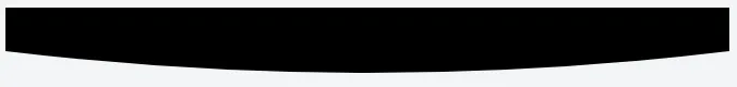
<path d="M 0,0
         L 0,40
         Q 250,80 500,40
         L 500,0
         Z" />
以下是上述代码中使用的path命令的简要说明:
M命令用于定义起始点。它出现在开头,并指定绘制应从何处开始。L命令用于绘制直线。Q命令用于绘制曲线。Z命令用于关闭当前路径。
输出图像:
工作演示:
svg {
  width: 100%;
}
<svg width="500" height="80" viewBox="0 0 500 80" preserveAspectRatio="none">
  <path d="M0,0 L0,40 Q250,80 500,40 L500,0 Z" fill="black" />
</svg>
2- Clipping:
Clipping means removing or hiding some parts of an element.
In this approach, we define a clipping region by using SVG's clipPath element and apply it to a rectangular element. Any area outside the clipping region will be hidden.
Below is the required code:
<defs>
    <clipPath id="shape">
        <path d="M0,0 L0,40 Q250,80 500,40 L500,0 Z" />
    </clipPath>
</defs>
<rect x="0" y="0" width="500" height="80" fill="#000" clip-path="url(#shape)" />
以下是上述代码中使用的元素的简要说明:
defs 元素用于定义SVG文档中稍后要使用的元素/对象。clipPath 元素用于定义剪切区域。rect 元素用于创建矩形。clip-path 属性用于链接先前创建的剪辑路径。
演示:
svg {
  width: 100%;
}
<svg width="500" height="80" viewBox="0 0 500 80" preserveAspectRatio="none">
  <defs>
    <clipPath id="shape">
      <path d="M0,0 L0,40 Q250,80 500,40 L500,0 Z" />
    </clipPath>
  </defs>
  <rect x="0" y="0" width="500" height="80" fill="#000" clip-path="url(#shape)" />
</svg>
CSS 基于样式的方法:
1- 使用伪元素:
我们可以使用 ::before 或 ::after 伪元素来创建这个形状。下面是创建此形状的步骤:
- 使用
::before 或 ::after 伪元素创建一个比其父元素宽度和高度更大的图层。
- 添加
border-radius 来创建圆角形状。
- 在父元素上添加
overflow: hidden 来隐藏不必要的部分。
所需 HTML:
我们只需要一个单独的 div 元素,可能带有一些类名,如 shape:
<div class="shape"></div>
工作演示:
.shape {
  position: relative;
  overflow: hidden;
  height: 80px;
}

.shape::before {
  border-radius: 100%;
  position: absolute;
  background: black;
  right: -200px;
  left: -200px;
  top: -200px;
  content: '';
  bottom: 0;
}
<div class="shape"></div>
2- 径向渐变:
使用CSS3的radial-gradient()函数作为背景在元素上绘制形状。然而,这种方法无法产生非常清晰的图像,可能会有一些锯齿状的角落。
所需HTML代码:
只需要一个带有某些类的单个div元素即可。
<div class="shape"></div>
必要的CSS:
.shape {
  background-image: radial-gradient(120% 120px at 50% -30px, #000 75%, transparent 75%);
}
演示:
.shape {
  background: radial-gradient(120% 120px at 50% -30px, #000 75%, transparent 75%) no-repeat;
  height: 80px;
}
<div class="shape"></div>
基于JavaScript的方法:
虽然在这种情况下不是必需的,但为了完整起见,我也添加了这种方法。在某些情况下,这也可能会很有用:
HTML5画布:
我们可以使用路径函数在HTML5画布元素上绘制此形状:
var canvas = document.getElementById('canvas');
var ctx = canvas.getContext('2d');

ctx.beginPath();
ctx.moveTo(0, 0);
ctx.lineTo(0, 40);
ctx.quadraticCurveTo(311, 80, 622, 40);
ctx.lineTo(622, 0);
ctx.fill();
<canvas id="canvas" width="622" height="80"></canvas>
以下是上面代码中使用的方法的简要描述:
-
beginPath() 用于创建一个新路径,在创建新路径后,将来的绘制命令将被指定到该路径中。
-
moveTo(x, y) 将笔移动到由
x 和
y 指定的坐标处。
-
lineTo(x, y) 从当前笔位置绘制一条直线到由
x 和
y 指定的点。
-
quadraticCurveTo(cp1x, cp1y, x, y) 使用由
cp1x 和
cp1y 指定的控制点,绘制一条曲线从当前笔位置到由
x 和
y 指定的点。
-
fill() 使用非零或奇偶环绕规则填充当前路径。
有用资源:
- 径向渐变:
规范、
MDN
- SVG:
规范、
MDN
- HTML5 画布:
规范、
MDN
