如何使用matplotlib在python中绘制向量。

51

我正在学习线性代数课程,希望能够将向量的操作可视化,比如向量相加、法向量等。

例如:

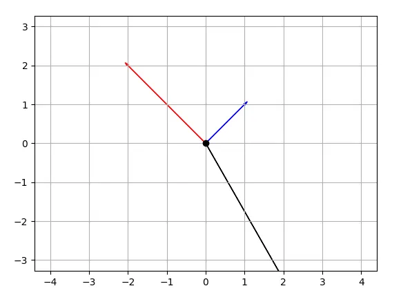
V = np.array([[1,1],[-2,2],[4,-7]])

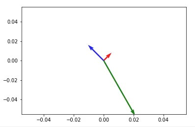
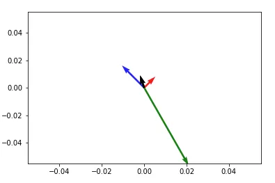
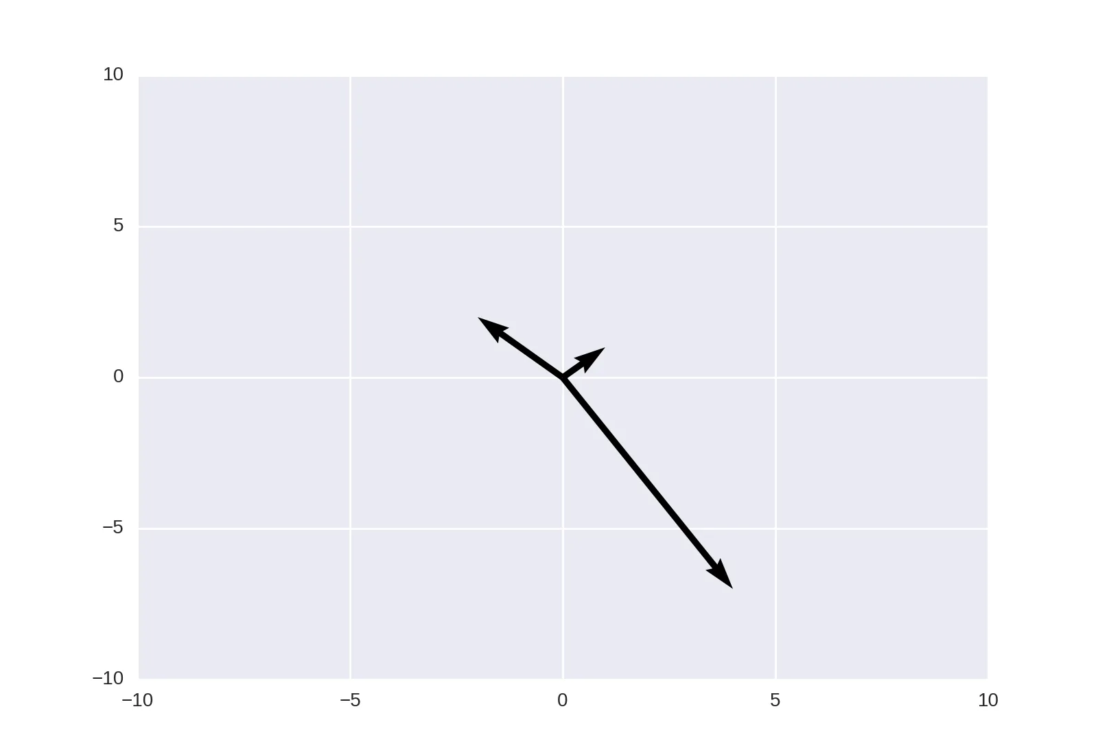
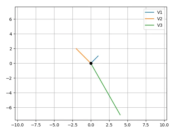
在这种情况下,我想要绘制3个向量 V1 = (1,1), M2 = (-2,2), M3 = (4,-7)

然后,我应该能够添加V1、V2到图中,绘制一个新的向量V12(全部在同一张图中)。

当我使用下面的代码时,绘图效果不像预期的那样。

import numpy as np
import matplotlib.pyplot as plt
M = np.array([[1,1],[-2,2],[4,-7]])

print("vector:1")
print(M[0,:])
# print("vector:2")
# print(M[1,:])
rows,cols = M.T.shape
print(cols)

for i,l in enumerate(range(0,cols)):
    print("Iteration: {}-{}".format(i,l))
    print("vector:{}".format(i))
    print(M[i,:])
    v1 = [0,0],[M[i,0],M[i,1]]
    # v1 = [M[i,0]],[M[i,1]]
    print(v1)
    plt.figure(i)
    plt.plot(v1)
    plt.show()

可能是如何使用Matplotlib绘制2D数学向量?的重复问题。 - fuglede
8个回答

74

这个怎么样:

import numpy as np
import matplotlib.pyplot as plt

V = np.array([[1,1], [-2,2], [4,-7]])
origin = np.array([[0, 0, 0],[0, 0, 0]]) # origin point

plt.quiver(*origin, V[:,0], V[:,1], color=['r','b','g'], scale=21)
plt.show()

输入图像描述

然后,在调用plt.show()之前,将任意两个向量相加并绘制到同一张图中,可以这样做:

plt.quiver(*origin, V[:,0], V[:,1], color=['r','b','g'], scale=21)
v12 = V[0] + V[1] # adding up the 1st (red) and 2nd (blue) vectors
plt.quiver(*origin, v12[0], v12[1])
plt.show()

输入图像描述

注意:在Python2中,使用origin[0], origin[1]代替*origin


+1 非常酷,你知道是否可以为箭羽中的每个箭头创建一个图例条目吗? - mitoRibo
不幸的是,我不知道 :/ 而且我不太确定是否有办法为每个添加单独的图例。也许像 figtexttext 这样的东西可以做到!? - Aziz Alto
1
在Python3.5+中,星号(*)可以解包列表。https://dev59.com/VHA75IYBdhLWcg3wFE6b#3480190 - Aziz Alto
3
如果坐标轴与向量的大小相匹配会非常有帮助,有没有办法实现呢? - Stan Shunpike
哈,这个API真不错。origin的形状为(2,3),而V的形状为(3,2)。 - jds
显示剩余2条评论

28

如链接答案所述,也可以使用matplotlib.pyplot.quiver来实现此操作。


plt.quiver([0, 0, 0], [0, 0, 0], [1, -2, 4], [1, 2, -7], angles='xy', scale_units='xy', scale=1)
plt.xlim(-10, 10)
plt.ylim(-10, 10)
plt.show()

mpl output


10
您的主要问题是在循环中创建新图形,因此每个向量都会绘制在不同的图形上。以下是我提出的解决方案,如果仍然无法满足您的期望,请告知:

代码:

import numpy as np
import matplotlib.pyplot as plt
M = np.array([[1,1],[-2,2],[4,-7]])

rows,cols = M.T.shape

#Get absolute maxes for axis ranges to center origin
#This is optional
maxes = 1.1*np.amax(abs(M), axis = 0)

for i,l in enumerate(range(0,cols)):
    xs = [0,M[i,0]]
    ys = [0,M[i,1]]
    plt.plot(xs,ys)

plt.plot(0,0,'ok') #<-- plot a black point at the origin
plt.axis('equal')  #<-- set the axes to the same scale
plt.xlim([-maxes[0],maxes[0]]) #<-- set the x axis limits
plt.ylim([-maxes[1],maxes[1]]) #<-- set the y axis limits
plt.legend(['V'+str(i+1) for i in range(cols)]) #<-- give a legend
plt.grid(b=True, which='major') #<-- plot grid lines
plt.show()

输出:

在这里输入图片描述

编辑代码:

import numpy as np
import matplotlib.pyplot as plt
M = np.array([[1,1],[-2,2],[4,-7]])

rows,cols = M.T.shape

#Get absolute maxes for axis ranges to center origin
#This is optional
maxes = 1.1*np.amax(abs(M), axis = 0)
colors = ['b','r','k']


for i,l in enumerate(range(0,cols)):
    plt.axes().arrow(0,0,M[i,0],M[i,1],head_width=0.05,head_length=0.1,color = colors[i])

plt.plot(0,0,'ok') #<-- plot a black point at the origin
plt.axis('equal')  #<-- set the axes to the same scale
plt.xlim([-maxes[0],maxes[0]]) #<-- set the x axis limits
plt.ylim([-maxes[1],maxes[1]]) #<-- set the y axis limits
plt.grid(b=True, which='major') #<-- plot grid lines
plt.show()

编辑输出: 在此输入图片描述


看起来很酷,我们能为每个向量添加箭头吗? - Shravan Kumar
当然可以!个人认为原点上的点足以表示方向,但你可以从juanpa的回答中借鉴一些命令。我尝试过使用箭头,但很难让它们成为图例中不同的条目并适合屏幕(请参见更新)。 - mitoRibo
1
嘿,谢谢。我已经注释掉了plt.axis('equal')。现在它显示了所有指定x、y限制的向量。 - Shravan Kumar
1
也许需要更新一下:对于我来说,使用Matplotlib 3.4.1,您编辑后的答案在绘制箭头时应省略.axes(),例如 plt.arrow(0,0,M[i,0],M[i,1],head_width=0.3,head_length=0.3,color = colors[i], length_includes_head=True) - Chris Stenkamp

7
你期望以下内容做什么?
v1 = [0,0],[M[i,0],M[i,1]]
v1 = [M[i,0]],[M[i,1]]

这是生成两个不同的元组,你覆盖了第一次的操作。无论如何,matplotlib 不理解你使用的 "向量" 的含义。你必须明确地绘制 "箭头":
In [5]: ax = plt.axes()

In [6]: ax.arrow(0, 0, *v1, head_width=0.05, head_length=0.1)
Out[6]: <matplotlib.patches.FancyArrow at 0x114fc8358>

In [7]: ax.arrow(0, 0, *v2, head_width=0.05, head_length=0.1)
Out[7]: <matplotlib.patches.FancyArrow at 0x115bb1470>

In [8]: plt.ylim(-5,5)
Out[8]: (-5, 5)

In [9]: plt.xlim(-5,5)
Out[9]: (-5, 5)

In [10]: plt.show()

结果:

在此输入图片描述


谢谢,我已经修改了v1的额外行。 - Shravan Kumar
我试过所有可能的方法,最后决定向社区寻求帮助,但在此过程中我并没有删除那行代码。我想做的就是像我们在笔记本上画图一样绘制一个向量。 - Shravan Kumar

2
感谢大家,你们每个人的帖子都给了我很大的帮助。rbierman 的代码对我的问题非常直接,我稍作修改并创建了一个从给定数组绘制向量的函数。我很乐意听取任何进一步改进的建议。
import numpy as np
import matplotlib.pyplot as plt
def plotv(M):
    rows,cols = M.T.shape
    print(rows,cols)

    #Get absolute maxes for axis ranges to center origin
    #This is optional
    maxes = 1.1*np.amax(abs(M), axis = 0)
    colors = ['b','r','k']
    fig = plt.figure()
    fig.suptitle('Vectors', fontsize=10, fontweight='bold')

    ax = fig.add_subplot(111)
    fig.subplots_adjust(top=0.85)
    ax.set_title('Vector operations')

    ax.set_xlabel('x')
    ax.set_ylabel('y')

    for i,l in enumerate(range(0,cols)):
        # print(i)
        plt.axes().arrow(0,0,M[i,0],M[i,1],head_width=0.2,head_length=0.1,zorder=3)

        ax.text(M[i,0],M[i,1], str(M[i]), style='italic',
            bbox={'facecolor':'red', 'alpha':0.5, 'pad':0.5})

    plt.plot(0,0,'ok') #<-- plot a black point at the origin
    # plt.axis('equal')  #<-- set the axes to the same scale
    plt.xlim([-maxes[0],maxes[0]]) #<-- set the x axis limits
    plt.ylim([-maxes[1],maxes[1]]) #<-- set the y axis limits

    plt.grid(b=True, which='major') #<-- plot grid lines
    plt.show()

r = np.random.randint(4,size=[2,2])
print(r[0,:])
print(r[1,:])
r12 = np.add(r[0,:],r[1,:])
print(r12)
plotv(np.vstack((r,r12)))

对随机向量进行的向量加法


1
所有不错的解决方案,都是为特殊情况借鉴和改进 -> 如果你想在箭头附近添加一个标签:

    arr = [2,3]
    txt = “Vector X”
    ax.annotate(txt, arr)
    ax.arrow(0, 0, *arr, head_width=0.05, head_length=0.1)


0

一旦你弄清了Quiver的烦人细节,它是一个不错的方法,比如不能按照原始比例绘制向量。据我所知,你必须将这些参数传递给quiver调用,正如许多人指出的那样:angles='xy', scale_units='xy', scale=1 并且你应该设置plt.xlimplt.ylim,使得你得到一个正方形或接近正方形的网格。这是我唯一能够让它以我想要的方式一致地绘制的方法。例如,将原点设置为*[0,0],U、V设置为*[5,3],意味着结果图应该是一个以原点0,0为中心的向右延伸5个单位在x轴上,向上延伸3个单位在y轴上的向量。


0
为了使向量的长度和角度与绘图的x、y坐标匹配,您可以使用以下选项来plt.quiver:
plt.figure(figsize=(5,2), dpi=100)
plt.quiver(0,0,250,100, angles='xy', scale_units='xy', scale=1)
plt.xlim(0,250)
plt.ylim(0,100)

网页内容由stack overflow 提供, 点击上面的
可以查看英文原文,
原文链接