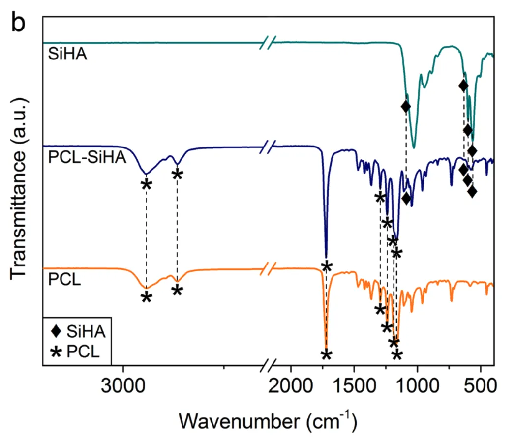
我正在尝试重新创建以下绘图的外观:
如此描述,轴的中断本身非常简单:https://matplotlib.org/stable/gallery/subplots_axes_and_figures/broken_axis.html
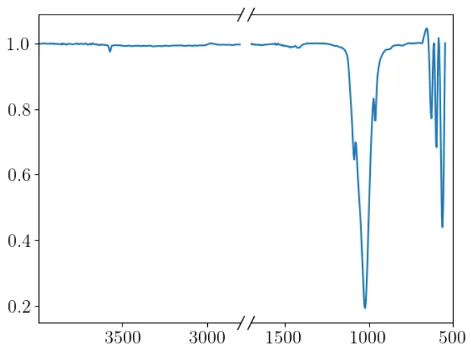
但我不知道如何在图表本身中包含 // 中断。有什么想法吗?
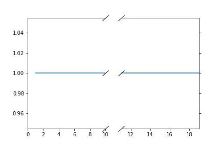
这是目前我的数据显示的样子。
我正在尝试重新创建以下绘图的外观:
如此描述,轴的中断本身非常简单:https://matplotlib.org/stable/gallery/subplots_axes_and_figures/broken_axis.html
但我不知道如何在图表本身中包含 // 中断。有什么想法吗?
这是目前我的数据显示的样子。
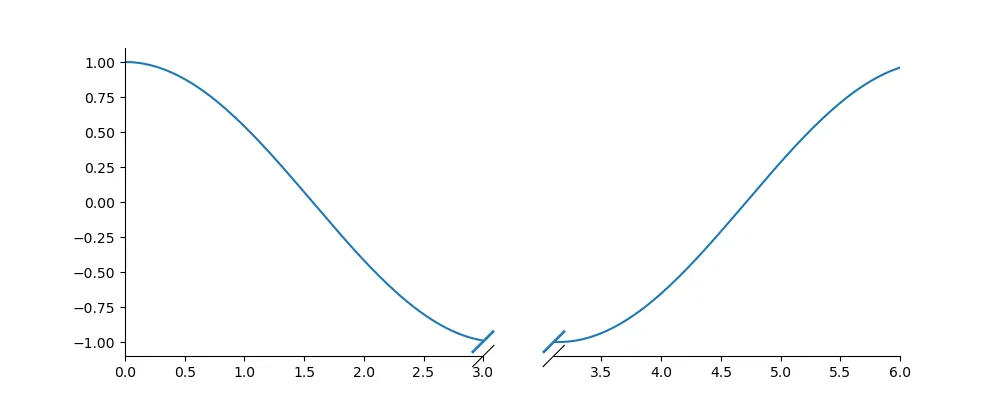
你已经知道了,brokenaxes包在中断轴方面非常完美,但似乎没有一个已发布的包提供此功能。然而,我已经想出了如何实现你所需要的效果。
首先,在终端中从你的环境目录安装该包:
>>> pip install brokenaxes
或者
>>> conda install -c conda-forge brokenaxes
解决方案:
from brokenaxes import brokenaxes
import numpy as np
import matplotlib.pyplot as plt

x_min    = 0
x_break  = 3
gap      = .1
x_max    = 6

def f(x):
    return np.cos(x)


fig  = plt.figure(figsize=(10,4))
brax = brokenaxes(xlims=((x_min, x_break), (x_break+gap, x_max)), hspace=gap)
xs   = np.linspace(x_min, x_max, 150)

brax.plot(xs, f(xs))
brax.annotate(u'—', (x_break-0.001, f(x_break)), rotation=45, size=25, ha='center', va='center', c='C0')
brax.annotate(u'—', (x_break+gap, f(x_break)), rotation=45, size=25, ha='center', va='center', c='C0')

plt.show()
使用示例链接 https://matplotlib.org/stable/gallery/subplots_axes_and_figures/broken_axis.html,来实现你的目标:
import numpy as np
import matplotlib.pyplot as plt

np.random.seed(19680801)

# creat data points
x = np.arange(20)+1
pts = x/x

# If we were to simply plot pts, we'd lose most of the interesting
# details due to the outliers. So let's 'break' or 'cut-out' the y-axis
# into two portions - use the top (ax1) for the outliers, and the bottom
# (ax2) for the details of the majority of our data
fig, (ax1, ax2) = plt.subplots(1, 2, sharey=True)
fig.subplots_adjust(hspace=0.05)  # adjust space between axes

# plot the same data on both axes
ax1.plot(x, pts)
ax2.plot(x, pts)

# zoom-in / limit the view to different portions of the data
ax1.set_xlim(0, 10)  # left part plot
ax2.set_xlim(11, 19)  # right part plot

# hide the spines between ax and ax2
ax1.spines['right'].set_visible(False)
ax2.spines['left'].set_visible(False)
#ax1.xaxis.tick_top()
#ax1.tick_params(labeltop=False)  # don't put tick labels at the top
ax2.yaxis.tick_right()

# Now, let's turn towards the cut-out slanted lines.
# We create line objects in axes coordinates, in which (0,0), (0,1),
# (1,0), and (1,1) are the four corners of the axes.
# The slanted lines themselves are markers at those locations, such that the
# lines keep their angle and position, independent of the axes size or scale
# Finally, we need to disable clipping.

d = .9  # proportion of vertical to horizontal extent of the slanted line
kwargs = dict(marker=[(-1, -d), (1, d)], markersize=12,
              linestyle="none", color='k', mec='k', mew=1, clip_on=False)
ax1.plot([1, 1], [0, 1], transform=ax1.transAxes, **kwargs)
ax2.plot([0, 0], [0, 1], transform=ax2.transAxes, **kwargs)

# add slanted line on the graph
ax1.plot([1], [0.5], transform=ax1.transAxes, **kwargs)
ax2.plot([0], [0.5], transform=ax2.transAxes, **kwargs)
#fig.savefig('_')

plt.show()