我在这里遇到了一些麻烦,请帮帮我。我有这个数据:
set.seed(4)
mydata <- data.frame(var = rnorm(100),
                     temp = rnorm(100),
                     subj = as.factor(rep(c(1:10),5)),
                     trt = rep(c("A","B"), 50))
以及适合它们的这个模型
lm <- lm(var ~ temp * subj, data = mydata)
我希望能用lattice绘制结果,并通过我的模型预测的回归线进行拟合。为此,我使用了D. Sarkar在“Lattice技巧for the power useR”中概述的方法。请保留HTML标记。
temp_rng <- range(mydata$temp, finite = TRUE)
grid <- expand.grid(temp = do.breaks(temp_rng, 30),
subj = unique(mydata$subj),
trt = unique(mydata$trt))
model <- cbind(grid, var = predict(lm, newdata = grid))
orig <- mydata[c("var","temp","subj","trt")]
combined <- make.groups(original = orig, model = model)
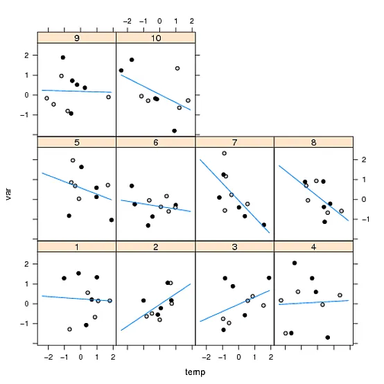
xyplot(var ~ temp | subj,
data = combined,
groups = which,
type = c("p", "l"),
distribute.type = TRUE
)
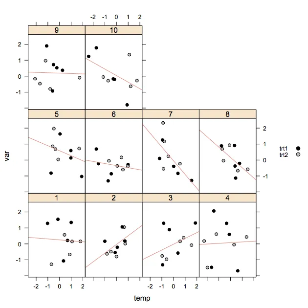
到目前为止一切都很好,但我还想为两种处理方式和的数据点指定填充颜色。
所以我写了这段代码,它运行良好,但当绘制回归线时,似乎面板函数无法识别类型...
my.fill <- c("black", "grey")

plot <- with(combined,
        xyplot(var ~ temp | subj,
              data = combined,
              group = combined$which,
              type = c("p", "l"),
              distribute.type = TRUE,
              panel = function(x, y, ..., subscripts){
                     fill <- my.fill[combined$trt[subscripts]]
                     panel.xyplot(x, y, pch = 21, fill = my.fill, col = "black")
                     },
             key = list(space = "right",
                     text = list(c("trt1", "trt2"), cex = 0.8),
                     points = list(pch = c(21), fill = c("black", "grey")),
                     rep = FALSE)
                     )
      )
plot
我也尝试移动和分配panel.xyplot中的类型,并在其中对数据进行子集处理,如下所示:
plot <- with(combined,
        xyplot(var ~ temp | subj,
              data = combined,
              panel = function(x, y, ..., subscripts){
                     fill <- my.fill[combined$trt[subscripts]]
                     panel.xyplot(x[combined$which=="original"], y[combined$which=="original"], pch = 21, fill = my.fill, col = "black")
                     panel.xyplot(x[combined$which=="model"], y[combined$which=="model"], type = "l", col = "black")
                     },
             key = list(space = "right",
                     text = list(c("trt1", "trt2"), cex = 0.8),
                     points = list(pch = c(21), fill = c("black", "grey")),
                     rep = FALSE)
                     )
      )
plot
但是也没有成功。
有人能帮我将预测值绘制成一条线而不是点吗?
panel.lmline得到的拟合线与使用lm的输出得到的拟合线相同。如果您需要在其他地方使用模型信息,没有任何阻止您进行拟合;我的观点是您不需要为了绘图本身而需要它。 - joranpanel.lmline在每个面板中使用lm拟合线性模型,其拟合值与您的模型完全相同。 - Aaron left Stack Overflow