我对R和plotly都很陌生。
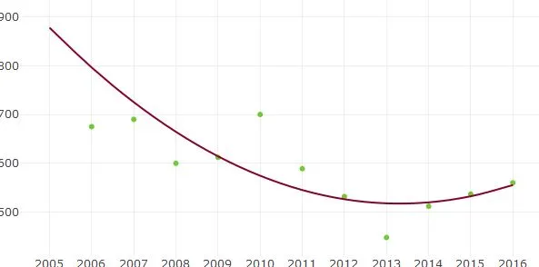
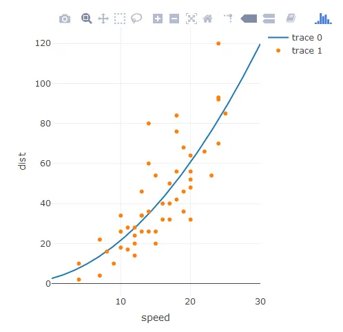
我试图绘制一个二次(即2次多项式)回归线。 一次是价格与年份的关系,另一次是相同的价格与某些整数列表(可能相同),比如得分。 这个例子中的数据为:
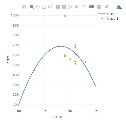
price = c(995, 675, 690, 600, 612, 700, 589, 532, 448, 512, 537, 560)
score = c(89, 91, 88, 89, 91, 91, 89, 93, 83, 91, 91, 90)
year = c(2005:2016)
第一个适合编码的方法效果很好
enter code here
qfit1 <- lm(price ~ poly (year,2))
然后一个带有Plotly的图表
add_trace(x=year, y=fitted(qfit1), type="scatter",
          mode="lines", line=list(shape="spline"),)
生成这个图表:
qfit2 <- lm(price ~ poly (score,2))
p <- plot_ly() %>% ...
  add_trace(x=score, y=fitted(qfit2), type="scatter", mode="lines",
  line=list(shape="spline", smoothing=1.3))*
给我:
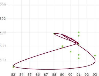
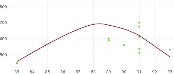
这个程序将12个数据值通过曲线连接起来。然后我对数据进行了排序,以使连接12个值的曲线是连续的。
add_trace(x=sort(score), y=fitted(qfit2)[order(score)],
          type="scatter", mode="lines",
          line=list(shape="spline", smoothing=1.3))*
但是结果仍然不是我想要的:
非常感谢您的帮助。
dput,并将其粘贴到你的问题中。 - missuse