我使用以下数据集(可在此处下载)和代码(下面)尝试在一个ggplot中绘制几个图形。我知道有很多解释,但我仍然似乎无法完成工作,因为我对在哪里放置ggplot命令以理解我的意图感到困惑。
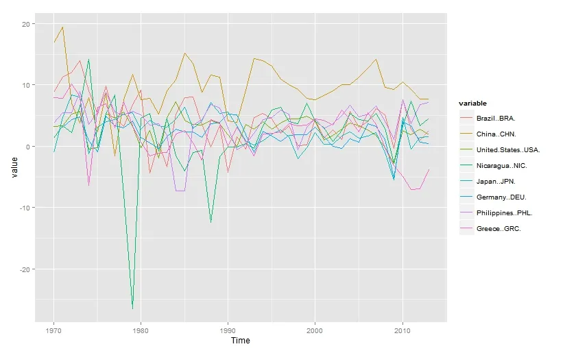
此外,我知道原始数据有两种呈现方式:宽格式或长格式。当我将数据保留在宽格式中时,我必须写很多才能完成工作(请参见下面的代码和图表),但当我将其转换为长格式时,ggplot会抱怨缺少值(请参见下面的代码和错误消息)。
这是我的最小代码示例:
此外,我知道原始数据有两种呈现方式:宽格式或长格式。当我将数据保留在宽格式中时,我必须写很多才能完成工作(请参见下面的代码和图表),但当我将其转换为长格式时,ggplot会抱怨缺少值(请参见下面的代码和错误消息)。
这是我的最小代码示例:
library(ggplot2) # for professional graphs
library(reshape2) # to convert data to long format
WDI_GDP_annual <- WDI[which(WDI$Series.Name=='GDP growth (annual %)'),] # extract data I need from dataset
WDI_GDP_annual_short <- WDI_GDP_annual[c(-1,-2,-4)] # wide format
test_data_long <- melt(WDI_GDP_annual_short, id = "Time") # long format
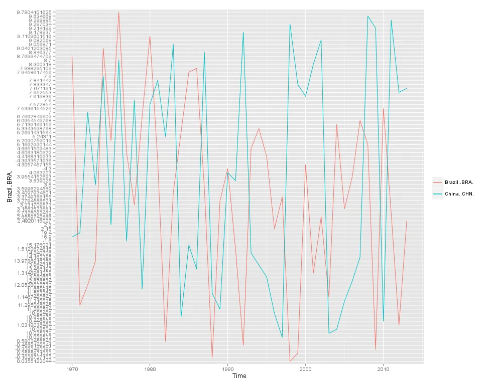
# (only successful) graph with wide format data
ggplot(WDI_GDP_annual_short, aes(x = Time)) +
geom_line(aes(y = Brazil..BRA., colour = "Brazil..BRA.", group=1)) +
geom_line(aes(y = China..CHN., colour = "China..CHN.", group=1)) +
theme(legend.title = element_blank())
# several graphs possibilities to plot data in long format and to have to write less (but all complain)
ggplot(data=test_data_long, aes(x = time, y = value, colour = variable)) +
geom_line() +
theme(legend.title = element_blank())
ggplot(data=test_data_long, aes(x = time, y = value, color = factor(variable))) +
geom_line() +
theme(legend.title = element_blank())
ggplot(test_data_long, aes(x = time, y = value, colour = variable, group = variable)) +
geom_line()
这是我目前唯一成功的图表,但我不想写太多(因为我希望在这个ggplot中再添加6个图表):