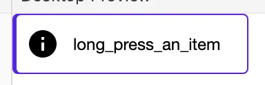
我使用了不同的颜色,但你可以看到结果:
我看到有三种方法可以实现这个效果:
- 您可以创建自定义的修饰符扩展方法,就像我在我的一个项目中所做的那样,使用 drawBehind 修饰符:
@Preview
@Composable
fun Preview() {
    Row(
        modifier = Modifier
            .someCustomOutline(
                outlineColor = MaterialTheme.colors.primary,
                surfaceColor = MaterialTheme.colors.surface,
                startOffset = 3.dp,
                outlineWidth = 1.dp,
                radius = 4.dp
            )
            .padding(10.dp),
        verticalAlignment = Alignment.CenterVertically
    ) {
        Image(
            imageVector = Icons.Default.Info,
            contentDescription = null,
        )
        Text(
            text = "long_press_an_item",
            fontSize = 12.sp,
            modifier = Modifier.padding(horizontal = 10.dp)
        )
    }
}

@Composable
fun Modifier.someCustomOutline(
    outlineColor: Color,
    surfaceColor: Color,
    startOffset: Dp,
    outlineWidth: Dp,
    radius: Dp = 1.dp
) = drawBehind {
    val startOffsetPx = startOffset.toPx()
    val outlineWidthPx = outlineWidth.toPx()
    val radiusPx = radius.toPx()
    drawRoundRect(
        color = outlineColor,
        topLeft = Offset(0f, 0f),
        size = size,
        cornerRadius = CornerRadius(radiusPx, radiusPx),
        style = Fill
    )
    drawRoundRect(
        color = surfaceColor,
        topLeft = Offset(startOffsetPx, outlineWidthPx),
        size = Size(size.width - startOffsetPx - outlineWidthPx, size.height - outlineWidthPx * 2),
        cornerRadius = CornerRadius(radiusPx - outlineWidthPx, radiusPx - outlineWidthPx),
        style = Fill
    )
}
使用方法:
这是一种非常糟糕的方法,但我会提到它以防万一。
- 您可以使用
Box包装您的元素并添加填充:
Box(
    modifier = Modifier
        .background(shape = RoundedCornerShape(4.dp), color = Purple3)
        .padding(start = 3.dp, top = 1.dp, end = 1.dp, bottom = 1.dp)
) {
    Row(
        modifier = Modifier
            .background(MaterialTheme.colors.surface, shape = RoundedCornerShape(3.dp))
            .padding(10.dp),
        verticalAlignment = Alignment.CenterVertically
    ) {
        Image(
            imageVector = painterResource(id = R.drawable.info),
            contentDescription = stringResource(id = R.string.long_press_an_item),
        )
        Text(
            text = stringResource(id = R.string.long_press_an_item),
            fontSize = 12.sp,
            fontFamily = FontFamily(Font(R.font.inter_medium)),
            color = Gray5,
            modifier = Modifier.padding(horizontal = 10.dp)
        )
    }
}
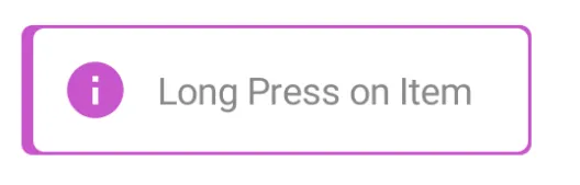
Box并将其修饰符与Row的修饰符合并。 - Maciej Ciemięga