我需要使用Jetpack Compose在按钮中添加带圆角的边框。
例如:
我需要使用Jetpack Compose在按钮中添加带圆角的边框。
例如:
OutlinedButton组件,在shape参数中应用RoundedCornerShape:OutlinedButton(
onClick = { },
border = BorderStroke(1.dp, Color.Red),
shape = RoundedCornerShape(50), // = 50% percent
// or shape = CircleShape
colors = ButtonDefaults.outlinedButtonColors(contentColor = Color.Red)
){
Text( text = "Save" )
}

它适用于M2和M3。
只需使用修饰符:
modifier = Modifier.border( width = 2.dp,
                            color = Color.Red,
                            shape = RoundedCornerShape(5.dp))
使用Clip修饰符,此外您还可以选择特定的角来使其弯曲。
modifier = Modifier.clip(RoundedCornerShape(15.dp, 15.dp, 0.dp, 0.dp))
clip修饰符。
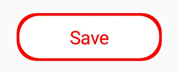
Modifier.clip(CircleShape)。这是您在该图片中看到的按钮:
Button(
       onClick = {},
       shape = RoundedCornerShape(23.dp),
       border = BorderStroke(3.dp, Color.Red),
       colors = ButtonDefaults.buttonColors(contentColor = Color.Red, backgroundColor = Color.White)
       ) {
            Text(
                text = "Save",
                fontSize = 17.sp,
                modifier = Modifier.padding(horizontal = 30.dp, vertical = 6.dp)
            )
        }
试试这个
               Box(
                    modifier = Modifier
                        .fillMaxWidth()
                        .height(40.dp)
                        .padding(4.dp)
                        .clip(RoundedCornerShape(8.dp))
                        .background(Color.White)
                        .border(
                            1.dp,
                            Color.RED,
                            shape = RoundedCornerShape(8.dp),
                        )

                ) {
                    Text(
                        modifier = Modifier.align(Alignment.Center),
                        text = "Save",
                        color = Color.RED,
                        style = MaterialTheme.typography.h6
                    )
                }
OutlinedButtonStyle默认拥有圆角。然而,你可以使用shape = RoundedCornerShape(x.dp)以覆盖默认值。 - Gabriele Mariottishape = RoundedCornerShape(50)的百分比值。我刚刚更新了答案。 - Gabriele MariottiOutlinedButton是一个带有outlinedBorder和自定义颜色的Button,其中backgroundColor= MaterialTheme.colors.surface和contentColor = MaterialTheme.colors.primary。 - Gabriele Mariotti