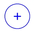
如何使用Jetpack Compose创建一个圆形的轮廓按钮

30

我正在尝试创建一个没有文本,只有图标在中心的圆形 OutlinedButton

    OutlinedButton(onClick = { /*TODO*/ },
        shape = CircleShape,
        border= BorderStroke(1.dp, Color.Blue)
    ) {
        Icon(Icons.Default.Add, contentDescription = "content description")
    }

最后的按钮呈椭圆形:

enter image description here

使用 
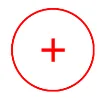
IconButton:
    IconButton(onClick = {  },
        modifier = Modifier
            .clip(CircleShape)
            .border(1.dp, Color.Red)
    ) {
        Icon(Icons.Default.Add, contentDescription = "content description",tint = Color.Red)
    }

这是最终结果:

enter image description here

1个回答

69
您可以使用OutlinedButton并移除contentPadding属性。
类似这样:
    OutlinedButton(onClick = { /*TODO*/ },
        modifier= Modifier.size(50.dp),  //avoid the oval shape
        shape = CircleShape,
        border= BorderStroke(1.dp, Color.Blue),
        contentPadding = PaddingValues(0.dp),  //avoid the little icon
        colors = ButtonDefaults.outlinedButtonColors(contentColor =  Color.Blue)
    ) {
         Icon(Icons.Default.Add, contentDescription = "content description")
    }

输入图像描述

或者使用 IconButton,删除 clip 修饰符并在 border 参数内使用 shape

    IconButton(onClick = {  },
          modifier = Modifier
              .then(Modifier.size(50.dp))
              .border(1.dp, Color.Red, shape = CircleShape)
              ) {
        Icon(Icons.Default.Add, contentDescription = "content description", tint = Color.Red)
    }

在这里输入图片描述


如何在轮廓按钮内设置图标大小?似乎不可能... - Alessandro Caliaro

网页内容由stack overflow 提供, 点击上面的
可以查看英文原文,
原文链接