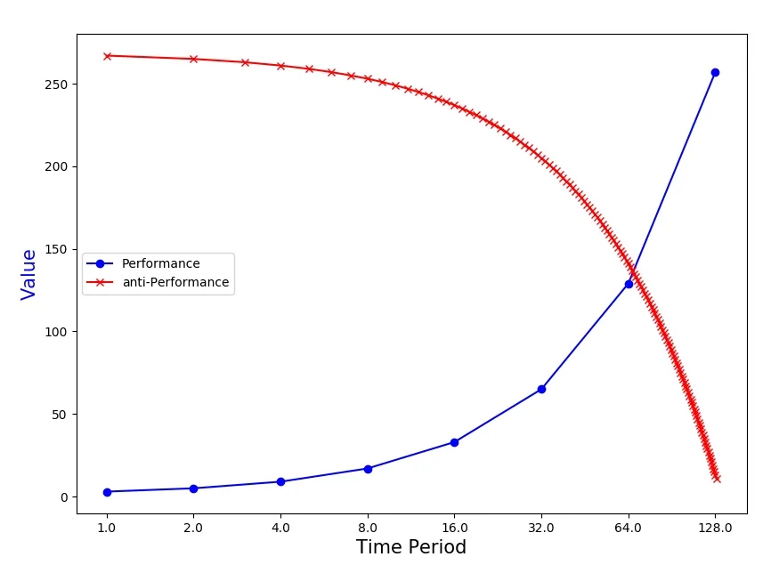
matplotlib - 如何绘制具有2^n不均匀间隔的图形?

3

我有两个列表,每个列表都有128个元素

x = [1,2,3,...,128]
y = [y1,y2,...,y128]

如何使用matplotlib绘制带有x轴的(x,y)图,其中x轴显示在此屏幕截图中?

为了复制图形,我(1)从原始列表创建了两个附加列表,并且(2)使用了set_xticklabels:

f, ax1 = plt.subplots(1,1,figsize=(16,7))  
x1 = [1, 2, 4, 8, 16, 32, 64, 128]  
y1 = [y[0],y[1],y[3],y[7],y[15],y[31],y[63],y[127]]  

line1 = ax1.plot(x1,y1,label="Performance",color='b',linestyle="-")  

ax1.set_xticklabels([0,1,2,4,8,16,32,64,128])  
ax1.set_xlabel('Time Period',fontsize=15)  
ax1.set_ylabel("Value",color='b',fontsize=15)

这种方法的问题在于只绘制了8对值,而忽略了120对值。

你尝试过使用xticksyticks吗? - Sohaib Farooqi
你用的是什么代码来获取这张图片的?使用类似 plt.plot(x, f(x)) 的函数不就足够了吗? - IMCoins
1
@ IMCoins使用plt.plot(x,f(x))是不够的,因为我的x轴间隔不均匀。我知道如何在图表上显示8个点,但我想要的是如何在仍然具有附加截图所示的x轴的情况下显示128个数据点。 - DT Ngo
2个回答

1
如果我的评论不够清晰,请问一下。 :)
from matplotlib import pyplot as plt

#   Instanciating my lists...
f = lambda x:x**2
x = [nb for nb in range(1, 129)]
y = [f(nb) for nb in x]

#   New values you want to plot, with linear spacing.
indexes_to_keep = [1, 2, 4, 8, 16, 32, 64, 128]
y_to_use = [y[nb - 1] for nb in indexes_to_keep]

#   First plot that shows the 128 points as a whole.
fig = plt.figure(figsize=(10, 5.4))
ax1 = fig.add_subplot(121)
ax1.plot(x, y)
ax1.set_title('Former values')

#   Second plot that shows only the indexes you wish to keep.
ax2 = fig.add_subplot(122)

#   my_ticks = [1, 2, 3, 4, 5, 6, 7]
#   meaning : my_ticks will be linear values.
my_ticks = [i for i in range(len(indexes_to_keep))]

#   We set the ticks we want to show, meaning : all our list
#   instead of some linear spacing matplotlib will show by default
ax2.set_xticks(my_ticks)

#   Then, we manually change the name of the X ticks.
ax2.set_xticklabels(indexes_to_keep)

#   We will then, plot the LINEAR x axis,
#   but with respect to the y-axis values pre-processed.
ax2.plot(my_ticks, y_to_use)
ax2.set_title('New selected values with linear spacing')

plt.show()

显示中...

Imgur


我有类似的需求,我的x轴项目是“datetime”对象。就像这个问题一样,我的日期没有定期分隔。起初我是这样做的:plt.bar(hours, frequency),其中hoursdatetime对象列表,这会绘制出左图中的值,并保持x刻度在规则间隔上。由于这种规则间距,大多数y值为0。我只是将x轴项目更改为字符串:plt.bar([h.isoformat() for h in hours], frequency),然后它只将那些存在于列表中的日期作为刻度,而不是进行任何规则间隔。这解决了我的问题。 - Vikas Prasad

0
你需要的是以2为底的对数刻度。 matplotlib 提供了对数刻度,你可以定义任何底数:
from matplotlib import pyplot as plt
from matplotlib.ticker import ScalarFormatter
#sample data
x = list(range(1, 130))
y = list(range(3, 260, 2)) 

f, ax1 = plt.subplots(1,1,figsize=(16,7))
x1 = [  1,   2,   4,   8,   16,   32,   64,   128]
y1 = [y[0],y[1],y[3],y[7],y[15],y[31],y[63],y[127]]
#just the points, where the ticks are
ax1.plot(x1, y1,"bo-", label = "Performance")
#all other points to contrast this
ax1.plot(x, [270 - i for i in y], "rx-", label = "anti-Performance")
#transform x axis into logarithmic scale with base 2
plt.xscale("log", basex = 2)
#modify x axis ticks from exponential representation to float 
ax1.get_xaxis().set_major_formatter(ScalarFormatter())
ax1.set_xlabel('Time Period',fontsize=15)
ax1.set_ylabel("Value",color='b',fontsize=15)
plt.legend()
plt.show()

输出:

enter image description here


网页内容由stack overflow 提供, 点击上面的
可以查看英文原文,
原文链接