如何使用CSS创建三重重叠边框?

3
我希望实现以下图片中的三重边框。 enter image description here 
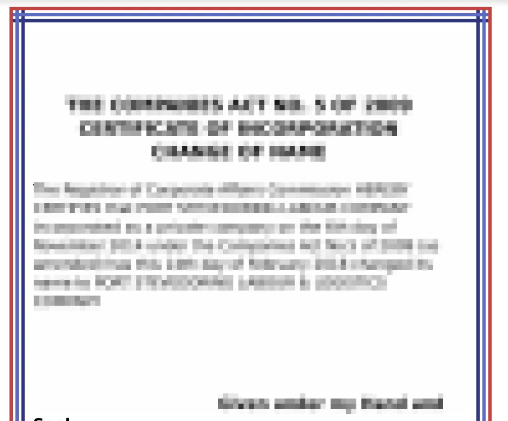
我尝试了下面的解决方法,但是角落看起来仍然不同。它们没有重叠。

.dtborder {
  position: relative;
  border: 5px solid red;
  height: 500px;
  width: 500px;
  background: #f8f8f8;
  padding: 30px;
}

.dtborder:before {
  content: "";
  position: absolute;
  top: 5px;
  bottom: 5px;
  left: 5px;
  right: 5px;
  border: 5px solid blue;
}

.dtborder:after {
  content: "";
  position: absolute;
  top: 15px;
  bottom: 15px;
  left: 15px;
  right: 15px;
  border: 5px solid green;
}
<div class="dtborder ">This text appears inside a double bracket bordered div where you can control the gap between border lines.</div>

看这个: https://jsfiddle.net/kajh1odv/1/

我会使用 border-image..可能更容易。 - Paulie_D
2个回答

8
您可以考虑使用可无限缩放的线性渐变 linear-gradient 来拥有任意数量的边框。虽然它看起来很复杂,但您会发现所有渐变都具有相同的大小 (4px),因此对于水平方向,应为 [100% 4px],对于垂直方向,应为 [4px 100%]。然后对于位置,我们每次删除/添加 8px (或任何值) 来偏移每个渐变之间的距离。

.dtborder {
  position: relative;
  height: 200px;
  width: 300px;
  background:
  /*First border*/
  linear-gradient(red,red) 0 100%/100%  4px, /*Bottom*/
  linear-gradient(red,red) 0 0/100%  4px ,   /*Top*/
  linear-gradient(red,red) 0 0/4px 100% ,    /*left*/
  linear-gradient(red,red) 100% 0/4px 100%,  /*right*/
  /*Second border*/
  linear-gradient(blue,blue) 0 calc(100% - 8px)/100%  4px ,
  linear-gradient(blue,blue) 0 8px/100%  4px,
  linear-gradient(blue,blue) 8px 0/4px 100%,
  linear-gradient(blue,blue) calc(100% - 8px) 0/4px 100%,
  /*third border*/
  linear-gradient(green,green) 0 calc(100% - 16px)/100%  4px,
  linear-gradient(green,green) 0 16px/100%  4px,
  linear-gradient(green,green) 16px 0/4px 100%,
  linear-gradient(green,green) calc(100% - 16px) 0/4px 100%;
  /*And so on ...*/
  background-repeat:no-repeat;
  padding: 30px;
}
<div class="dtborder ">This text appears inside a double bracket bordered div where you can control the gap between border lines.</div>

您可以这样优化代码:

.dtborder {
  position: relative;
  height: 200px;
  width: 300px;
  background:
  /*First border*/
  linear-gradient(red,red) 0 100%,
  linear-gradient(red,red) 0 0,
  linear-gradient(red,red) 0 0,
  linear-gradient(red,red) 100% 0,
  /*Second border*/
  linear-gradient(blue,blue) 0 calc(100% - 8px),
  linear-gradient(blue,blue) 8px 0,
  linear-gradient(blue,blue) 0 8px,
  linear-gradient(blue,blue) calc(100% - 8px) 0,
  /*third border*/
  linear-gradient(green,green) 0 calc(100% - 16px),
  linear-gradient(green,green) 16px 0,
  linear-gradient(green,green) 0 16px,
  linear-gradient(green,green) calc(100% - 16px) 0;
  /*And so on ...*/
  background-size:100% 4px,4px 100%;
  background-repeat:no-repeat;
  padding: 30px;
}
<div class="dtborder ">This text appears inside a double bracket bordered div where you can control the gap between border lines.</div>

还有像这样的:

.dtborder {
  position: relative;
  height: 200px;
  width: 300px;
  background:
  /*First border*/
  linear-gradient(red,red) left 0 bottom 0,
  linear-gradient(red,red) 0 0,
  linear-gradient(red,red) 0 0,
  linear-gradient(red,red) right 0 top 0,
  /*Second border*/
  linear-gradient(blue,blue) left 0 bottom 8px,
  linear-gradient(blue,blue) 8px 0,
  linear-gradient(blue,blue) 0 8px,
  linear-gradient(blue,blue) right 8px top 0,
  /*third border*/
  linear-gradient(green,green) left 0 bottom 16px,
  linear-gradient(green,green) 16px 0,
  linear-gradient(green,green) 0 16px,
  linear-gradient(green,green) right 16px top 0;
  /*And so on ...*/
  background-size:100% 4px,4px 100%;
  background-repeat:no-repeat;
  padding: 30px;
}
<div class="dtborder ">This text appears inside a double bracket bordered div where you can control the gap between border lines.</div>


@Paulie_D 当然可以 ;) 但我认为最好将它们分开,这样可以更容易地添加更多内容..通过这种分离,我们可以轻松处理颜色 :) - Temani Afif

1

我在这里尝试理解一些类似于您的图像的东西,希望这种方法对您有所帮助。谢谢。

.dtborder {
  position: relative;
  border: 5px solid red;
  height: 500px;
  width: 500px;
  background: #f8f8f8;
  padding: 30px;
  overflow: hidden;
}
.dtborder:before {
  content: "";
  position: absolute;
  top: 5px;
  left: 0;
  width: 100%;
  height: 5px;
  background: blue;
}

.dtborder:after {
  content: "";
  position: absolute;
  top: 0;
  left: 5px;
  width: 5px;
  height: 100%;
  background: blue;
}

.dtborder_two:before {
  content: "";
  position: absolute;
  top: 0;
  right: 5px;
  width: 5px;
  height: 100%;
  background: blue;
}
.dtborder_two:after {
  content: "";
  position: absolute;
  bottom: 5px;
  right: 0;
  width: 100%;
  height: 5px;
  background: blue;
}

.dtborder_three:before {
  content: "";
  position: absolute;
  top: 0;
  right: 15px;
  width: 5px;
  height: 100%;
  background: #36648b;
}
.dtborder_three:after {
  content: "";
  position: absolute;
  bottom: 15px;
  right: 0;
  width: 100%;
  height: 5px;
  background: #36648b;
}

.dtborder_four:before {
  content: "";
  position: absolute;
  top: 15px;
  left: 0;
  width: 100%;
  height: 5px;
  background: #36648b;
}

.dtborder_four:after {
  content: "";
  position: absolute;
  top: 0;
  left: 15px;
  width: 5px;
  height: 100%;
  background: #36648b;
}
<div class="dtborder">
  <div class="dtborder_two">
    <div class="dtborder_three">
      <div class="dtborder_four">
        This text appears inside a double bracket bordered div where you can control the gap between border lines.
      </div>
    </div>
  </div>
</div>


网页内容由stack overflow 提供, 点击上面的
可以查看英文原文,
原文链接