如何使用CSS创建实心彩虹边框?

8
如何使用CSS创建以下彩虹效果?
即具有实心彩虹颜色停止的顶部圆角边框(无需插入HTML)。

enter image description here

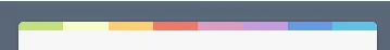
颜色值为:#c4e17f, #f7fdca, #fad071, #f0766b, #db9dbe, #c49cdf, #6599e2, #61c2e4

目前我尝试过的方法:

.container {
  background: #596678;
  width: 100%;
  height: 300px;
  display: flex;
  justify-content: center;
  align-items: center;
}

.top-round-rainbow {
  width: 50%;
  height: 50%;
  background: white;
  border-radius: 4px;
  
  background-image: repeating-linear-gradient(to right, #c4e17f 50px, #f7fdca 50px, #fad071 50px, #f0766b, #db9dbe, #c49cdf, #6599e2, #61c2e4);
}
<div class="container">
  <div class="top-round-rainbow">
  </div>
</div>


我猜你不想只是创建一张图片并将其设置为背景吧? - Samyok Nepal
如果您所说的图片是指图形,那么不可以。但是,如果您是指通过某些渐变或CSS背景图像,那么可以。 - abdul-wahab
6个回答

13

你并没有离正确答案太远。只需要使用相等的值设置颜色停止点以使它们变为纯色,并将背景大小设置为仅在顶部。

.container {
  background: #596678;
  width: 100%;
  height: 300px;
  display: flex;
  justify-content: center;
  align-items: center;
}

.top-round-rainbow {
  width: 400px;
  height: 50%;
  background: white;
  border-radius: 4px;
  
  background-image: repeating-linear-gradient(to right,
  #c4e17f 0px, #c4e17f 50px,
  #f7fdca 50px, #f7fdca 100px,
  #fad071 100px, #fad071 150px,
  #f0766b 150px, #f0766b 200px,
  #db9dbe 200px, #db9dbe 250px,
  #c49cdf 250px, #c49cdf 300px,
  #6599e2 300px, #6599e2 350px,
  #61c2e4 350px, #61c2e4 400px);
  background-size: 100% 10px;
  background-repeat:no-repeat;
}
<div class="container">
  <div class="top-round-rainbow">
  </div>
</div>


哇,这就是我一直在寻找的。 - abdul-wahab
1
如果有人想知道,这个的浏览器支持相当不错:https://caniuse.com/#feat=css-repeating-gradients - Mike

4
您可以使用带有线性渐变的after伪元素来创建边框。

.container {
  background: #596678;
  width: 100%;
  height: 300px;
  display: flex;
  justify-content: center;
  align-items: center;
}

.top-round-rainbow {
  width: 50%;
  height: 50px;
  background: white;
  border-radius: 4px;
  position: relative;
  overflow: hidden;
}

.top-round-rainbow:after {
  content: "";
  position: absolute;
  height: 10px;
  top: 0;
  width: 100%;
  left: 0;
  background: linear-gradient(to right, rgba(196,225,127,1) 0%, rgba(196,225,127,1) 12%, rgba(247,253,202,1) 12%, rgba(247,253,202,1) 25%, rgba(250,208,113,1) 25%, rgba(250,208,113,1) 39%, rgba(240,118,107,1) 39%, rgba(240,118,107,1) 52%, rgba(219,157,190,1) 52%, rgba(219,157,190,1) 65%, rgba(196,156,223,1) 65%, rgba(196,156,223,1) 78%, rgba(101,153,226,1) 78%, rgba(101,153,226,1) 89%, rgba(97,194,228,1) 89%, rgba(97,194,228,1) 100%);
}
<div class="container">
  <div class="top-round-rainbow"></div>
</div>


不错的方法 :) - Facundo Corradini

3
已经提供的解决方案是完美的,但我将添加另一种使用边框(border)和渐变(gradient)的方法。您还可以将渐变用作边框图像,但请注意,这无法与border-radius配合使用。

.container {
  background: #596678;
  width: 100%;
  height: 300px;
  display: flex;
  justify-content: center;
  align-items: center;
}

.top-round-rainbow {
  width: 400px;
  height: 50%;
  background: white;
  border-radius:5px;
  border-top: 10px solid;
  border-image:linear-gradient(90deg,
  #c4e17f 0 50px,
  #f7fdca 0 100px,
  #fad071 0 150px,
  #f0766b 0 200px,
  #db9dbe 0 250px,
  #c49cdf 0 300px,
  #6599e2 0 350px,
  #61c2e4 0 400px) 10;
}
<div class="container">
  <div class="top-round-rainbow">
  </div>
</div>


1
是的,你的补充仍然很有帮助。而且你要知道,我的第一直觉也是使用带边框的渐变。 - abdul-wahab
@abdul-wahab,当我看到你的代码时,我非常确定这一点;这就是为什么我添加了这个……因为处理线性渐变作为背景并调整大小使其像边框可能有些困难,但它仍然是一个很好的解决方案,只需注意填充,因为背景是内容的一部分,不像边框。 - Temani Afif

2

这个问题不一定需要伪元素或额外的层。

为了实现停止渐变,可以在交点处声明颜色。

要将背景图像高度限制为10px(或任意数),但保留100%的宽度,请使用background-size: 10px 100%

要避免渐变重复,请使用background-repeat: no-repeat;

.container {
  background: #596678;
  width: 100%;
  height: 300px;
  display: flex;
  justify-content: center;
  align-items: center;
}

.top-round-rainbow {
  width: 50%;
  height: 50%;
  border-radius: 4px;
  background: repeating-linear-gradient(to right, #c4e17f 0%, #c4e17f 12.5%, #f7fdca 12.5%, #f7fdca 25%, #fad071 25%, #fad071 37.5%, #f0766b 37.5%, #f0766b 50%, #db9dbe 50%, #db9dbe 62.5%, #c49cdf 62.5%, #c49cdf 75%, #6599e2 75%, #6599e2 87.5%, #61c2e4 87.5%, #61c2e4 100%), white;
  background-size: 100% 10px, 100% 100%;
  background-repeat: no-repeat;
}
<div class="container">
  <div class="top-round-rainbow">
  </div>
</div>


1

为了好玩,我们来介绍另一种方法。这次使用多个盒子阴影。

.container {
  background: #596678;
  width: 100%;
  height: 300px;
  display: flex;
  justify-content: center;
  align-items: center;
}

.top-round-rainbow {
  width: 400px;
  height: 50%;
  background: white;
  box-shadow:
/*white overlay*/
  0 -150px 0 -10px white inset,
/*"borders" that cover each other*/
  50px 0 0 0 #c4e17f inset,
  100px 0 0 0 #f7fdca inset,
  150px 0 0 0 #fad071 inset,
  200px 0 0 0 #f0766b inset,
  250px 0 0 0 #db9dbe inset,
  300px 0 0 0 #c49cdf inset,
  350px 0 0 0 #6599e2 inset,
  400px 0 0 0 #61c2e4 inset;
}
<div class="container">
  <div class="top-round-rainbow">
  </div>
</div>

并不是很实用,因为我们需要知道 div 的高度。但是它们可以通过边框半径实现一些很酷的效果。 :p

.container {
  background: #596678;
  width: 100%;
  height: 300px;
  display: flex;
  justify-content: center;
  align-items: center;
}

.top-round-rainbow {
  width: 400px;
  height: 50%;
  background: white;
  box-shadow:
/*white overlay*/
  0 -150px 0 -10px white inset,
/*"borders" that cover each other*/
  50px 0 0 0 #c4e17f inset,
  100px 0 0 0 #f7fdca inset,
  150px 0 0 0 #fad071 inset,
  200px 0 0 0 #f0766b inset,
  250px 0 0 0 #db9dbe inset,
  300px 0 0 0 #c49cdf inset,
  350px 0 0 0 #6599e2 inset,
  400px 0 0 0 #61c2e4 inset;
  
  border-radius:10px;
}
<div class="container">
  <div class="top-round-rainbow">
  </div>
</div>

并且最后但并非最不重要的,一个带有圆角边框和圆角盒阴影的样式,这使得它看起来非常棒。我认为这样更有意义。

.container {
  background: #596678;
  width: 100%;
  height: 300px;
  display: flex;
  justify-content: center;
  align-items: center;
}

.top-round-rainbow {
  width: 400px;
  height: 50%;
  background: white;
  border-radius:10px;
  position:relative;
  overflow:hidden;
  padding-top:10px;
}
  
.top-round-rainbow::before{
  content:"";
  position:absolute; top:0; left:0;
  height:10px; width:100%;
  box-shadow:
  50px 0 0 0 #c4e17f inset,
  100px 0 0 0 #f7fdca inset,
  150px 0 0 0 #fad071 inset,
  200px 0 0 0 #f0766b inset,
  250px 0 0 0 #db9dbe inset,
  300px 0 0 0 #c49cdf inset,
  350px 0 0 0 #6599e2 inset,
  400px 0 0 0 #61c2e4 inset;
  border-radius:10px 0 0 0;
}
<div class="container">
  <div class="top-round-rainbow">
  </div>
</div>


0

只需添加一个新图层,这将让您指定白色区域的大小。

希望这就是您要寻找的内容。如果需要,我们很乐意解释或提供更好的解决方案。

.container {
  background: #596678;
  width: 100%;
  height: 300px;
  display: flex;
  justify-content: center;
  align-items: center;
}

.top-round-rainbow {
  width: 50%;
  height: 50%;
  background: white;
  border-radius: 4px;
  border-top-width: 4px;
  background-image: repeating-linear-gradient(to right, #c4e17f 50px, #f7fdca 50px, #fad071 50px, #f0766b, #db9dbe, #c49cdf, #6599e2, #61c2e4);
}

.white-layer {
  width: 100%;
  height: 95%;
  margin-top: 5%;
  background: white;
  border-radius:  0 0 4px 4px;
  border-top-width: 4px;
}
<div class="container">
  <div class="top-round-rainbow">
    <div class="white-layer">
    </div>
  </div>
</div>


谢谢,但您能否进一步检查并查看是否可以使用实心停止点制作渐变,就像图像中那样。然后我们将看到如何避免添加额外的元素。 - abdul-wahab

网页内容由stack overflow 提供, 点击上面的
可以查看英文原文,
原文链接