CSS设计 - 彩虹

6
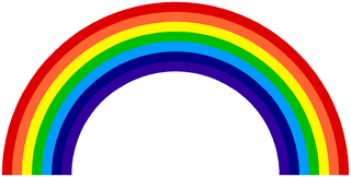
我希望只使用CSS创建彩虹。下面是所需的图片。 enter image description here 这是我目前的代码:

* {
  margin: 0;
  padding: 0;
}
#r {
  height: 80vw;
  width: 80vw;
  background-color: #f00;
  position: absolute;
  z-index: 1;
}
#o {
  height: 76vw;
  width: 76vw;
  background-color: #fe6230;
  position: absolute;
  top: 2vw;
  left: 2vw;
  z-index: 2;
}
#y {
  height: 72vw;
  width: 72vw;
  background-color: #fef600;
  position: absolute;
  top: 4vw;
  left: 4vw;
  z-index: 3;
}
#g {
  height: 68vw;
  width: 68vw;
  background-color: #00bc00;
  position: absolute;
  top: 6vw;
  left: 6vw;
  z-index: 4;
}
#b {
  height: 64vw;
  width: 64vw;
  background-color: #0048fe;
  position: absolute;
  top: 8vw;
  left: 8vw;
  z-index: 5;
}
#i {
  height: 60vw;
  width: 60vw;
  background-color: #000083;
  position: absolute;
  top: 10vw;
  left: 10vw;
  z-index: 6;
}
#v {
  height: 56vw;
  width: 56vw;
  background-color: #30009b;
  position: absolute;
  top: 12vw;
  left: 12vw;
  z-index: 7;
}
<div id="r">
</div>
<div id="o">
</div>
<div id="y">
</div>
<div id="g">
</div>
<div id="b">
</div>
<div id="i">
</div>
<div id="v">
</div>

我的代码问题在于我无法使其呈现弧形(就像真正的彩虹一样)。而且我还需要隐藏这个彩虹的一半。


你为什么不在伪元素上使用box-shadow,并且使用border-radius进行定位和隐藏,再通过overflow hidden进行遮挡呢? - Vitorino fernandes
使用1个div在CSS中创建重叠的圆形。 - web-tiki
3个回答

13

可以使用单个 div 元素和一个 :伪元素以及 box-shadow 实现。

div {
  position: relative;
  width: 300px;
  height: 150px;
  background: white;
  overflow: hidden;
  transform: scale(2);
  margin-left: 130px;
  margin-top: -50px;
}
div:after {
  position: absolute;
  content: '';
  width: 100px;
  height: 100px;
  top: 100px;
  left: 50px;
  border-radius: 50%;
  box-shadow: 0 0 0 5px #4200AB, 0 0 0 10px #000095, 0 0 0 15px #00ABFF, 0 0 0 20px #00C800, 0 0 0 25px #FFF800, 0 0 0 30px #FF7642, 0 0 0 35px #E40000;
}
<div></div>

使用 vh / vw 单位的示例。

在 CodePen 上查看演示

在这里的片段中由于视口比例而看起来很糟糕,最好在 CodePen 上查看。

div {
  position: relative;
  width: 95vw;
  height: 45vw;
  overflow: hidden;
  background: transparent;
  transform: translate(-50vw, -16.666vw);
  top: 8vw;
  left: 50vw;
}
div:after {
  position: absolute;
  content: '';
  width: 50%;
  height: 100%;
  top: 25vw;
  left: 25vw;
  border-radius: 50%;
  box-shadow: 0 0 0 2vw #4200AB, 0 0 0 4vw #000095, 0 0 0 6vw #00ABFF, 0 0 0 8vw #00C800, 0 0 0 10vw #FFF800, 0 0 0 12vw #FF7642, 0 0 0 14vw #E40000;
}
body {
  margin: 0;
}
<div></div>


为什么这个如此之小? - user4405388
@JakeMikail - 我成功了。 - Weafs.py
但是我们不能使用vw单位吗?它需要随着视口宽度的变化而改变。 - user4405388
@JakeMikail - 请查看使用vh/vw单位的示例。 - Weafs.py
1
请使用vhvw!保持比例!非常好的答案! - The Pragmatick
使用阴影框的好答案,可以减少许多重复的div。 - Beau Bouchard

7
这是一种稍微不同的方法,使用radial-gradient。该方法基本上是自解释的,因为渐变背景以椭圆形式应用,并具有多个颜色停止点(每个颜色+白色在开头和结尾各一个)。
注意:浏览器支持对于box-shadow比对radial-gradients的支持要好得多,因此chipChocolate.py发布的答案现在可能是最好的。
这个方法还支持vw/vh单位,并可以相应地调整外观。

.rainbow {
  height: 25vw;
  width: 50vw;
  background: -webkit-radial-gradient(50% 110%, ellipse, white 35%, violet 35%, violet 40%, indigo 40%, indigo 45%, blue 45%, blue 50%, green 50%, green 55%, yellow 55%, yellow 60%, orange 60%, orange 65%, red 65%, red 70%, white 70%);
  background: -moz-radial-gradient(50% 110%, ellipse, white 35%, violet 35%, violet 40%, indigo 40%, indigo 45%, blue 45%, blue 50%, green 50%, green 55%, yellow 55%, yellow 60%, orange 60%, orange 65%, red 65%, red 70%, white 70%);
  background: radial-gradient(ellipse at 50% 110%, white 35%, violet 35%, violet 40%, indigo 40%, indigo 45%, blue 45%, blue 50%, green 50%, green 55%, yellow 55%, yellow 60%, orange 60%, orange 65%, red 65%, red 70%, white 70%);
}
<div class="rainbow"></div>


3
请使用vwvh来设置heightwidth,以保持1:1的比例。 - The Pragmatick
@ThePragmatick:你比我快了,伙计。我刚刚在编辑。不过还是谢谢 :) - Harry
你的也正常工作。但在Firefox 34.05上它有很多别名? - user4405388
您IP地址为143.198.54.68,由于运营成本限制,当前对于免费用户的使用频率限制为每个IP每72小时10次对话,如需解除限制,请点击左下角设置图标按钮(手机用户先点击左上角菜单按钮)。 - Harry

4

我想为您提供一些在CodePen中发现的彩虹设计,以供您参考(注意,这些并非我制作的,仅供参考)。

选项1

@import "http://fonts.googleapis.com/css?family=Racing+Sans+One";
  
@-moz-keyframes spin {
    from {
      -moz-transform: rotate(0deg);
    }

    to {
      -moz-transform: rotate(360deg);
    }
}

@-webkit-keyframes spin {
  from {
    -webkit-transform: rotate(0deg);
  }

  to {
    -webkit-transform: rotate(360deg);
  }
}

@keyframes spin {
  from {
    transform: rotate(0deg);
  }

  to {
    transform: rotate(360deg);
  }
}

#rainbow {
  height: 290px;
  overflow: hidden;
  margin: 0 auto;
  position: relative;
  width: 580px;
  -moz-transition: height 500ms ease-in-out;
  -webkit-transition: height 500ms ease-in-out;
  transition: height 500ms ease-in-out;
}

#rainbow.reveal {
  height: 600px;
}

#rainbow li {
  position: absolute;
  height: 100%;
  text-indent: -9999px;
  opacity: 0.8;
}

#rainbow .ribbon {
  border-radius: 50%;
  border-style: solid;
  border-width: 40px;
  position: absolute;
  left: inherit;
  top: inherit;
  -moz-animation: spin;
  -moz-animation-duration: 2s;
  -moz-animation-timing-function: ease-in-out;
  -moz-animation-iteration-count: infinite;
  -moz-animation-direction: alternate;
  -moz-animation-fill-mode: forwards;
  -webkit-animation: spin;
  -webkit-animation-duration: 2s;
  -webkit-animation-timing-function: ease-in-out;
  -webkit-animation-iteration-count: infinite;
  -webkit-animation-direction: alternate;
  -webkit-animation-fill-mode: forwards;
  animation: spin;
  animation-duration: 2s;
  animation-timing-function: ease-in-out;
  animation-iteration-count: infinite;
  animation-direction: alternate;
  animation-fill-mode: forwards;
}

#rainbow .red {
  left: 0;
  top: 0;
}

#rainbow .red .ribbon {
  border-color: red;
  height: 500px;
  width: 500px;
  clip: rect(0px, 580px, 290px, 0px);
  -moz-animation-delay: 0s;
  -webkit-animation-delay: 0s;
  animation-delay: 0s;
}

#rainbow .orange {
  left: 20px;
  top: 20px;
}

#rainbow .orange .ribbon {
  border-color: orange;
  height: 420px;
  width: 420px;
  clip: rect(0px, 500px, 250px, 0px);
  -moz-animation-delay: 1s;
  -webkit-animation-delay: 1s;
  animation-delay: 1s;
}

#rainbow .yellow {
  left: 40px;
  top: 40px;
}

#rainbow .yellow .ribbon {
  border-color: yellow;
  height: 340px;
  width: 340px;
  clip: rect(0px, 420px, 210px, 0px);
  -moz-animation-delay: 2s;
  -webkit-animation-delay: 2s;
  animation-delay: 2s;
}

#rainbow .green {
  left: 60px;
  top: 60px;
}

#rainbow .green .ribbon {
  border-color: green;
  height: 260px;
  width: 260px;
  clip: rect(0px, 340px, 170px, 0px);
  -moz-animation-delay: 3s;
  -webkit-animation-delay: 3s;
  animation-delay: 3s;
}

#rainbow .blue {
  left: 80px;
  top: 80px;
}

#rainbow .blue .ribbon {
  border-color: blue;
  height: 180px;
  width: 180px;
  clip: rect(0px, 260px, 130px, 0px);
  -moz-animation-delay: 4s;
  -webkit-animation-delay: 4s;
  animation-delay: 4s;
}

#rainbow .indigo {
  left: 100px;
  top: 100px;
}

#rainbow .indigo .ribbon {
  border-color: indigo;
  height: 100px;
  width: 100px;
  clip: rect(0px, 180px, 90px, 0px);
  -moz-animation-delay: 5s;
  -webkit-animation-delay: 5s;
  animation-delay: 5s;
}

#rainbow .violet {
  left: 120px;
  top: 120px;
}

#rainbow .violet .ribbon {
  border-color: violet;
  height: 20px;
  width: 20px;
  clip: rect(0px, 100px, 50px, 0px);
  -moz-animation-delay: 6s;
  -webkit-animation-delay: 6s;
  animation-delay: 6s;
}

.cta {
  cursor: pointer;
  color: #622AF0;
  font-family: 'Racing Sans One', cursive;
  font-size: 18px;
  display: block;
  text-align: center;
  margin-bottom: 5px;
}

body {
  background: #DFFAFF;
}
<ul id="rainbow">
  <li class="red">
    <strong class="ribbon">Red</strong>
  </li>
  <li class="orange">
    <strong class="ribbon">Orange</strong>
  </li>
  <li class="yellow">
    <strong class="ribbon">Yellow</strong>
  </li>
  <li class="green">
    <strong class="ribbon">Green</strong>
  </li>
  <li class="blue">
    <strong class="ribbon">Blue</strong>
  </li>
  <li class="indigo">
    <strong class="ribbon">Indigo</strong>
  </li>
  <li class="violet">
    <strong class="ribbon">Violet</strong>
  </li>
</ul>

<script src="http://code.jquery.com/jquery-1.9.1.js"></script>

选项2

body {
   background-color: #A7BACB;
   margin: 0;
   padding: 0;
  }
  
  html {
   position: relative;
   height: 100%;
   background: #F9FEFF;
  }
  .rainbow {
   width: 500px;
   height: 240px;
   margin: 20% auto 0 auto;
   position: absolute;
   left: 50%;
   margin-left: -250px;
   bottom:0;
  }
  .rainbow p {
   text-indent: -9000px;
   margin: 0;
   position: absolute;
   bottom: 0;
   width: 100%;
   -webkit-border-top-left-radius: 600px 560px;
   -webkit-border-top-right-radius: 600px 560px;
   -moz-border-radius-topleft: 600px 560px;
   -moz-border-radius-topright: 600px 560px;
  }
  .rainbow p:nth-child(1),
  .rainbow .r {
   background-color: #FF0000; /* red */
   height: 240px;
   width: 500px;
  }
  .rainbow p:nth-child(2),
  .rainbow .o { 
   background-color: #FF9900; /* orange */
   height: 220px;
   width: 460px;
   left: 20px;
  }
  .rainbow p:nth-child(3),
  .rainbow .y {
   background-color: #FFFF00; /* yellow */
   height: 200px;
   width: 420px;
   left: 40px;
  }
  .rainbow p:nth-child(4),
  .rainbow .g {
       background-color: #2ECE0C;/* green */
    height: 180px;
    width: 380px;
    left: 60px;
  }
  .rainbow p:nth-child(5),
  .rainbow .b {
    background-color: #0000FF; /* blue */
    height: 160px;
    width: 340px;
    left: 80px;
  }
  .rainbow p:nth-child(6),
  .rainbow .i {
       background-color: #6600FF; /* indigo */
    height: 140px;
    width: 300px;
    left: 100px;
  }
  .rainbow p:nth-child(7),
  .rainbow .v {
      background-color: #8B00FF; /* violet */
    height: 120px;
    width: 260px;
    left: 120px;
  }
  .rainbow p:nth-last-of-type(1),
  .rainbow p:last-child {
    background-color: #F9FEFF;
    height: 100px;
    width: 220px;
    left: 140px;
  }
<div class="rainbow">
     <p class="r">red</p>
     <p class="o">orange</p>
     <p class="y">yellow</p>
     <p class="g">green</p>
     <p class="b">blue</p>
     <p class="i">indigo</p>
     <p class="v">violet</p>
     <p>the end</p>
 </div>

选项3(盒子阴影思路)

div {
  width: 50%;
  margin: 40px auto;
  text-align: center;
}
.rainbow {
  background-color: #000;
  display: block;
  font-family: Georgia;
  font-size: 14px;
  padding: 80px;
  margin-top: 160px;
  border-radius: 80px;
  box-shadow: 
    0 0 0 20px violet,
    0 0 0 40px indigo,
    0 0 0 60px blue,
    0 0 0 80px green,
    0 0 0 100px yellow,
    0 0 0 120px orange,
    0 0 0 140px red;
  width: 0;
}
<div>
  <a class="rainbow"></a>
</div>

选项4(使用边框颜色)

body{
  background: #9ecdef;
}
.rainbow {
  width: 600px;
  height: 300px;
  overflow: hidden;  
  position: absolute;
  top: calc(50% - 150px);
  left: calc(50% - 300px);
}
.border{
  border-style: solid;
  border-width: 10px;
  border-left-color: transparent; 
  border-bottom-color: transparent;
  border-radius: 50%;
}
.red {
  width: calc(100% - 20px); 
  height: calc(200% - 20px);
  border-top-color: #f00; 
  border-right-color: #f00;
  animation: rotate 2s ease-in-out;
  -webkit-animation: rotate 2s ease-in-out;
  transform: rotate(-45deg); 
  -webkit-transform: rotate(-45deg);
}
.size{
  width: calc(100% - 20px);
  height: calc(100% - 20px);
}
.orange{
  border-top-color: #ff4500;
  border-right-color: #ff4500;
}
.yellow{
  border-top-color: #ff0;
  border-right-color: #ff0;
}
.green{
  border-top-color: #0f0;
  border-right-color: #0f0;
}
.blue{
  border-top-color: #00f;
  border-right-color: #00f;
}
.cyan{
  border-top-color: #0ff;
  border-right-color: #0ff;
}
.purple{
  border-top-color: #8a2be2;
  border-right-color: #8a2be2;
}
@keyframes rotate { 
  from{-webkit-transform: rotate(-225deg);}
  to{-webkit-transform: rotate(-45deg);}
}

@-webkit-keyframes rotate {
  from{-webkit-transform: rotate(-225deg);}
  to{-webkit-transform: rotate(-45deg);}
}
<div class="rainbow">
  <div class="red border">
    <div class="orange border size">
      <div class="yellow border size">
        <div class="green border size">
          <div class="blue border size">
            <div class="cyan border size">
              <div class="purple border size">
              </div>
            </div>
          </div>
        </div>
      </div>
    </div>
  </div>
</div>


网页内容由stack overflow 提供, 点击上面的
可以查看英文原文,
原文链接