如何用CSS实现这个设计效果是最佳方法?
还有这个:

谢谢您的帮助!
如何用CSS实现这个设计效果是最佳方法?
还有这个:
谢谢您的帮助!
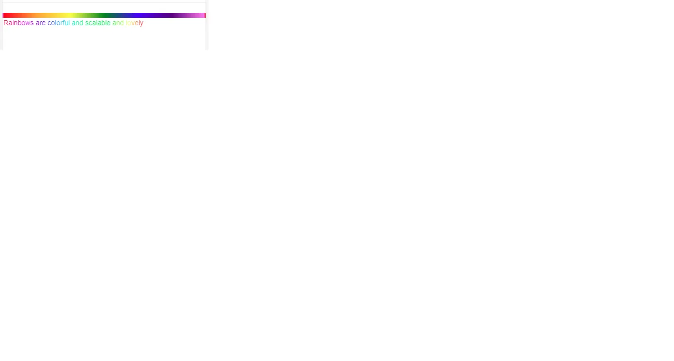
以下是如何创建基本的彩虹线性渐变效果(尚未与文本集成):
#grad1 {
    height: 200px;
    background: red; /* For browsers that do not support gradients */
    background: -webkit-linear-gradient(left, orange , yellow, green, cyan, blue, violet); /* For Safari 5.1 to 6.0 */
    background: -o-linear-gradient(right, orange, yellow, green, cyan, blue, violet); /* For Opera 11.1 to 12.0 */
    background: -moz-linear-gradient(right, orange, yellow, green, cyan, blue, violet); /* For Firefox 3.6 to 15 */
    background: linear-gradient(to right, orange , yellow, green, cyan, blue, violet); /* Standard syntax (must be last) */
}<div id="grad1"></div>或者,您可以使用渐变生成器之一(我更喜欢这个)。
以下是文本集成:
#grad1 {
    background: red;
    background: -webkit-linear-gradient(left, orange , yellow, green, cyan, blue, violet);
    background: -o-linear-gradient(right, orange, yellow, green, cyan, blue, violet);
    background: -moz-linear-gradient(right, orange, yellow, green, cyan, blue, violet);
    background: linear-gradient(to right, orange , yellow, green, cyan, blue, violet);
    -webkit-background-clip: text;
    -webkit-text-fill-color: transparent;
    font-size: 20vw;
}<h1 id="grad1">Fake Text</h1>这里的主要部分是background-clip和text-fill-color属性,但请注意,并非所有浏览器都支持它。要了解有关浏览器兼容性的更多信息,请查看这些页面底部具有相同名称的部分:
P.S. 绘制一条线非常简单,您只需要使用渐变并定义一些样式,使该块成为正确的形状,例如:
#grad1 {
    background: red; /* For browsers that do not support gradients */
    background: -webkit-linear-gradient(left, orange , yellow, green, cyan, blue, violet); /* For Safari 5.1 to 6.0 */
    background: -o-linear-gradient(right, orange, yellow, green, cyan, blue, violet); /* For Opera 11.1 to 12.0 */
    background: -moz-linear-gradient(right, orange, yellow, green, cyan, blue, violet); /* For Firefox 3.6 to 15 */
    background: linear-gradient(to right, orange , yellow, green, cyan, blue, violet); /* Standard syntax (must be last) */
}

.line {
    height: 6px;
    border-radius: 4px;
}<div id="grad1" class="line"></div>如果你需要对文本使用同样的渐变效果,可以尝试使用以下代码:
    h1 {
  background: linear-gradient(to right, orange , yellow, green, cyan, blue, violet);
  -webkit-background-clip: text;
  -webkit-text-fill-color: transparent;
  font-size: 60px;
  line-height: 60px;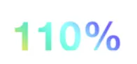
}<h1>100% Unicorn</h1>但是 Internet Explorer 不支持 text-fill-color 属性。因此,最好使用透明的 PNG 或 SVG 前景。
在CSS文件中:
.rainbow {
  background-image: -webkit-gradient( linear, left top, right top, color-stop(0, #f22), color-stop(0.15, #f2f), color-stop(0.3, #22f), color-stop(0.45, #2ff), color-stop(0.6, #2f2),color-stop(0.75, #2f2), color-stop(0.9, #ff2), color-stop(1, #f22) );

background-image: gradient( linear, left top, right top, color-stop(0, #f22), color-stop(0.15, #f2f), color-stop(0.3, #22f), color-stop(0.45, #2ff), color-stop(0.6, #2f2),color-stop(0.75, #2f2), color-stop(0.9, #ff2), color-stop(1, #f22) );

color:transparent;

border: 2px dotted white;

-webkit-background-clip: text;

background-clip: text;

}
结果
精确的HSL值
.rainbow{
    background: linear-gradient(to right, rgb(255, 0, 0), rgb(255, 191, 0), rgb(128, 255, 0), rgb(0, 255, 64), rgb(0, 255, 255), rgb(0, 64, 255), rgb(128, 0, 255), rgb(255, 0, 191), rgb(255, 0, 0));
}
橙色和黄色的默认值在白色背景上不易阅读,因此这是改进后的版本:

CSS:
 background-image: linear-gradient(to left, violet, indigo, blue, green, #d2d20f, #eb9c0b, red);
-webkit-background-clip: text;
-webkit-text-fill-color: transparent;
React JSX:
<div
  style={{
    backgroundImage:
      "linear-gradient(to left, violet, indigo, blue, green, #d2d20f, #eb9c0b, red)",
    WebkitBackgroundClip: "text",
    WebkitTextFillColor: "transparent",
  }}
>
  That's all, folks!
</div>;