使用CSS反射文本并添加渐变效果

4
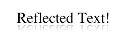
我需要使用CSS反射文本并为其添加渐变效果。这里是一个我想要的示例。但是,我不想使用带有alpha透明度的淡出png图像,因为背景已经设置好了enter image description here https://jsfiddle.net/9318Ltkp/

.slogan {
  font-size: 30px;
  line-height: 121px;
  position: relative;
  float: right;
  margin-right: 115px;
  text-transform: uppercase;
  color: #f00;
}
.slogan::after {
  position: absolute;
  z-index: 1;
  right: 0;
  bottom: -26px;
  left: 0;
  display: block;
  content: 'comming soon';
  transform: scaleY(-1);
  opacity: .5;
}
<div class="slogan">comming soon</div>

2个回答

4

注意:我找不到任何方法可以在各种浏览器中使其正常工作,我想可能根本没有办法。如果您只需要支持基于WebKit的浏览器,则可以使用以下方法。

在这种方法中,将从透明到半透明黑色的渐变分配为伪元素的背景(产生反射效果),然后使用WebKit的-webkit-background-clip将背景裁剪为仅在文本边界内。

不幸的是,其他浏览器没有等效的属性。在其他浏览器中,我们可以将线性渐变背景分配给元素,将文本颜色设置为透明,但仅限于此。没有办法将背景裁剪为文本内部。它将应用于整个元素。

body {
  background-image: radial-gradient(circle, #3F9CBA 0%, #153346 100%);
}
div {
  position: relative;
  display: inline-block;
  font-size: 24px;
}
div:after,
div:before {
  position: absolute;
  width: 100%;
  height: 100%;
  bottom: 0px;
  left: 0px;
  transform: scaleY(-1);
  transform-origin: bottom;
}
div:after {
  content: attr(data-content);
  background: linear-gradient(to bottom, rgba(0, 0, 0, 0) 30%, rgba(0, 0, 0, 0.5) 80%);
  -webkit-background-clip: text;
  -webkit-text-fill-color: transparent;
}
<script src="https://cdnjs.cloudflare.com/ajax/libs/prefixfree/1.0.7/prefixfree.min.js"></script>
<div data-content='Reflected Text'>Reflected Text</div>


跨浏览器解决方案:

这是我找到的最佳跨浏览器解决方案,但它涉及在父元素上设置overflow: hidden来强制切断反射文本,而不是优雅地渐变。

body {
  background-image: radial-gradient(circle, #3F9CBA 0%, #153346 100%);
}
div {
  position: relative;
  display: inline-block;
  font-size: 24px;
  height: 1em;
  padding-bottom: .5em;
  overflow: hidden;
}
div:after {
  position: absolute;
  content: attr(data-content);
  width: 100%;
  height: 1em;
  top: 0px;
  left: 0px;
  transform: scaleY(-1);
  transform-origin: bottom;
  opacity: 0.3;
}
<script src="https://cdnjs.cloudflare.com/ajax/libs/prefixfree/1.0.7/prefixfree.min.js"></script>
<div data-content='Reflected Text'>Reflected Text</div>


Translated Answer:

您可以通过在:after伪元素上叠加具有渐变背景的:before伪元素来实现此目的。

这种方法只适用于背景是纯色(任何纯色)的情况。只需要将渐变中的颜色更改为匹配它即可。然而,当与图像或渐变背景一起使用时,这种方法不起作用。

div {
  position: relative;
  display: inline-block;
  font-size: 24px;
}
div:after,
div:before {
  position: absolute;
  width: 100%;
  height: 100%;
  bottom: 0px;
  left: 0px;
  transform: scaleY(-1);
  transform-origin: bottom;
}
div:after {
  content: attr(data-content);
}
div:before {
  content: '';
  background: linear-gradient(to bottom, rgba(0, 128, 0, 1) 30%, rgba(0, 128, 0, 0.7) 70%);
  z-index: 2;
}
body {
  background: rgb(0, 128, 0);
<script src="https://cdnjs.cloudflare.com/ajax/libs/prefixfree/1.0.7/prefixfree.min.js"></script>
<div data-content='Reflected Text'>Reflected Text</div>


@user3351236:背景是纯色还是图像/渐变?如果是纯色,这种方法仍然有效。这里是您的fiddle的更新 - Harry
不,这是一张图片 ((( - user3351236
您可能希望在编辑完成之前删除该答案。 - Paulie_D

0

对于渐变,我已经设计过了,请在下面的代码中查找: 对于反射,我认为使用svg将其旋转180度并从上到下透明到白色的渐变也很容易。如果这会导致其他影响,请使用剪辑svg,这将有助于您。

<html>
<body>

<svg height="150" width="400">
  <defs>
<linearGradient id="grad2" x1="0%" y1="0%" x2="100%" y2="0%">
<stop offset="0%" style="stop-color:rgb(255,0,0);stop-opacity:1" />
      <stop offset="100%" style="stop-color:rgb(255,255,0);stop-opacity:1" />
          </linearGradient>
  </defs>

  <text fill="url('#grad2')" font-size="45" font-family="Verdana" x="150" y="86">SVG</text>
  Sorry, your browser does not support inline SVG.
</svg>


</body>

</html>

网页内容由stack overflow 提供, 点击上面的
可以查看英文原文,
原文链接