使用CSS为阿拉伯文本添加轮廓效果

3

我希望为阿拉伯文本添加轮廓。一个可能的解决方案是使用text-stroke:

body {
  background-color: pink;
  }
h1 {
  color: white;
  text-align: center;
  -webkit-text-stroke: 1px black;
  text-stroke: 1px black;
}
<h1>Experiment</h1>
<h1>تجربة</h1>

这是我的渲染效果:

enter image description here

正如您所看到的,这在英语中效果很好,但在阿拉伯语中却不行。在阿拉伯语中,字母经常连接在一起,轮廓线不应出现在连接的字母之间。引用W3的话:
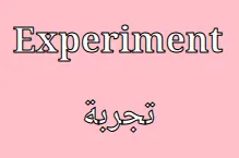
“当添加文本边框时,仅向每个字形添加边框无法为阿拉伯文字体提供正确的结果。通过将所有连接的字母的字形路径统一为一个大路径,并在该路径周围添加边框,可以避免将连接字母与其相邻的连接字母分开。”

enter image description here

如何在CSS中实现正确的文本边框?

https://jsfiddle.net/xmarLb6h/? - Temani Afif
@TemaniAfif 看起来不错,发表答案吧!由于某种原因,当我尝试使用 text-shadow 时,我得到了错误的文本边框。如果您能在答案中解释一下您是如何确保 text-shadow 不会引起这个问题的,那就太好了。 - Flimm
1个回答

5

叠加多个带有 1px 模糊的 text-shadow,以模拟实心描边。添加的阴影越多,视觉效果越接近实心。

body {
  background-color: pink;
}

h1 {
  color: white;
  text-align: center;
  text-shadow: 
   0 0 1px #000, 
   0 0 1px #000, 
   0 0 1px #000, 
   0 0 1px #000, 
   0 0 1px #000, 
   0 0 1px #000, 
   0 0 1px #000, 
   0 0 1px #000, 
   0 0 1px #000, 
   0 0 1px #000, 
   0 0 1px #000, 
   0 0 1px #000, 
   0 0 1px #000;
}
<h1>Experiment</h1>
<h1>تجربة</h1>

它也适用于任何模糊值:

body {
  background-color: pink;
}

h1 {
  --s:2px;
  color: white;
  text-align: center;
  text-shadow: 
   0 0 var(--s) #000, 
   0 0 var(--s) #000, 
   0 0 var(--s) #000, 
   0 0 var(--s) #000, 
   0 0 var(--s) #000, 
   0 0 var(--s) #000, 
   0 0 var(--s) #000, 
   0 0 var(--s) #000, 
   0 0 var(--s) #000, 
   0 0 var(--s) #000, 
   0 0 var(--s) #000, 
   0 0 var(--s) #000, 
   0 0 var(--s) #000;
}
<h1>Experiment</h1>
<h1>تجربة</h1>


我想告诉您,我终于通过这段代码解决了问题!代码链接为: https://jsfiddle.net/qdyf8c3L/2/ - Zahraa Maher

网页内容由stack overflow 提供, 点击上面的
可以查看英文原文,
原文链接