Matplotlib对于双轴loglog图的刻度/标签显示有问题

3
我正在使用matplotlib创建对数-对数图。如下图所示,缺省刻度的选择非常糟糕(充其量),右y轴甚至根本没有刻度(在线性情况下有)而且两个x轴只有一个刻度。 loglog plot with bad default ticks 有没有一种方法可以获得合理数量的带标签的刻度,而不必为每张图手动指定它们
编辑:确切的代码太长了,但这里是问题的简短示例:
x = linspace(4, 18, 20)
y = 1 / (x ** 4)
fig = figure()
ax = fig.add_axes([.1, .1, .8, .8])
ax.loglog(x, y)
ax.set_xlim([4, 18])
ax2 = ax.twiny()
ax2.set_xlim([4 / 3., 18 / 3.])
ax2.set_xscale('log')
show()

默认设置仅在十年间打勾(而您不到十年时间)。您能否展示一下生成该内容所使用的代码? - tacaswell
可能是使用对数刻度设置刻度的重复问题。 - tacaswell
看得更仔细一些,似乎你正在使用哈特里/玻尔轴进行所有的绘图,然后使用“twinx”和“twiny”来获取电子伏特和埃轴,但从未在它们上面绘制任何内容。你需要明确设置它们的限制,以匹配其他轴上的限制(正确转换)。 - tacaswell
@tcaswell:你说得对,我从来没有将任何东西绘制到它们上面,但我已经设置了限制,并且我认为它们是正确的。我会看一下可能的重复内容。 - Mark
转换为电子伏特并不能隐藏7个数量级。 - tacaswell
显示剩余4条评论
2个回答

1

我一直在处理类似于您展示的问题(轴范围内只有一个主要刻度)。没有一个matplotlib刻度格式化程序能够令我满意,因此我使用matplotlib.ticker.FuncFormatter来实现我想要的效果。我还没有测试过双轴,但我的感觉是它应该可以正常工作。

import matplotlib.pyplot as plt
from matplotlib import ticker
import numpy as np

#@Mark: thanks for the suggestion :D
mi, ma, conv = 4, 8, 1./3.
x = np.linspace(mi, ma, 20)
y = 1 / (x ** 4)

fig, ax = plt.subplots()

ax.plot(x, y)  # plot the lines
ax.set_xscale('log') #convert to log
ax.set_yscale('log')

ax.set_xlim([0.2, 1.8])  #large enough, but should show only 1 tick

def ticks_format(value, index):
    """
    This function decompose value in base*10^{exp} and return a latex string.
    If 0<=value<99: return the value as it is.
    if 0.1<value<0: returns as it is rounded to the first decimal
    otherwise returns $base*10^{exp}$
    I've designed the function to be use with values for which the decomposition
    returns integers
    """
    exp = np.floor(np.log10(value))
    base = value/10**exp
    if exp == 0 or exp == 1:
        return '${0:d}$'.format(int(value))
    if exp == -1:
        return '${0:.1f}$'.format(value)
    else:
        return '${0:d}\\times10^{{{1:d}}}$'.format(int(base), int(exp))

# here specify which minor ticks per decate you want
# likely all of them give you a too crowed axis
subs = [1., 3., 6.]
# set the minor locators
ax.xaxis.set_minor_locator(ticker.LogLocator(subs=subs))
ax.yaxis.set_minor_locator(ticker.LogLocator(subs=subs))
# remove the tick labels for the major ticks: 
# if not done they will be printed with the custom ones (you don't want it)
# plus you want to remove them to avoid font missmatch: the above function 
# returns latex string, and I don't know how matplotlib does exponents in labels
ax.xaxis.set_major_formatter(ticker.NullFormatter())
ax.yaxis.set_major_formatter(ticker.NullFormatter())
# set the desired minor tick labels using the above function
ax.xaxis.set_minor_formatter(ticker.FuncFormatter(ticks_format))
ax.yaxis.set_minor_formatter(ticker.FuncFormatter(ticks_format))

我得到的图形如下所示:enter image description here
当然,您可以为x轴和y轴设置不同的次要定位器,并且您可以将从ticks_format到结尾的所有内容包装在接受一个轴实例ax和输入参数subssubsxsubsy的函数中。
希望这可以帮助您。

它在接近0的一个数量级变化范围内表现良好,我认为这是一个常见的问题区域。如果您需要在较小的域上使用对数刻度,次要刻度不会有太大帮助,但这可能是例外情况...此外,格式很酷! - Mark

0
最终,在这里和其他地方的其他答案的帮助下,我能够想出最好的解决方案是这样的:

enter image description here

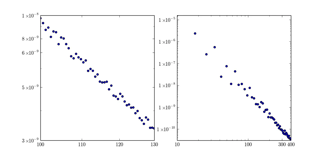
在左侧,x和y只变化了一个数量级的一部分,标签相当好用。在右侧,x变化在1到2个数量级之间。这很好用,但是该方法已经达到极限。y值变化多个数量级,使用标准标签。

from matplotlib import ticker
from numpy import linspace, logspace, log10, floor
from warnings import warn

def round_to_n(x, n):
    ''' https://dev59.com/ZXA75IYBdhLWcg3wOWRd '''
    return round(x, -int(floor(log10(abs(x)))) + (n - 1))

def ticks_log_format(value, index):
    ''' https://dev59.com/bnfZa4cB1Zd3GeqPVLc_ '''
    pwr = floor(log10(value))
    base = value / (10 ** pwr)
    if pwr == 0 or pwr == 1:
        return '${0:d}$'.format(int(value))
    if -3 <= pwr < 0:
        return '${0:.3g}$'.format(value)
    if 0 < pwr <= 3:
        return '${0:d}$'.format(int(value))
    else:
        return '${0:d}\\times10^{{{1:d}}}$'.format(int(base), int(pwr))

def calc_ticks(domain, tick_count, equidistant):
    if equidistant:
        ticks = logspace(log10(domain[0]), log10(domain[1]), num = tick_count, base = 10)
    else:
        ticks = linspace(domain[0], domain[1], num = tick_count)
    for n in range(1, 6):
        if len(set(round_to_n(tick, n) for tick in ticks)) == tick_count:
            break    
    return list(round_to_n(tick, n) for tick in ticks)

''' small domain log ticks '''
def sdlt_x(ax, domain, tick_count = 4, equidistant = True):
    ''' https://dev59.com/ZXA75IYBdhLWcg3wOWRd '''
    if min(domain) <= 0:
        warn('domain %g-%g contains values lower than 0' % (domain[0], domain[1]))
        domain = [max(value, 0.) for value in domain]
    ax.set_xscale('log')
    ax.set_xlim(domain)
    ax.xaxis.set_major_formatter(ticker.FuncFormatter(ticks_log_format))
    if log10(max(domain) / min(domain)) > 1.7:
        return
    ticks = calc_ticks(domain, tick_count = tick_count, equidistant = equidistant)
    ax.set_xticks(ticks)

''' any way to prevent this code duplication? '''
def sdlt_y(ax, domain, tick_count = 5, equidistant = True):
    ''' https://dev59.com/ZXA75IYBdhLWcg3wOWRd '''
    if min(domain) <= 0:
        warn('domain %g-%g contains values lower than 0' % (domain[0], domain[1]))
        domain = [max(value, 1e-8) for value in domain]
    ax.set_yscale('log')
    ax.set_ylim(domain)
    ax.yaxis.set_major_formatter(ticker.FuncFormatter(ticks_log_format))
    if log10(max(domain) / min(domain)) > 1.7:
        return
    ticks = calc_ticks(domain, tick_count = tick_count, equidistant = equidistant)
    ax.set_yticks(ticks)

''' demo '''
fig, (ax1, ax2,) = plt.subplots(1, 2)
for mi, ma, ax in ((100, 130, ax1,), (10, 400, ax2,), ):
    x = np.linspace(mi, ma, 50)
    y = 1 / ((x + random(50) * 0.1 * (ma - mi)) ** 4)
    ax.scatter(x, y)
    sdlt_x(ax, (mi, ma, ))
    sdlt_y(ax, (min(y), max(y), ))
show()

编辑:更新了一个选项,使标签等距(因此值为对数,但可见位置是等距的)。


网页内容由stack overflow 提供, 点击上面的
可以查看英文原文,
原文链接