使用ggplot2生成“模糊”的RD图

3
我的问题类似于这个,但那里的答案对我没有用。基本上,我正在尝试使用“模糊”设计生成回归不连续图,该设计使用所有治疗组和对照组的数据,但仅在治疗组和对照组的“范围”内绘制回归线。
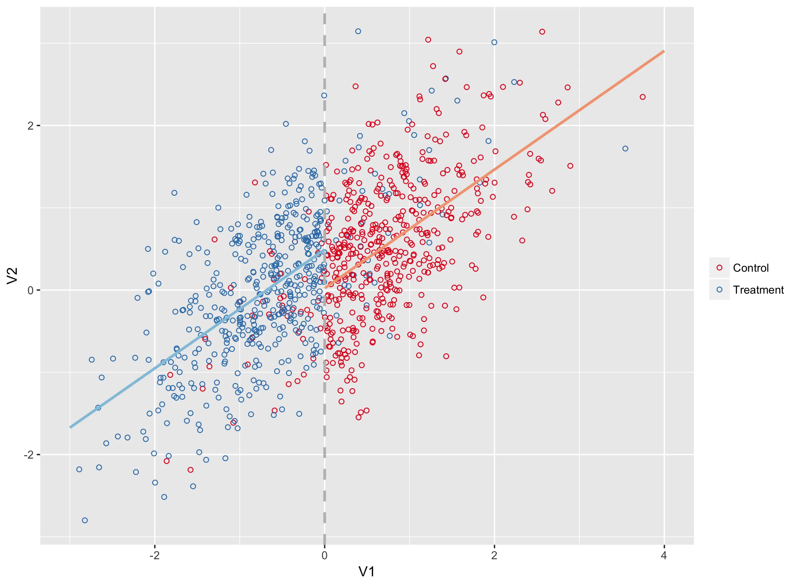
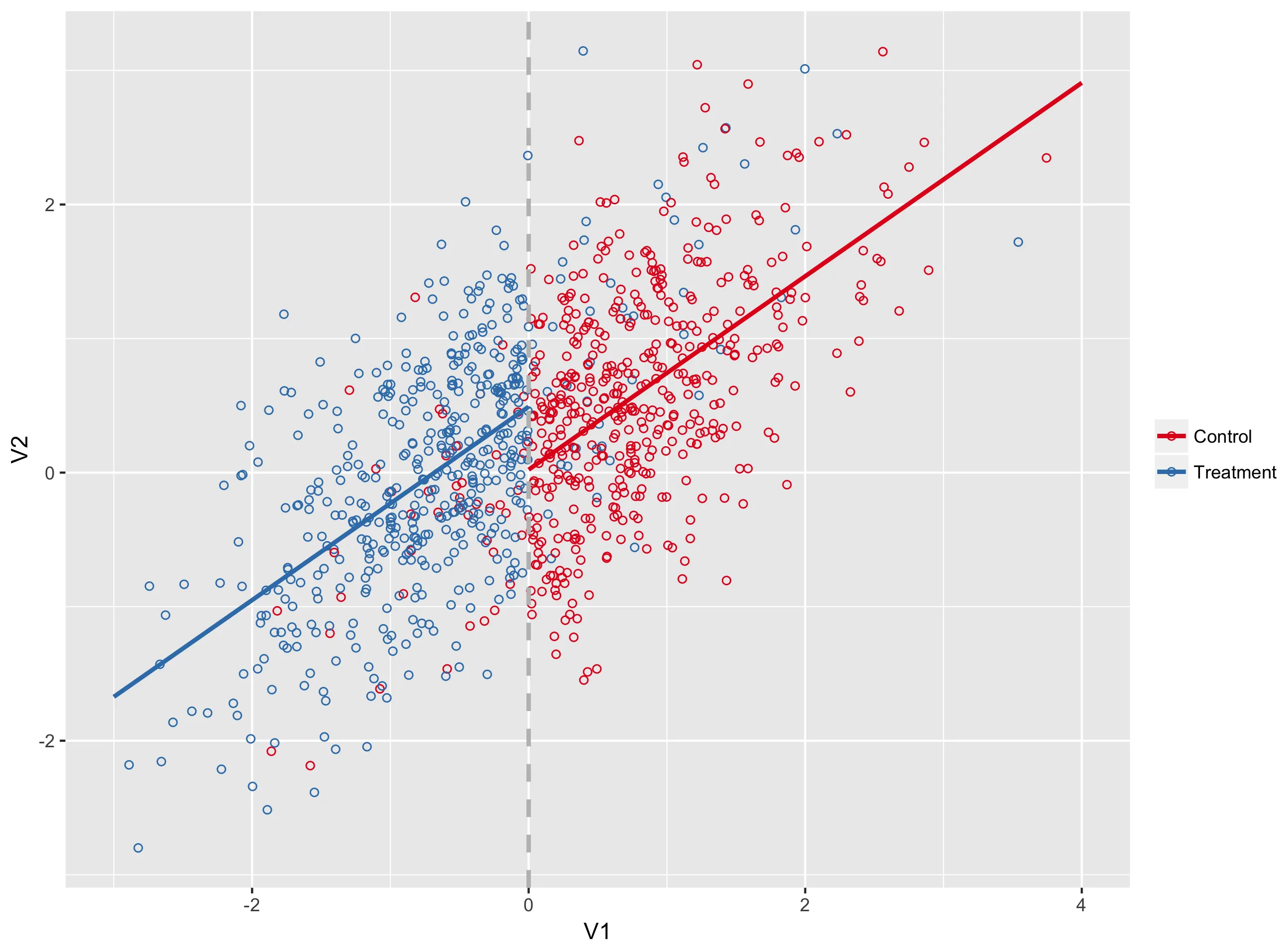
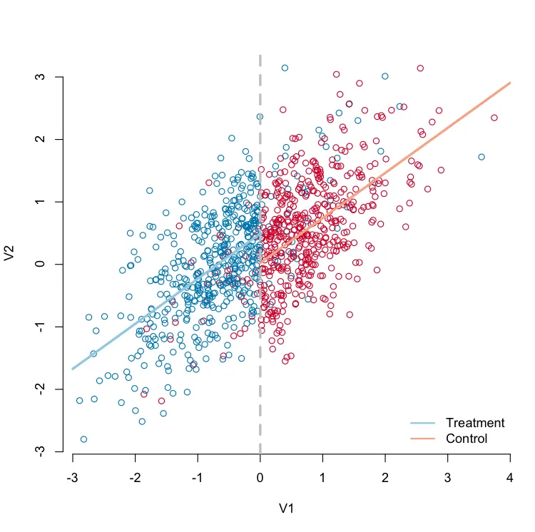
下面,我模拟了一些数据并使用基础图形生成了模糊RD图。我希望使用ggplot2复制此图。请注意,最重要的部分是浅蓝色回归线是使用所有蓝点拟合的,而桃色回归线是使用所有红点拟合的,尽管仅在预期接受治疗的个体范围内绘制。这是我难以在ggplot中复制的部分。
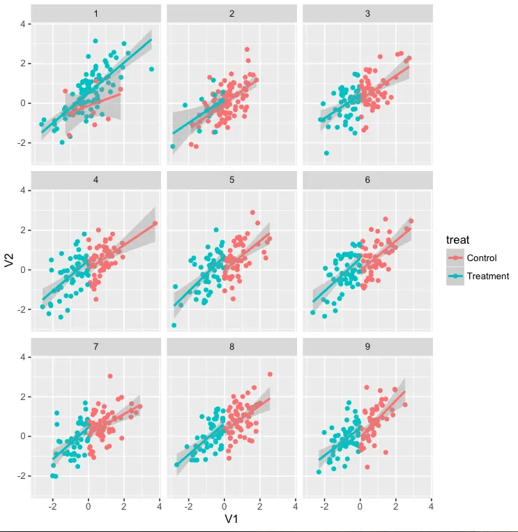
我想转向ggplot,因为我想使用分面将此相同的图形产生在参与者嵌套的各个单位中。在下面的代码中,我展示了一个非示例,使用geom_smooth。当组内没有模糊性时,它可以正常工作,否则会失败。如果我可以让geom_smooth仅限于特定范围,我认为我就可以解决问题了。非常感谢任何帮助。

模拟数据

library(MASS)
mu <- c(0, 0)
sigma <- matrix(c(1, 0.7, 0.7, 1), ncol = 2)

set.seed(100)
d <- as.data.frame(mvrnorm(1e3, mu, sigma))

# Create treatment variable
d$treat <- ifelse(d$V1 <= 0, 1, 0)

# Introduce fuzziness
d$treat[d$treat == 1][sample(100)] <- 0
d$treat[d$treat == 0][sample(100)] <- 1

# Treatment effect
d$V2[d$treat == 1] <- d$V2[d$treat == 1] + 0.5

# Add grouping factor
d$group <- gl(9, 1e3/9)

使用基础程序生成回归不连续性图。
library(RColorBrewer)
pal <- brewer.pal(5, "RdBu")

color <- d$treat
color[color == 0] <- pal[1]
color[color == 1] <- pal[5]

plot(V2 ~ V1, 
    data = d, 
    col = color,
    bty = "n")
abline(v = 0, col = "gray", lwd = 3, lty = 2)

# Fit model
m <- lm(V2 ~ V1 + treat, data = d)

# predicted achievement for treatment group
pred_treat <- predict(m, 
            newdata = data.frame(V1 = seq(-3, 0, 0.1), 
                                 treat = 1))
# predicted achievement for control group
pred_no_treat <- predict(m, 
            newdata = data.frame(V1 = seq(0, 4, 0.1), 
                                 treat = 0))

# Add predicted achievement lines
lines(seq(-3, 0, 0.1), pred_treat, col = pal[4], lwd = 3)
lines(seq(0, 4, 0.1), pred_no_treat, col = pal[2], lwd = 3)

# Add legend
legend("bottomright", 
    legend = c("Treatment", "Control"),
    lty = 1,
    lwd = 2,
    col = c(pal[4], pal[2]),
    box.lwd = 0)

fuzzy_RD_plot

使用ggplot出图的反例


该图是使用ggplot绘制的。
d$treat <- factor(d$treat, labels = c("Control", "Treatment"))

library(ggplot2)
ggplot(d, aes(V1, V2, group = treat)) + 
    geom_point(aes(color = treat)) +
    geom_smooth(method = "lm", aes(color = treat)) +
    facet_wrap(~group)

请注意,1组和2组的回归线超出了治疗范围。

ggplot_non_example

1个回答

2

使用geom_smooth可以更加优美地绘制线条,但是也可以通过geom_segment进行拼接。如果需要,可以在绘图调用之外修改数据框。

ggplot(d, aes(x = V1, y = V2, color = factor(treat, labels = c('Control', 'Treatment')))) + 
    geom_point(shape = 21) + 
    scale_color_brewer(NULL, type = 'qual', palette = 6) + 
    geom_vline(aes(xintercept = 0), color = 'grey', size = 1, linetype = 'dashed') + 
    geom_segment(data = data.frame(t(predict(m, data.frame(V1 = c(-3, 0), treat = 1)))), 
                 aes(x = -3, xend = 0, y = X1, yend = X2), color = pal[4], size = 1) + 
    geom_segment(data = data.frame(t(predict(m, data.frame(V1 = c(0, 4), treat = 0)))), 
                 aes(x = 0, xend = 4, y = X1, yend = X2), color = pal[2], size = 1)

ggplot版本

还有一个选项是geom_path

df <- data.frame(V1 = c(-3, 0, 0, 4), treat = c(1, 1, 0, 0))
df <- cbind(df, V2 = predict(m, df))

ggplot(d, aes(x = V1, y = V2, color = factor(treat, labels = c('Control', 'Treatment')))) + 
    geom_point(shape = 21) + 
    geom_vline(aes(xintercept = 0), color = 'grey', size = 1, linetype = 'dashed') + 
    scale_color_brewer(NULL, type = 'qual', palette = 6) + 
    geom_path(data = df, size = 1)

使用geom_path的ggplot


对于带有分面的编辑,如果我正确理解您的意图,您可以使用lapply为每个组计算模型,并为每个组进行预测。这里我使用dplyr :: bind_rows重新组合,而不是使用do.call(rbind, ...)来使用.id参数插入列表元素名称中的组号码,虽然有其他方法可以完成相同的操作。

df <- data.frame(V1 = c(-3, 0, 0, 4), treat = c('Treatment', 'Treatment', 'Control', 'Control'))
m_list <- lapply(split(d, d$group), function(x){lm(V2 ~ V1 + treat, data = x)})
df <- dplyr::bind_rows(lapply(m_list, function(x){cbind(df, V2 = predict(x, df))}), .id = 'group')

ggplot(d, aes(x = V1, y = V2, color = treat)) + 
    geom_point(shape = 21) + 
    geom_vline(aes(xintercept = 0), color = 'grey', size = 1, linetype = 'dashed') + 
    geom_path(data = df, size = 1) + 
    scale_color_brewer(NULL, type = 'qual', palette = 6) + 
    facet_wrap(~group)

facetted ggplot


谢谢您的输入。这对于这个单一的图表效果很好,但我真正希望做的是使用分面绘图来为每个组生成图表,因此模型会针对每个组而改变。我已经编辑了我的问题,以使其更清晰。 - Daniel Anderson
射...实际上,我有点过于兴奋了。它并不完全有效,因为它仍然为每个组使用相同的模型,而我实际上需要它绘制每个组的单独模型的拟合(即,非示例中正在发生的事情,但拟合范围仅限于治疗范围)。 - Daniel Anderson
1
看一下修改后的内容。如果我理解你的需求,这主要是一个数据整理问题;最好在ggplot之外制作模型,这样你可以自己控制它们。 - alistaire
1
太棒了!我回到电脑前测试一下,但看起来这个方法会奏效!我曾考虑通过循环来适配所有的模型,但认为ggplot中应该有一个实现。无论如何,这比我走那条路想出来的要好得多。非常感谢! - Daniel Anderson
1
很荣幸,非常开心! - alistaire
显示剩余3条评论

网页内容由stack overflow 提供, 点击上面的
可以查看英文原文,
原文链接