为了方便重现,您可以在此处下载数据。其结构如下:
> str(data)
'data.frame':   30 obs. of  4 variables:
 $ Count: num  -15.26 NaN NaN -7.17 -49.37 ...
 $ X1   : Factor w/ 1 level "Mean": 1 1 1 1 1 1 1 1 1 1 ...
 $ X2   : Factor w/ 10 levels "DC1","DC10","DC2",..: 1 1 1 3 3 3 4 4 4 5 ...
 $ X3   : Factor w/ 3 levels "SAPvsSH","SAPvsTD6",..: 1 2 3 1 2 3 1 2 3 1 ...
我运行了这个ggplot图表:
ggplot(data=data,  aes(x=X2, y=Count, group=X3, colour=X3)) +
  geom_point(size=5) +
  geom_line() +
  xlab("Decils") +
  ylab("% difference in nº Pk") +
  ylim(-50,25) + ggtitle("CL")  +
  geom_hline(aes(yintercept=0), lwd=1, lty=2) +
  scale_x_discrete(limits=c(orden_deciles))
使用此结果:
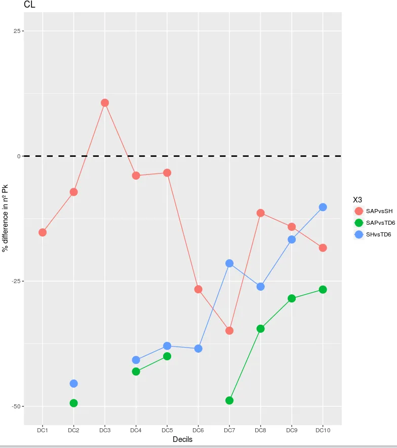
DC1:DC10。
我想把这张图表转换成雷达图。我尝试使用ggradar或ggRadar,但没有成功。像这样的东西会很棒:
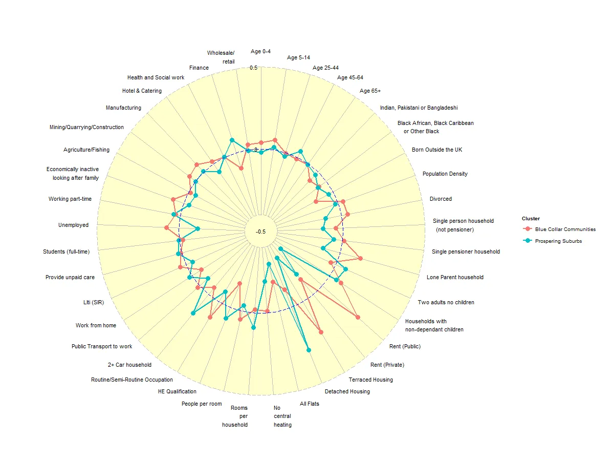
水平的黑线应该是完美的圆形,就像前一张图片中红线和蓝线之间放置的圆形一样。理想情况下,DC1应该朝北放置,顺时针旋转。
有任何想法或建议吗?
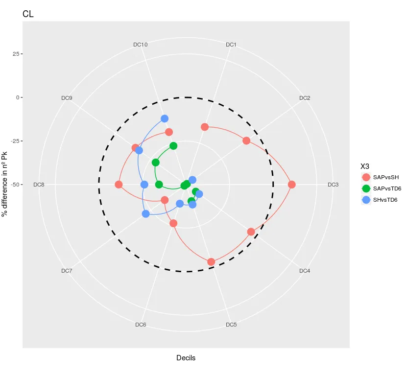
g + coord_polar()会将 ggplot 对象g中的坐标轴转换为极坐标轴。 - DJack