有以下代码:
import numpy as np
import matplotlib.pyplot as plt
import matplotlib.dates as mdates

days, impressions = np.loadtxt('results_history.csv', unpack=True, delimiter=',',usecols=(0,1) ,
        converters={ 0: mdates.strpdate2num('%d-%m-%y')})

plt.plot_date(x=days, y=impressions, fmt="r-")
plt.title("Load Testing Results")


#params = {'legend.labelsize': 500,
    #'legend.handletextpad': 1,
    #'legend.handlelength': 2,
    #'legend.loc': 'upper left',
    #'labelspacing':0.25,
    #'legend.linewidth': 50}
#plt.rcParams.update(params)

plt.legend("response times")

plt.ylabel("Date")
plt.grid(True)
plt.show()
图表已经生成,但我不知道如何添加一些xy标签。生成的图表:
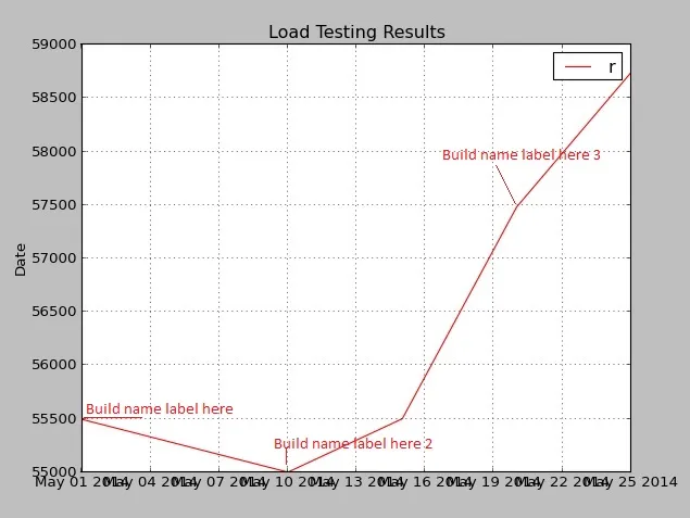 同时尝试增加图例文本大小,但文本未显示。X轴标签重叠了。CSV文件:
01-05-14, 55494, Build 1
10-05-14, 55000, Build 2
15-05-14, 55500, Build 3
20-05-14, 57482, Build 4
25-05-14, 58741, Build 5
我怎样才能从CSV文件中添加xytext,还可以更改图例和X轴的格式?