如何在R中连接绘图中每个主题的数据点?

11

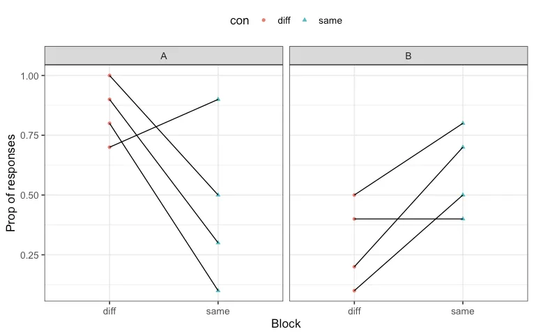
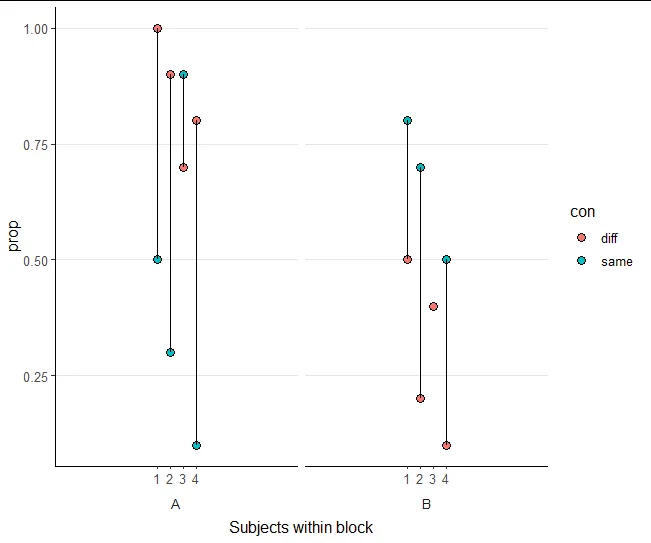
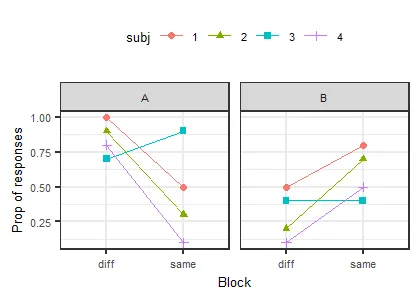
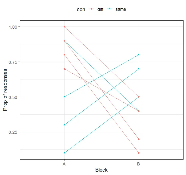
我正在绘制每个受试者在两个块(A块和B块)中对“相同”或“不同”刺激做出反应的比例,这意味着每个受试者有4个数据点被绘制。其中A块有两个数据点(相同和不同),B块也是如此。这也意味着有4行数据,每行数据包含每个受试者的反应比例。

我希望在每个块内连接每个受试者的“相同”和“不同”数据点(例如,在A块内通过线连接其一个“相同”的数据点和“不同”的数据点,在B块内也是如此)。

我尝试使用geom_line()中的“group = subject”,但它连接了所有受试者的数据点,而我只想连接每个块内的数据点。

testplot <- ggplot(df, aes(x=block, y=prop, shape=con, colour=con)) +
  geom_point(position=position_dodge(width=.1)) +
  xlab("Block") + ylab("Prop of responses") +
  theme_bw(base_size = 13) +
  theme(legend.position="top")
plot(testplot)

样本数据集:

subj = c(1, 1, 2, 2, 3, 3, 4, 4, 1, 1, 2, 2, 3, 3, 4, 4)
prop = c(0.5, 0.8, 0.3, 0.7, 0.9, 0.4, 0.1, 0.5, 1, 0.5, 0.9, 0.2, 0.7, 0.4, 0.8, 0.1)
con = c("same", "same", "same", "same", "same", "same", "same", "same", "diff", "diff", "diff", "diff", "diff", "diff", "diff", "diff")
block = c("A", "B", "A", "B", "A", "B", "A", "B", "A", "B", "A", "B", "A", "B", "A", "B")

df = data.frame(subj, prop, con, block)

我希望这有道理,这可行吗?非常感谢任何帮助!

5个回答

9

我认为最好的方法是使用facet_grid

ggplot(df, aes(x=con, y=prop, shape=con)) +
  geom_point(aes(color=con), position=position_dodge(width=.1)) +
  geom_line(aes(group = subj)) +
  facet_grid(.~block) +
  xlab("Block") + ylab("Prop of responses") +
  theme_bw(base_size = 13) +
  theme(legend.position="top")

enter image description here


非常好。+1,但是鉴于x轴已经包含了这个解释,传说是否必要?您可以使用颜色/形状来表示传说中的主题。 - Edward
@Edward 可能不需要,但这是在 OP 的原始问题中提到的,并且他们使用符号和颜色来引起对 con 的注意。此外,符号之间的差异可能不太清楚。 - Ian Campbell

7
要实现您想要的图表,一种方法是使用 facet_wrap,按block进行分面,并将con映射到x,将subj映射到group。请尝试以下内容:
subj = c(1, 1, 2, 2, 3, 3, 4, 4, 1, 1, 2, 2, 3, 3, 4, 4)
prop = c(0.5, 0.8, 0.3, 0.7, 0.9, 0.4, 0.1, 0.5, 1, 0.5, 0.9, 0.2, 0.7, 0.4, 0.8, 0.1)
con = c("same", "same", "same", "same", "same", "same", "same", "same", "diff", "diff", "diff", "diff", "diff", "diff", "diff", "diff")
block = c("A", "B", "A", "B", "A", "B", "A", "B", "A", "B", "A", "B", "A", "B", "A", "B")

df = data.frame(subj, prop, con, block)

library(ggplot2)

testplot <- ggplot(df, aes(x=con, y=prop, group = subj)) +
  geom_point(aes(shape=con, colour=con)) +
  geom_line() +
  xlab("Block") + ylab("Prop of responses") +
  theme_bw(base_size = 13) +
  theme(legend.position="top") +
  facet_wrap(~block, strip.position = "bottom") +
  theme(strip.placement = "outside", axis.text.x = element_blank(), axis.ticks.x = element_blank())
testplot


哈哈,抱歉我在你发帖前大约30秒编辑了我的回答成为了你的回答。点个赞。 - Ian Campbell
@IanCampbell。给你点赞。(; - stefan
你们俩都做到了。 - Onyambu

7

从查看这里的其他答案,我可能误解了,但我认为这可能是更清晰的表述方式:

ggplot(df, aes(factor(subj), prop)) +
  geom_point(aes(fill = con), size = 3, shape = 21) +
  geom_line(aes(group = factor(subj))) +
  facet_grid(.~block, switch = "x") +
  scale_x_discrete(expand = c(2, 2)) +
  labs(x = "Subjects within block") +
  theme_classic() +
  theme(text = element_text(size = 12),
        strip.placement = "outside",
        strip.background = element_blank(),
        panel.grid.major.y = element_line(colour = "gray90"))

enter image description here


5
这个答案与Ian Cambell的回答非常相似,但使用颜色和形状来表示主题,因为同/异在x轴上显示,因此在图例中是多余的。由于主题容易识别,因此绘图也类似于Allan Cameron的绘图。只是为了展示另一种视角。
ggplot(df, aes(x=con, y=prop, col=subj, shape=subj)) +
  geom_point() +
  geom_line(aes(group = subj)) +
  facet_grid(.~block) +
  xlab("Block") + ylab("Prop of responses") +
  theme_bw(base_size = 13) +
  theme(legend.position="top")

enter image description here

我们可以在各个块(方面)之间比较这四个主题。

看起来不错,但如果将“con”映射到“x”,则不需要使用“position_dodge”。 - Ian Campbell
是的 - 你说得对。我无耻地复制了你的代码并修改了美学! - Edward

1
这些都是很好的建议和有趣的想法,如果你想重新考虑数据表示(特别是方面),但是为了实际回答你的问题,你需要将组合在一起,例如geom_line(aes(group=paste(subj, con)))
ggplot(df, aes(x=block, y=prop, shape=con, colour=con)) +
  geom_point() +
  geom_line(aes(group=paste(subj, con))) +
  xlab("Block") + ylab("Prop of responses") +
  theme_bw(base_size = 13) +
  theme(legend.position="top")

result plot


网页内容由stack overflow 提供, 点击上面的
可以查看英文原文,
原文链接