使用轮廓图的FacetGrid

3
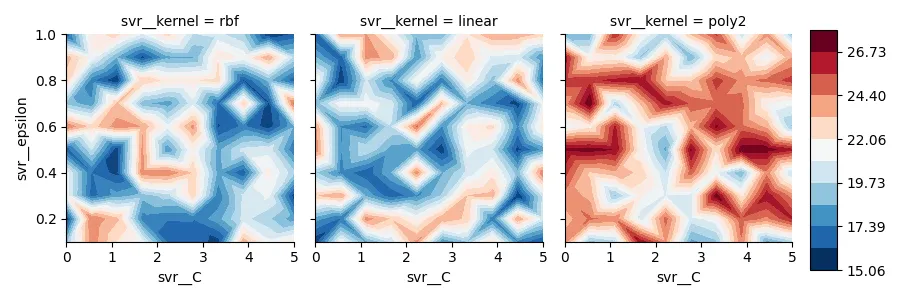
为了找到最佳的超参数来支持向量回归,我进行了网格搜索,并获得了一个类似于DataFrame的结果。
svr__kernel svr__C  svr__epsilon   mae  
rbf         0.01    0.1            19.80    
linear      0.01    0.1            19.00    
poly2       0.01    0.1            19.72    
rbf         0.01    0.2            19.76
..          ..      ..             ..

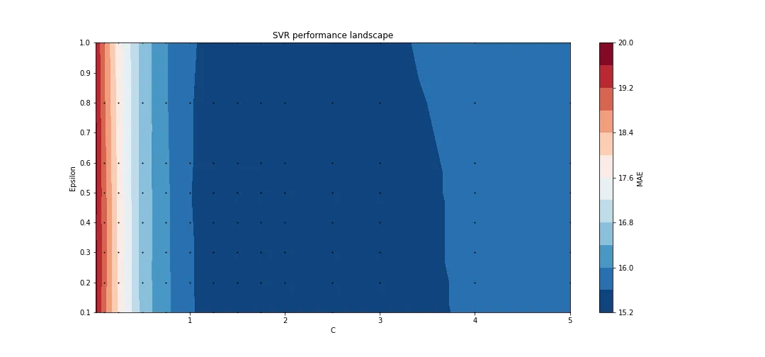
为了可视化结果,我为一个核函数创建了等高线图。
fig, ax = plt.subplots(figsize=(15,7))

plot_df = df[df.svr__kernel == "poly2"].copy()
C = plot_df["svr__C"]
epsilon = plot_df["svr__epsilon"]
score = plot_df["mae"]

# Plotting all evaluations:
ax.plot(C, epsilon, "ko", ms=1)
# Create a contour plot
cntr = ax.tricontourf(C, epsilon, score, levels=12, cmap="RdBu_r")
# Adjusting the colorbar
fig.colorbar(cntr, ax=ax, label="MAE")
# Adjusting the axis limits
ax.set(
    xlim=(min(C), max(C)),
    ylim=(min(epsilon), max(epsilon)),
    xlabel="C",
    ylabel="Epsilon",
)
ax.set_title("SVR performance landscape")

SVR超参数调优的轮廓绘图

现在我想用每个核的轮廓图来创建FacetGrid,并使用相同的颜色条对mae值进行比较。不幸的是,我对FacetGrid的操作流程存在严重问题。

1个回答

4

答案

如果您有这样一个数据框:

kernels = ['rbf', 'linear', 'poly2']
c_size = 10
eps_size = 10
df = pd.DataFrame({'svr__kernel': np.repeat(kernels, c_size*eps_size),
                   'svr__C': len(kernels)*eps_size*list(np.linspace(0, 5, c_size)),
                   'svr__epsilon': len(kernels)*list(np.repeat(np.linspace(0.1, 1, eps_size), c_size))})
df['mae'] = 15 + 10*np.random.random(len(df))

    svr__kernel    svr__C  svr__epsilon        mae
0           rbf  0.000000           0.1  18.745401
1           rbf  0.555556           0.1  24.507143
2           rbf  1.111111           0.1  22.319939
3           rbf  1.666667           0.1  20.986585
4           rbf  2.222222           0.1  16.560186
..          ...       ...           ...        ...
295       poly2  2.777778           1.0  20.222433
296       poly2  3.333333           1.0  22.699936
297       poly2  3.888889           1.0  17.158210
298       poly2  4.444444           1.0  21.228905
299       poly2  5.000000           1.0  15.853475

您可以使用以下方式设置 seaborn.FacetGrid

overall_min = df['mae'].min()
overall_max = df['mae'].max()
cmap = RdBu_r
levels = 12

g = sns.FacetGrid(df, col = 'svr__kernel')
g.map(plt.tricontourf, 'svr__C', 'svr__epsilon', 'mae', levels = levels, cmap = cmap, vmin = overall_min, vmax = overall_max)

接着,您可以将最后一张图向左移动以为色条腾出一些空间,添加一个坐标轴并在其上绘制色图:

g.fig.subplots_adjust(right = 0.88)
cbar_ax = g.fig.add_axes([0.9, 0.1, 0.03, 0.8])
norm = BoundaryNorm(np.linspace(overall_min, overall_max, levels), cmap.N)
plt.colorbar(ScalarMappable(norm = norm, cmap = cmap), cax = cbar_ax)

完整代码

在此示例中,我使用add_3_to_poly2函数只针对'poly2'内核,向'mae'列添加了3,目的是检查与contourf值相对于等高线水平的颜色条值。

import pandas as pd
import matplotlib.pyplot as plt
import seaborn as sns
import numpy as np
from matplotlib.cm import ScalarMappable, RdBu_r
from matplotlib.colors import BoundaryNorm


def add_3_to_poly2(df):
    if df['svr__kernel'] == 'poly2':
        return df['mae'] + 3
    else:
        return df['mae']


kernels = ['rbf', 'linear', 'poly2']
c_size = 10
eps_size = 10
df = pd.DataFrame({'svr__kernel': np.repeat(kernels, c_size*eps_size),
                   'svr__C': len(kernels)*eps_size*list(np.linspace(0, 5, c_size)),
                   'svr__epsilon': len(kernels)*list(np.repeat(np.linspace(0.1, 1, eps_size), c_size))})
df['mae'] = 15 + 10*np.random.random(len(df))
df['mae'] = df.apply(add_3_to_poly2, axis = 1)


overall_min = df['mae'].min()
overall_max = df['mae'].max()
cmap = RdBu_r
levels = 12

g = sns.FacetGrid(df, col = 'svr__kernel')
g.map(plt.tricontourf, 'svr__C', 'svr__epsilon', 'mae', levels = levels, cmap = cmap, vmin = overall_min, vmax = overall_max)

g.fig.subplots_adjust(right = 0.88)
cbar_ax = g.fig.add_axes([0.9, 0.1, 0.03, 0.8])
norm = BoundaryNorm(np.linspace(overall_min, overall_max, levels), cmap.N)
plt.colorbar(ScalarMappable(norm = norm, cmap = cmap), cax = cbar_ax)

plt.show()

图示

enter image description here

注释

从图中可以看出,'poly2'的contourf值实际上比其他值要大,色条正确地跟踪了所有值,从整体最小值到整体最大值。


网页内容由stack overflow 提供, 点击上面的
可以查看英文原文,
原文链接