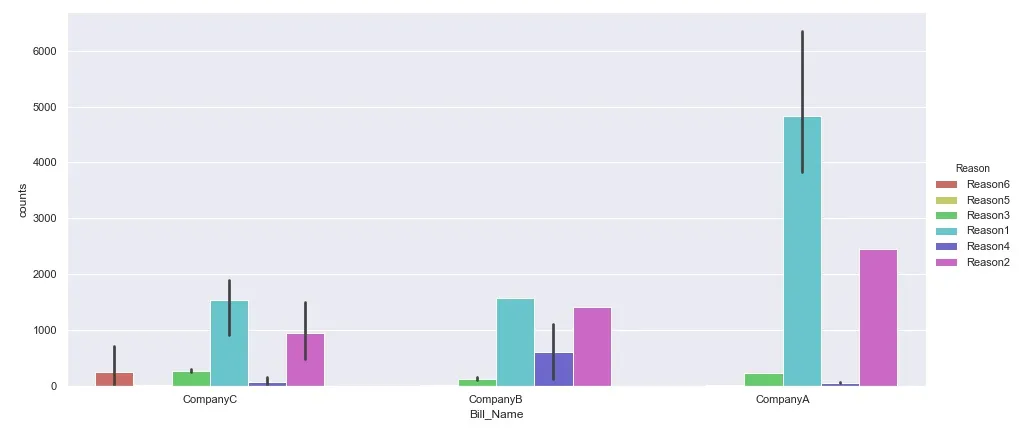
我一直在使用seaborn.catplot制作柱状图(下面是数据示例),将counts列中的值相加,针对一组公司的reasons进行分组:
sns.catplot(x='Bill_Name', y='counts', hue='Reason',
            data=data, kind='bar', height=6, aspect=13/6,
            legend=True, palette='hls')
year的列。因此,我考虑使用seaborn.FacetGrid,以便将上述内容呈现为行网格。因此,如果我正确理解了这种工作方式,
sns.FacetGrid必须将数据和year列作为row参数提供,然后使用sns.map、sns.catplot及其相应的参数,但是这并没有正常工作:g = sns.FacetGrid(data, row="year", height=4, aspect=.5)
g = g.map(sns.catplot, x='Bill_Name', y='counts', hue='Reason',
data=data, kind='bar', height=6, aspect=13/6,
legend=True, palette='hls')
我做错了什么?
这是数据的示例:
   Bill_Name      year   Reason  counts
0   CompanyC     2018.0  Reason6       2
1   CompanyC     2017.0  Reason5       8
2   CompanyB     2017.0  Reason3     146
3   CompanyC     2015.0  Reason6       2
4   CompanyC     2017.0  Reason1    1828
5   CompanyC     2016.0  Reason3     237
6   CompanyB     2018.0  Reason4    1097
7   CompanyC     2016.0  Reason4      11
8   CompanyB     2016.0  Reason5      12
9   CompanyC     2017.0  Reason2     834
10  CompanyB     2016.0  Reason3      97
11  CompanyC     2017.0  Reason6     714
12  CompanyA     2017.0  Reason1    4288
13  CompanyA     2016.0  Reason2    2444
14  CompanyC     2017.0  Reason3     293
15  CompanyB     2016.0  Reason1    1576
16  CompanyA     2016.0  Reason4      37
17  CompanyA     2018.0  Reason5       1
18  CompanyC     2018.0  Reason1     908
19  CompanyC     2018.0  Reason2     478
20  CompanyA     2015.0  Reason1    3826
21  CompanyB     2016.0  Reason4     119
22  CompanyB     2017.0  Reason2    1404
23  CompanyC     2016.0  Reason1    1884
24  CompanyC     2015.0  Reason4       1
25  CompanyA     2016.0  Reason1    6360
26  CompanyA     2018.0  Reason3     225
27  CompanyA     2018.0  Reason4      63
28  CompanyC     2018.0  Reason4     162
29  CompanyC     2016.0  Reason2    1504
row参数添加到sns.catplot中,则完全可以避免使用facetgrid:sns.catplot(x='Bill_Name', y='counts', hue='Reason',row='year', data=data, kind='bar', height=6, aspect=13/6, legend=True, palette='hls')。 - CAPSLOCK