如何在pandas中绘制一个图形化的计数表

3

我有一个数据框 df,其中有两列customer1customer2,它们的值是字符串类型。 我想制作一个方形图,用于表示来自这两列每个对中的计数数字。

我可以这样做:

df[['customer1', 'customer2']].value_counts()

我可以使用计数的方式获得结果。但是怎样才能得到类似以下图片的效果:

enter image description here

如何从结果中得到这个效果呢?下面是一个包含三个标签的CSV的玩具示例,由于涉及真实数据集,我不能提供实际数据。

customer1,customer2
a,b
a,c
a,c
b,a
b,c
b,c
c,c
a,a
b,c
b,c

1
请查看seaborn.heatmap的内容... - MaxU - stand with Ukraine
@MaxU 看起来不错。你知道如何将 pandas 数据框转换为 sns.heatmap 可以接受的格式吗? - Simd
请提供一个数据集的示例 - MaxU - stand with Ukraine
@MaxU很遗憾我不能提供真实数据,但我刚刚在csv文件中添加了一个玩具示例。 - Simd
2个回答

2

更新:

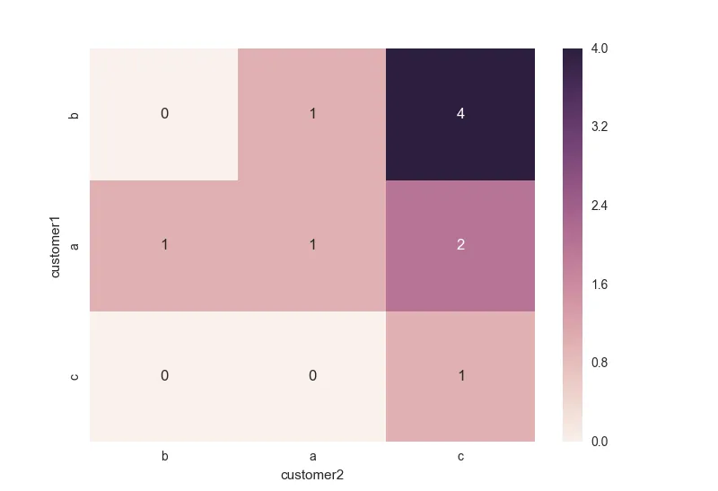
是否可以对行/列进行排序,使得计数最高的行位于顶部?在这种情况下,顺序应为b,a,c。

如果我理解正确,您可以通过以下方式实现(其中):

In [80]: x = df.pivot_table(index='customer1',columns='customer2',aggfunc='size',fill_value=0)

In [81]: idx = x.max(axis=1).sort_values(ascending=0).index

In [82]: idx
Out[82]: Index(['b', 'a', 'c'], dtype='object', name='customer1')

In [87]: sns.heatmap(x[idx].reindex(idx), annot=True)
Out[87]: <matplotlib.axes._subplots.AxesSubplot at 0x9ee3f98>

enter image description here

新的回答:

您可以使用seaborn模块中的heatmap()方法来进行操作,具体请参考此链接

In [42]: import seaborn as sns

In [43]: df
Out[43]:
  customer1 customer2
0         a         b
1         a         c
2         a         c
3         b         a
4         b         c
5         b         c
6         c         c
7         a         a
8         b         c
9         b         c

In [44]: x = df.pivot_table(index='customer1',columns='customer2',aggfunc='size',fill_value=0)

In [45]: x
Out[45]:
customer2  a  b  c
customer1
a          1  1  2
b          1  0  4
c          0  0  1

In [46]: sns.heatmap(x)
Out[46]: <matplotlib.axes._subplots.AxesSubplot at 0xb150b70>
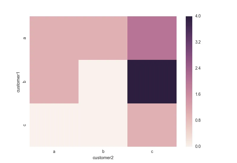
这里输入图片描述

或者带有注释:

In [48]: sns.heatmap(x, annot=True)
Out[48]: <matplotlib.axes._subplots.AxesSubplot at 0xc596d68>

enter image description here


谢谢。是否可以对行/列进行排序,使得计数最高的行在顶部?在这种情况下,顺序将是b,a,c。 - Simd
@eleanora,请查看更新部分。 - MaxU - stand with Ukraine
谢谢您的更新。我的意思是行和列以相同的方式排序。因此,在这种情况下,行将是b,a,c,列也是如此。 - Simd
我在http://stackoverflow.com/questions/39291261/how-to-draw-a-heatmap-in-pandas-with-items-that-dont-occur-in-both-columns添加了一个后续。 - Simd

0
根据@MaxU提到的,应该可以使用seaborn.heatmap函数。似乎可以将Pandas DataFrame作为输入。 seaborn.heatmap(data, vmin=None, vmax=None, cmap=None, center=None, robust=False, annot=None, fmt='.2g', annot_kws=None, linewidths=0, linecolor='white', cbar=True, cbar_kws=None, cbar_ax=None, square=False, ax=None, xticklabels=True, yticklabels=True, mask=None, **kwargs)

https://stanford.edu/~mwaskom/software/seaborn/generated/seaborn.heatmap.html#seaborn.heatmap


数据框架应该包含计数数据,我想我们仍然需要计算它吗? - Simd

网页内容由stack overflow 提供, 点击上面的
可以查看英文原文,
原文链接