如何在Matplotlib中绘制Pandas数据框?

4

我有以下代码:

import matplotlib.pyplot as plt
import numpy as np

import pandas as pd

data = pd.read_csv("Ari_atlag.txt", sep = '\t', header = 0)


#Num_array = pd.DataFrame(data).to_numpy()

print(data.head())
data.plot()
#data.columns = ['Date', 'Number_of_test', 'Avarage_of_ARI']
#print(Num_array)
plt.show()

输出:

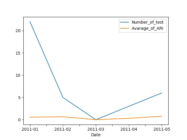
     Date    Number_of_test    Avarage_of_ARI 
0  2011-01                22          0.568734
1  2011-02                 5          0.662637
2  2011-03                 0          0.000000
3  2011-04                 3          0.307692
4  2011-05                 6          0.773611

Process finished with exit code 0

还有图形。

但是有了这段代码在图中,x轴是索引。但我想让日期出现在x轴上。

如何绘制Number_of_test的日期和Avarage_of_ARI的日期?

我认为我应该将字符串(日期)更改为日期,但不知道如何做到这一点。

最好的。


当你说“x轴不是日期,只是索引”时,你的意思是你得到了这样的图形,还是你想要这样的图形? - fam-woodpecker
@StuartMills 这就是我得到的,我想在x轴上获取日期。 - Dávid Kókai
1
这个回答解决了你的问题吗?Matplotlib pandas plot date time - Be Chiller Too
3个回答

4

使用x='Date'作为plot的参数:

df.plot(x='Date')
plt.show()

enter image description here


4

试试这个:

#Excutable example
df = pd.DataFrame({"Date" : ["2011-01", "2011-02", "2011-03", "2011-04", "2011-05"],
                   "Number_of_test" : [22, 5, 0, 3, 6],
                   "Avarage_of_ARI" : [0.568734, 0.662637, 0.000000, 0.307692,
                                       0.773611]})
df.Date = pd.to_datetime(df.Date)
df = df.set_index("Date")

绘图

plt.style.use('ggplot')
plt.rcParams['figure.figsize'] = [13,5]

data_ax1 = df.Number_of_test
data_ax2 = df.Avarage_of_ARI
fig, ax1 = plt.subplots()
        
ax1.set_ylabel('Number_of_test', color = 'tab:red')
ax1.plot(data_ax1, color = 'tab:red', linewidth= 1)
ax1.tick_params(axis = 'y',
                labelcolor= 'tab:red',
                length = 6, 
                width = 1, 
                grid_alpha=0.5)
    
ax2 = ax1.twinx()
ax2.set_ylabel('Avarage_of_ARI', color = 'tab:blue')
ax2.plot(data_ax2, color = 'tab:blue', linewidth = 1)
ax2.tick_params(axis='y', labelcolor = 'tab:blue')
fig.tight_layout()
plt.title("Plot", fontsize = 15)

结果 在此输入图片描述


0

如果适用于您的数据,您可以将索引设置为日期列。

cols = ['Number_of_test','Avarage_of_ARI']

data.set_index('Date', inplace = True)

for c in cols:
    data[c].plot()

网页内容由stack overflow 提供, 点击上面的
可以查看英文原文,
原文链接