我该如何将glyphicon添加到文本输入框中?例如,我想在用户名输入框中使用'icon-user',类似于以下内容:
将 Bootstrap 图标添加到输入框
363
- doovers
2
6这是我的备选方案(2014年)
JSFiddle [http://jsfiddle.net/rcotrina94/cyCFS/272] - Richard Cotrina
1晚到派对了,但是看看我的答案,我只使用Bootstrap来实现这个效果,并且使用两行CSS来改变颜色和边框。它解决了在答案部分讨论的其他问题。https://dev59.com/a2Mk5IYBdhLWcg3w7COX#40945821 - some_groceries
16个回答
2
已测试使用Bootstrap 4。
选取一个form-control,并将is-valid添加到其类中。注意控件变为绿色,但更重要的是,注意控件右侧的勾号图标?这正是我们想要的!
示例:
<input class="form-control is-valid" type="text">
.my-icon {
    padding-right: calc(1.5em + .75rem);
    background-image: url('https://use.fontawesome.com/releases/v5.8.2/svgs/regular/calendar-alt.svg');
    background-repeat: no-repeat;
    background-position: center right calc(.375em + .1875rem);
    background-size: calc(.75em + .375rem) calc(.75em + .375rem);
}<script src="https://cdnjs.cloudflare.com/ajax/libs/jquery/3.3.1/jquery.min.js"></script>
<script src="https://cdnjs.cloudflare.com/ajax/libs/popper.js/1.14.3/umd/popper.min.js"></script>
<link href="https://stackpath.bootstrapcdn.com/bootstrap/4.1.3/css/bootstrap.min.css" rel="stylesheet"/>
<script src="https://stackpath.bootstrapcdn.com/bootstrap/4.1.3/js/bootstrap.min.js"></script>
<div class="container">
<div class="col-md-5">
<input type="text" id="date" class="form-control my-icon" placeholder="Select...">
</div>
</div>- Igor K
2
你好,今天过得怎么样?你从哪里得到了这个链接:https://use.fontawesome.com/releases/v5.8.2/svgs/regular/calendar-alt.svg 我找不到其他图标的类似链接。 - Aljohn Yamaro
啊,我不记得了。但是这个技巧是有效的,只要使用来自5.8.2版本的任何图标即可。您可以在此处查看这些图标:https://fontawesome.com/icons?d=gallery&v=5.8.0,5.8.2 - Igor K
2
您可以使用Unicode HTML
因此,要添加用户图标,只需将添加到placeholder属性或任何您想要的位置。
您可能需要查看此备忘单。
示例:
<link rel="stylesheet" href="https://maxcdn.bootstrapcdn.com/bootstrap/3.3.7/css/bootstrap.min.css">
<input type="text" class="form-control" placeholder=" placeholder..." style="font-family: 'Glyphicons Halflings', Arial">
<input type="text" class="form-control" value=" value..." style="font-family: 'Glyphicons Halflings', Arial">
<input type="submit" class="btn btn-primary" value=" submit-button" style="font-family: 'Glyphicons Halflings', Arial">font-family: 'Glyphicons Halflings', Arial,其中Arial是输入框中常规文本的字体。- Mona Lisa
1
我也有一个关于Bootstrap 3.3.5的决定:
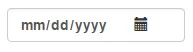
我有一个输入,类似于这样:
请注意,这是HTML格式的文本,不进行解释。
<div class="col-sm-5">
    <label for="date">
       <input type="date" placeholder="Date" id="date" class="form-control">
    </label>
    <i class="glyphicon glyphicon-calendar col-sm-pull-2"></i>
</div>
我有一个输入,类似于这样:
请注意,这是HTML格式的文本,不进行解释。
- Vitalii Nesterenko
1
以下是纯Bootstrap 5的工作原理:
为了去掉输入框聚焦时出现的边框,需要在输入框中添加
<!doctype html>
<html lang="en">

<head>
    <meta charset="utf-8">
    <meta name="viewport" content="width=device-width, initial-scale=1">
    <title>iconbutton</title>
    <link href="https://cdn.jsdelivr.net/npm/bootstrap@5.2.0-beta1/dist/css/bootstrap.min.css" rel="stylesheet">
    <link href="https://cdnjs.cloudflare.com/ajax/libs/font-awesome/6.1.1/css/all.min.css" rel="stylesheet">
</head>

<body>

<div class="d-flex flex-row align-items-center m-4 border rounded">
    <i class="fa-solid fa-search mx-2"></i>
    <input type="text" class="form-control border-0" placeholder="Search">
</div>

<script src="https://cdn.jsdelivr.net/npm/bootstrap@5.2.0-beta1/dist/js/bootstrap.bundle.min.js"></script>
</body>

</html>shadow-0。- nhcodes
0
如果你足够幸运,只需要现代浏览器的话:尝试使用CSS transform translate。这不需要任何包装器,并且可以自定义,以便为input[type=number]提供更多的间距来容纳输入微调器,或将其移动到手柄的左侧。
    @import url("//netdna.bootstrapcdn.com/bootstrap/3.0.0/css/bootstrap.min.css");


.is-invalid {
  height: 30px;
  box-sizing: border-box;
}

.is-invalid-x {
  font-size:27px;
  vertical-align:middle;
  color: red;
  top: initial;
  transform: translateX(-100%);
}


 <h1>Tasty Field Validation Icons using only css transform</h1>
    <label>I am just a poor boy nobody loves me</label>
    <input class="is-invalid"><span class="glyphicon glyphicon-exclamation-sign is-invalid-x"></span>
- httpete
0
您可以使用现有的Bootstrap类和一些自定义样式来完成此操作。
<form>
    <div class="input-prepend">
        <span class="add-on">
            <i class="icon-user"></i>
        </span>
        <input class="span2" id="prependedInput" type="text" placeholder="Username" style="background-color: #eeeeee;border-left: #eeeeee;">
    </div>
编辑 图标是通过 icon-user 类进行引用的。此答案是在 Bootstrap 版本 2 发布时编写的。您可以在以下页面上查看参考资料:http://getbootstrap.com/2.3.2/base-css.html#images
- YOOOEE
2
在这个答案中没有看到Bootstrap glyphicon的引用。 - Kirby
@Kirby,图标是通过icon-user类引用的。此答案是在Bootstrap 2版本时编写的。您可以在以下页面上查看参考 - http://getbootstrap.com/2.3.2/base-css.html#images - YOOOEE
网页内容由stack overflow 提供, 点击上面的可以查看英文原文,
原文链接
原文链接
- 相关问题
- 7 将电话和地图图标添加到bootstrap汉堡菜单图标左侧
- 3 将Bootstrap输入框水平排列
- 3 Bootstrap如何在输入框旁边放置两个图标?
- 6 在输入框右侧添加 Bootstrap 图标
- 4 Twitter Bootstrap Typeahead - 当搜索开始时,将"loading"类添加到输入框
- 4 将 Bootstrap 图标添加到按钮
- 37 在输入框中添加Twitter Bootstrap图标
- 4 将bootstrap的图标添加到Datatable输入搜索字段中
- 3 使用Twitter Bootstrap将图标放置在输入框右侧并固定位置
- 31 Bootstrap 4 中输入框中的图标