在输入框中添加Twitter Bootstrap图标

37

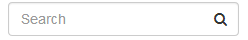
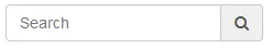
我们如何在文本输入框右侧添加 Twitter Bootstrap 图标 icon-search

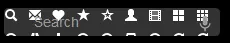
以下尝试将所有图标放置在输入框内,如何进行裁剪,使其仅显示 icon-search 的图标?

当前尝试

enter image description here

CSS

input.search-box {
    width: 180px;
    background: #333;
    background-image: url('/img/glyphicons-halflings-white.png');
    background-position: -48px 0;
    padding-left: 30px;
    margin-top: 45px;
    border: 0;
    float: right;
}
6个回答

90

更新的 Bootstrap 3.x

您可以像这样使用 .input-group 类:

<div class="input-group">
    <input type="text" class="form-control"/>
    <span class="input-group-addon">
        <i class="fa fa-search"></i>
    </span>
</div>

在jsFiddle中使用3.x的演示


Bootstrap 2.x

您可以像这样使用.input-append类:

<div class="input-append">
    <input class="span2" type="text">
    <button type="submit" class="btn">
        <i class="icon-search"></i>
    </button>
</div>

2.x的jsFiddle工作演示


两者都会看起来像这样:

屏幕截图(外部)

如果你想让图标输入框内,像这样:

屏幕截图(内部)

那么请参阅我对向输入框添加Bootstrap图标的回答。


如果没有为Bootstrap 4提供解决方案,请编辑问题。如果有解决方案,请修改问题。 - alhelal

15

使用3种不同的方式来应用Bootstrap 5。


  1. Icon with default bootstrap Style Icon with default bootstrap Style

    <div class="input-group">
       <input type="text" class="form-control" placeholder="From" aria-label="from" aria-describedby="from">
       <span class="input-group-text"><i class="fas fa-map-marker-alt"></i></span>
    </div>
    
  2. Icon Inside Input with default bootstrap class Icon Inside Input with default bootstrap class

    <div class="input-group">
       <input type="text" class="form-control border-end-0" placeholder="From" aria-label="from" aria-describedby="from">
       <span class="input-group-text bg-transparent"><i class="fas fa-map-marker-alt"></i></span>
    </div>
    
  3. Icon Inside Input with small custom css Icon Inside Input with small custom css

    <div class="input-group">
       <input type="text" class="form-control rounded-end" placeholder="From" aria-label="from" aria-describedby="from">
       <span class="icon-inside"><i class="fas fa-map-marker-alt"></i></span>
    </div>
    

自定义 CSS

.icon-inside {
              position: absolute;
              right: 10px;
              top: calc(50% - 12px);
              pointer-events: none;
              font-size: 16px;
              font-size: 1.125rem;
              color: #c4c3c3;
              z-index:3;
            }

.icon-inside {
      position: absolute;
      right: 10px;
      top: calc(50% - 12px);
      pointer-events: none;
      font-size: 16px;
      font-size: 1.125rem;
      color: #c4c3c3;
      z-index:3;
    }
<link rel="stylesheet" type="text/css" href="https://cdn.jsdelivr.net/npm/bootstrap@5.1.3/dist/css/bootstrap.min.css" />
    <link rel="stylesheet" href="https://use.fontawesome.com/releases/v5.2.0/css/all.css" integrity="sha384-hWVjflwFxL6sNzntih27bfxkr27PmbbK/iSvJ+a4+0owXq79v+lsFkW54bOGbiDQ" crossorigin="anonymous">

    <div class="container">
    <h5 class="mt-3">Icon <small>with default bootstrap Style</small><h5>
    <div class="input-group">
       <input type="text" class="form-control" placeholder="From" aria-label="from" aria-describedby="from">
       <span class="input-group-text"><i class="fas fa-map-marker-alt"></i></span>
    </div>

    <h5 class="mt-3">Icon Inside Input <small>with default bootstrap class</small><h5>
    <div class="input-group">
       <input type="text" class="form-control border-end-0" placeholder="From" aria-label="from" aria-describedby="from">
       <span class="input-group-text bg-transparent"><i class="fas fa-map-marker-alt"></i></span>
    </div>

    <h5 class="mt-3">Icon Inside Input<small> with small custom css</small><h5>
    <div class="input-group">
       <input type="text" class="form-control rounded-end" placeholder="From" aria-label="from" aria-describedby="from">
       <span class="icon-inside"><i class="fas fa-map-marker-alt"></i></span>
    </div>

    </div>

三种不同的方式使用Bootstrap 4.x。


  1. Icon with default bootstrap Style Icon with default bootstrap Style

    <div class="input-group">
          <input type="text" class="form-control" placeholder="From" aria-label="from" aria-describedby="from">
          <div class="input-group-append">
            <span class="input-group-text"><i class="fas fa-map-marker-alt"></i></span>
          </div>
        </div>
    
  2. Icon Inside Input with default bootstrap class Icon Inside Input with default bootstrap class

    <div class="input-group">
          <input type="text" class="form-control border-right-0" placeholder="From" aria-label="from" aria-describedby="from">
          <div class="input-group-append">
            <span class="input-group-text bg-transparent"><i class="fas fa-map-marker-alt"></i></span>
          </div>
    
    </div>
    
  3. Icon Inside Input with small custom css Icon Inside Input with small custom css

    <div class="input-group">
          <input type="text" class="form-control rounded-right" placeholder="From" aria-label="from" aria-describedby="from">
            <span class="icon-inside"><i class="fas fa-map-marker-alt"></i></span>
        </div> 
    

自定义CSS

    .icon-inside {
          position: absolute;
          right: 10px;
          top: calc(50% - 12px);
          pointer-events: none;
          font-size: 16px;
          font-size: 1.125rem;
          color: #c4c3c3;
          z-index:3;
        }

.icon-inside {
      position: absolute;
      right: 10px;
      top: calc(50% - 12px);
      pointer-events: none;
      font-size: 16px;
      font-size: 1.125rem;
      color: #c4c3c3;
      z-index:3;
    }
<link rel="stylesheet" type="text/css" href="https://stackpath.bootstrapcdn.com/bootstrap/4.1.3/css/bootstrap.min.css" />
    <link rel="stylesheet" href="https://use.fontawesome.com/releases/v5.2.0/css/all.css" integrity="sha384-hWVjflwFxL6sNzntih27bfxkr27PmbbK/iSvJ+a4+0owXq79v+lsFkW54bOGbiDQ" crossorigin="anonymous">

    <div class="container">
    <h5 class="mt-3">Icon <small>with default bootstrap Style</small><h5>
    <div class="input-group">
      <input type="text" class="form-control" placeholder="From" aria-label="from" aria-describedby="from">
      <div class="input-group-append">
        <span class="input-group-text"><i class="fas fa-map-marker-alt"></i></span>
      </div>
    </div>

    <h5 class="mt-3">Icon Inside Input <small>with default bootstrap class</small><h5>
    <div class="input-group">
      <input type="text" class="form-control border-right-0" placeholder="From" aria-label="from" aria-describedby="from">
      <div class="input-group-append">
        <span class="input-group-text bg-transparent"><i class="fas fa-map-marker-alt"></i></span>
      </div>
    </div>

    <h5 class="mt-3">Icon Inside Input<small> with small custom css</small><h5>
    <div class="input-group">
      <input type="text" class="form-control rounded-right" placeholder="From" aria-label="from" aria-describedby="from">
        <span class="icon-inside"><i class="fas fa-map-marker-alt"></i></span>
    </div>

    </div>


谢谢,我更喜欢第一个,因为它更简单,而且密码管理器(自动填充)遮盖了第二个图标。感谢您提供这些漂亮、简单的示例。 - rchrd

1
由于glyphicons图像是一个精灵,因此您实际上无法这样做:基本上您想要的是限制背景的大小,但是没有办法指定背景有多大。 要么你剪切你想要的图标,将其缩小并使用它,要么使用类似于输入字段前置/后置选项的东西(http://twitter.github.io/bootstrap/base-css.html#forms,然后搜索前置输入)。

0

针对Bootstrap 4

        <link rel="stylesheet" href="https://stackpath.bootstrapcdn.com/bootstrap/4.1.0/css/bootstrap.min.css" integrity="sha384-9gVQ4dYFwwWSjIDZnLEWnxCjeSWFphJiwGPXr1jddIhOegiu1FwO5qRGvFXOdJZ4" crossorigin="anonymous">

            <script src="https://code.jquery.com/jquery-3.3.1.slim.min.js" integrity="sha384-q8i/X+965DzO0rT7abK41JStQIAqVgRVzpbzo5smXKp4YfRvH+8abtTE1Pi6jizo" crossorigin="anonymous"></script>
            <script src="https://cdnjs.cloudflare.com/ajax/libs/popper.js/1.14.0/umd/popper.min.js" integrity="sha384-cs/chFZiN24E4KMATLdqdvsezGxaGsi4hLGOzlXwp5UZB1LY//20VyM2taTB4QvJ" crossorigin="anonymous"></script>
            <script src="https://stackpath.bootstrapcdn.com/bootstrap/4.1.0/js/bootstrap.min.js" integrity="sha384-uefMccjFJAIv6A+rW+L4AHf99KvxDjWSu1z9VI8SKNVmz4sk7buKt/6v9KI65qnm" crossorigin="anonymous"></script>
        <link href="https://maxcdn.bootstrapcdn.com/font-awesome/4.7.0/css/font-awesome.min.css" rel="stylesheet">
        <form class="form-inline my-2 my-lg-0">
                        <div class="input-group">
                            <input class="form-control" type="search" placeholder="Search">
                            <div class="input-group-append">
                                <div class="input-group-text"><i class="fa fa-search"></i></div>
                            </div>
                        </div>
                    </form>

演示


0

Bootstrap 5

根据Bootstrap 5文档

.input-group-append和.input-group-prepend。您现在可以将按钮和.input-group-text直接添加到输入组的子元素中。

示例:

<div class="input-group">
    <div class="input-group-text">File input</div>
    <input class="form-control" id="formFile" type="file" />
    <button class="btn border" type="button" style="background-color: #e9ecef;">
        <i class="fas fa-times"></i>
    </button>
</div>

enter image description here


0

Bootstrap 4.x

使用 Bootstrap 4(和 Font Awesome),我们仍然可以在我们的 form-control 元素周围使用 input-group 包装器,并且现在我们可以使用 input-group-append(或 input-group-prepend)包装器与 input-group-text 完成工作:

<div class="input-group mb-3">
  <input type="text" class="form-control" placeholder="Search" aria-label="Search" aria-describedby="my-search">
  <div class="input-group-append">
    <span class="input-group-text" id="my-search"><i class="fas fa-filter"></i></span>
  </div>
</div>

它将看起来像这样(感谢KyleMit提供的截图):

enter image description here

访问输入组文档以了解更多信息。


网页内容由stack overflow 提供, 点击上面的
可以查看英文原文,
原文链接