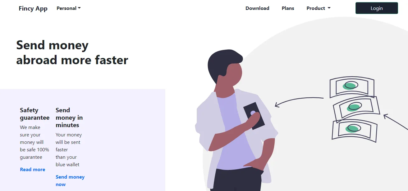
使用CSS/Bootstrap将图像定位到内容的右侧

4

你想让图像像图标一样固定在屏幕上,还是像我提供的解决方案那样? - Sercan Sebetçi
3个回答

0
通过更新bg-image类样式,我得到了以下结果。如果有不同的问题,请更清楚地指明。

enter image description here

body {
  background-color: white;
  color: #1d2331;
}

.bg-image {
  float: right !important;
  width: 100%;
  position: relative;
  height: auto;
  margin-right: -40% !important;
}

a.nav-link,
a.navbar-brand {
  color: #1d2331;
}

a i {
  color: #c9327b;
}

form .btn {
  background-color: #1d2331;
  color: #f3f1fe;
}

.action-call {
  min-height: 35vh;
}

.feature {
  background-color: #f3f1fe;
  min-height: 56vh;
}

.feature .icon-link {
  text-decoration: none;
}
<link href="https://cdn.jsdelivr.net/npm/bootstrap@5.0.2/dist/css/bootstrap.min.css" rel="stylesheet"
  integrity="sha384-EVSTQN3/azprG1Anm3QDgpJLIm9Nao0Yz1ztcQTwFspd3yD65VohhpuuCOmLASjC" crossorigin="anonymous">

<header>
  <nav class="navbar navbar-expand-md mt-4">
    <div class="container-fluid mx-5">
      <a class="navbar-brand" href=""> <i class="bi bi-app-indicator me-2"></i> <strong>Fincy App</strong></a>
      <div class="vr ms-0"></div>
      <div class="dropdown">
        <button class="btn dropdown-toggle" type=" button" id="personalbtn" data-bs-toggle="dropdown"
          aria-expanded="false"><strong>Personal</strong></button>
      </div>
      <ul class="navbar-nav ms-auto">
        <li class="nav-item me-4">
          <a class="nav-link" href="#"><strong>Download</strong></a>
        </li>
        <li class="nav-item  me-4"><a class="nav-link" href="#"> <strong>Plans</strong></a></li>
        <li class="nav-item  me-4"><a class="nav-link dropdown-toggle" href="#"> <strong>Product </strong></a>
        </li>
      </ul>
      <form class="ms-5">
        <button class="btn btn-outline-success px-5" type="submit">Login</button>
      </form>
    </div>
  </nav>
</header>
<article class="content">
  <img class="bg-image" src="https://pinapelkod.github.io/assets/imgs/03_1.svg" alt="">
  <section class="mx-5 action-call d-flex align-items-center ">
    <div class="container-fluid">
      <div class="row t-row">
        <h1> <strong>Send money <br>abroad more faster</strong></h1>
        <div class="sendnow"></div>
      </div>
    </div>
  </section>
  <section class="feature d-flex align-items-center">
    <div class="container-fluid">
      <div class="mx-5 row b-row">
        <div class="d-flex justify-content-start">
          <div class="col-3 me-3">
            <i class="fs-2 bi bi-shield-shaded"></i>
            <h5> <strong>Safety guarantee</strong></h5>
            <p>We make sure your money will <br>be safe 100% guarantee</p>
            <a href="#" class="icon-link"> <strong>Read more</strong><i class="bi bi-chevron-right text-primary"></i>
            </a>
          </div>
          <div class="col-3 me-3">
            <i class="fs-2 bi bi-credit-card-2-front-fill"></i>
            <h5> <strong>Send money in minutes</strong></h5>
            <p>Your money will be sent faster <br>than your blue wallet</p>
            <a href="#" class="icon-link"> <strong>Send money now</strong><i
                class="bi bi-chevron-right text-primary"></i> </a>
          </div>
        </div>
      </div>
    </div>
  </section>
</article>


0

<img style="float: right;" alt="" src="http://example.com/image.png" />
<div style="clear: right">
   ...text...
</div> 


-1

我重新组织了HTML,并添加了Bootstrap显示(d-flex)类,如下所示。

更新HTML结构:

<div class="d-flex mt-5">
          <div class="col-3 ">
           .....
          </div>
          <div class="col-3">
           .....
          </div>
          <div class="col-6 content">
            <img class="bg-image" src="https://pinapelkod.github.io/assets/imgs/03_1.svg" alt="">
          </div>
</div>

相应的CSS:

.content {
  position: relative;
}

.bg-image {
  position: relative;
  top: -310px;
  left: 160px;
  height: 500px;
}

代码笔链接: https://codepen.io/pinapelkod/pen/RwLJJNm


目前你的回答不够清晰。请编辑并添加更多细节,以帮助其他人理解它如何回答所提出的问题。你可以在帮助中心找到有关如何撰写好答案的更多信息。 - Community

网页内容由stack overflow 提供, 点击上面的
可以查看英文原文,
原文链接