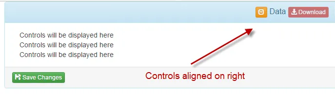
我在 Bootstrap 面板标题部分有几个控件,想让它们显示在右侧。我使用了 "pull-right" 的 CSS 类来对齐右侧的控件,但是面板标题的高度就会丢失。这种行为在 IE8 及以上版本和 Chrome 中都能观察到。
当前状态:
Fiddler: https://jsfiddle.net/99x50s2s/156/
代码:
<div id="DataRow" class="col-md-12">
<div class="panel panel-info">
<div class="panel-heading">
<h3 class="panel-title">
<div class="pull-right">
<a class="btn btn-warning btn-xs" data-toggle="collapse" data-parent="#DataRow" href="#CollapseData" aria-expanded="true" aria-controls="CollapseData">
<span class="glyphicon glyphicon-collapse-down"></span>
</a>
Data
<button class="btn btn-danger btn-xs disabled" id="DownloadBtn" type="button" title="Download all data"><span class="glyphicon glyphicon-download-alt" aria-hidden="true"></span> Download</button>
</div>
</h3>
</div>
<div id="CollapseData" class="panel-collapse collapse in" role="tabpanel" aria-labelledby="headingOne">
<div class="panel-body">
<div class="form-inline col-sm-12 move-down-sm">
Controls will be displayed here
</div>
<div class="form-horizontal col-sm-12 move-down-sm">
Controls will be displayed here
</div>
<div class="form-inline col-sm-12 move-down-sm">
Controls will be displayed here
</div>
</div>
<div class="panel-footer">
<button class="btn btn-success btn-xs" id="SaveChangesBtn" type="button" title="Save the changes"><span class="glyphicon glyphicon-floppy-save" aria-hidden="true"></span> Save Changes</button>
</div>
</div>
</div>
</div>
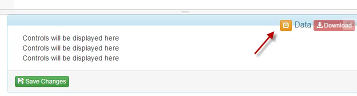
期望: