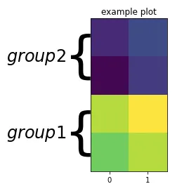
感谢j_4321的建议和链接问题中的响应代码,我想出了以下解决方案。它并不完美,因为我仍然需要手动调整不同大小图形的值。它还需要自动方面,这会使热力图有些倾斜:
import numpy as np
import matplotlib.pyplot as plt
import matplotlib.gridspec as gridspec
def draw_brace(ax, span, text, axis):
"""Draws an annotated brace on the axes."""
xx = ax.get_xlim()
xmin = np.min(xx)
xmax = np.max(xx)
yy = ax.get_ylim()
ymin = np.min(yy)
ymax = np.max(yy)
xspan = xmax - xmin
yspan = ymax - ymin
if axis=="y":
tspan = yspan
ospan = xspan
omin = xmin
else:
ospan = yspan
omin = ymin
tspan = xspan
amin, amax = span
span = amax - amin
resolution = int(span/tspan*100)*2+1
beta = 300./tspan
x = np.linspace(amin, amax, resolution)
x_half = x[:resolution//2+1]
y_half_brace = (1/(1.+np.exp(-beta*(x_half-x_half[0])))
+ 1/(1.+np.exp(-beta*(x_half-x_half[-1]))))
y = np.concatenate((y_half_brace, y_half_brace[-2::-1]))
y = omin + (.05*y - .01)*ospan
if axis == "y":
ax.plot(-y +1 , x, color='black', lw=1)
ax.text(0.8+ymin+.07*yspan, (amax+amin)/2., text, ha='center', va='center')
else:
ax.plot(x, y, color='black', lw=1)
ax.text((amax+amin)/2.,ymin+.07*yspan, text, ha='center', va='center')
arr = np.array([[3,4],[2,3.5],[10,11],[9,10]])
fig = plt.figure()
gs = fig.add_gridspec(nrows=1, ncols=2, wspace=0,width_ratios=[1,4])
ax2 = fig.add_subplot(gs[:, 1])
ax2.imshow(arr)
ax2.set_title("example plot")
ax2.set_yticklabels([])
ax2.set_yticks([])
ax2.set_xticklabels([])
ax2.set_aspect('auto')
ax1 = fig.add_subplot(gs[:, 0], sharey=ax2)
ax1.set_xticks([])
ax1.set_xticklabels([])
ax1.set_aspect('auto')
ax1.set_xlim([0,1])
ax1.axis('off')
draw_brace(ax1, (0, 1), 'group1',"y")
draw_brace(ax1, (2, 3), 'group2',"y")
fig.subplots_adjust(wspace=0, hspace=0)
这将创建以下图表:
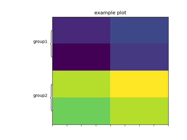
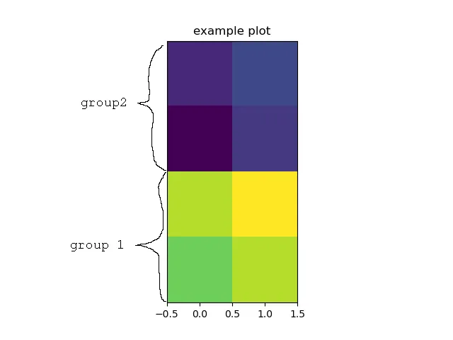
 我想要的:
我想要的:
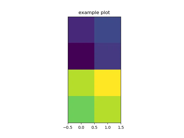
 示例图的代码: