我有一个 DataFrame,可以将其保存为 PNG 文件。但现在我想要改变符合特定条件的特定单元格的背景颜色。
条件如下:
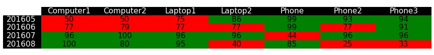
- 数字等于或高于 80 的单元格必须具有绿色背景。 - 数字低于 80 的单元格必须具有红色背景。 - 所有列名和索引单元格需要黑色背景和白色文本颜色。
以下帖子接近我的需求,但并没有提供我需要的答案。 帖子 1 帖子 2 我的代码:
这是目前的样子: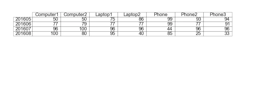 这是我想要的样子:
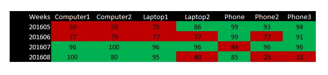
条件如下:
- 数字等于或高于 80 的单元格必须具有绿色背景。 - 数字低于 80 的单元格必须具有红色背景。 - 所有列名和索引单元格需要黑色背景和白色文本颜色。
以下帖子接近我的需求,但并没有提供我需要的答案。 帖子 1 帖子 2 我的代码:
import matplotlib.pyplot as plt
from pandas.tools.plotting import table
import pandas as pd

#My dataframe
df = pd.DataFrame({
    'Weeks' : [201605, 201606, 201607, 201608],
    'Computer1' : [50, 77, 96, 100],
    'Computer2' : [50, 79, 100, 80],
    'Laptop1'   : [75, 77, 96, 95],
    'Laptop2'   : [86, 77, 96, 40],
    'Phone'     : [99, 99, 44, 85],
    'Phone2'    : [93, 77, 96, 25],
    'Phone3'    : [94, 91, 96, 33]
})
df2 = df.set_index('Weeks') #Makes the column 'Weeks' the index.

#Make a png file out of an dataframe.
plt.figure(figsize=(9,3))
ax = plt.subplot(211, frame_on=False) # no visible frame
ax.xaxis.set_visible(False)  # hide the x axis
ax.yaxis.set_visible(False)  # hide the y axis
table(ax, df2, rowLabels=df2.index, colLabels=df2.columns, loc='center', cellColours=None)
plt.savefig('mytable.png') #save it as an png.
这是目前的样子:
这是我想要的样子: