如何从pandas的value_counts函数绘制条形图

13
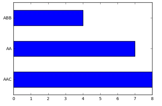
我使用了pandas的value_counts函数来提供唯一值的计数:
CountStatus = pd.value_counts(df['scstatus'].values, sort=True)

Output:
200    133809
304      7217
404      2176
302       740
500       159
403         4
301         1
dtype: int64

我现在想使用matplotlib绘制这些值,即plt.barh(CountStatus),但是我一直得到错误:ValueError: 不兼容的大小:参数'width'必须是长度为7或标量
我猜这可能与左侧列是索引列有关。有没有办法解决这个问题以获得一个水平条形图?我需要转换它或在函数中指定其他内容吗?
1个回答

27

更新

  • pandas.Series.value_counts 是一个 Series 方法
    • 使用 normalize=True 来获取相对频率,如果需要可以乘以 100 ,.mul(100),得到百分比。
  • 使用 pandas.Series.plotkind='bar'kind='barh' 进行绘图
import seaborn as sns

# test data, loads a pandas dataframe
df = sns.load_dataset('planets')

# display(df.head(3))
            method  number  orbital_period  mass  distance  year
0  Radial Velocity       1         269.300  7.10     77.40  2006
1  Radial Velocity       1         874.774  2.21     56.95  2008
2  Radial Velocity       1         763.000  2.60     19.84  2011

# plot value_counts of Series
ax = df.method.value_counts().plot(kind='barh')
ax.set_xscale('log')

enter image description here

原始答案

我觉得你可以使用barh

CountStatus.plot.barh()

示例:
CountStatus = pd.value_counts(df['scstatus'].values, sort=True)
print CountStatus
AAC    8
AA     7
ABB    4
dtype: int64

CountStatus.plot.barh()

graph


网页内容由stack overflow 提供, 点击上面的
可以查看英文原文,
原文链接