如何从 pandas 的序列中绘制条形图?

28

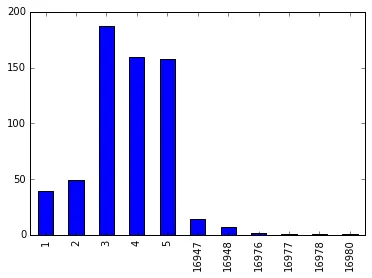
请看我下面的系列:第一列是文章编号,第二列是频率计数。

article_id  
1         39 
2         49 
3        187 
4        159 
5        158 
        ...  
16947     14 
16948      7 
16976      2 
16977      1 
16978      1 
16980      1 

Name: article_id, dtype: int64

我使用以下命令从数据框中获取了这个序列:

logs.loc[logs['article_id'] <= 17029].groupby('article_id')['article_id'].count()

这里的dataframe是指logs,其中article_id是其中一个列。

我该如何绘制一张条形图(使用Matplotlib),使得article_id在X轴上,频率计数在Y轴上?

我的第一反应是使用.tolist()将其转换为列表,但这样无法保留article_id。


1
这样的问题让我真的很想知道人们在询问之前是否尝试过谷歌搜索或阅读文档。http://pandas.pydata.org/pandas-docs/stable/visualization.html - MaxNoe
3个回答

49

根据我的理解,您需要使用Series.plot.bar函数:

#pandas 0.17.0 and above
s.plot.bar()
#pandas below 0.17.0
s.plot('bar')

示例:

import pandas as pd
import matplotlib.pyplot as plt

s = pd.Series({16976: 2, 1: 39, 2: 49, 3: 187, 4: 159, 
               5: 158, 16947: 14, 16977: 1, 16948: 7, 16978: 1, 16980: 1},
               name='article_id')
print (s)
1         39
2         49
3        187
4        159
5        158
16947     14
16948      7
16976      2
16977      1
16978      1
16980      1
Name: article_id, dtype: int64


s.plot.bar()

plt.show()

graph


谢谢。有没有增加图表大小的建议?我的图表中有16980个不同的值,看起来有点密集。我尝试使用plt.figure(figsize =(20,10))。PS我正在使用内联图表。 - Aashil
3
s.plot.bar()之前加上plt.figure(figsize=(20,10))对我来说非常有效。 - jezrael
已解决。我是将其放在s.plot.bar()之后。 - Aashil
1
@NishantKumar - 如果需要对值进行排序 s = s.sort_values().plot.bar(),如果需要对x轴进行索引,则使用 s = s.sort_index().plot.bar() - jezrael

6
新的pandas API建议采用以下方式:pandas.Series.plot
import pandas as pd

s = pd.Series({16976: 2, 1: 39, 2: 49, 3: 187, 4: 159, 
               5: 158, 16947: 14, 16977: 1, 16948: 7, 16978: 1, 16980: 1},
               name='article_id')

s.plot(kind="bar", figsize=(20,10))

如果您正在使用Jupyter,您不需要matplotlib库。


2

在绘图的kind参数中使用“bar”即可

示例

series = read_csv('BwsCount.csv', header=0, parse_dates=[0], index_col=0, squeeze=True, date_parser=parser)
series.plot(kind='bar')

kind的默认值是'line'(即series.plot() --> 将自动绘制线图)

供您参考:

kind : str
        ‘line’ : line plot (default)
        ‘bar’ : vertical bar plot
        ‘barh’ : horizontal bar plot
        ‘hist’ : histogram
        ‘box’ : boxplot
        ‘kde’ : Kernel Density Estimation plot
        ‘density’ : same as ‘kde’
        ‘area’ : area plot
        ‘pie’ : pie plot

网页内容由stack overflow 提供, 点击上面的
可以查看英文原文,
原文链接