带堆叠的Pandas并列条形图绘制

8
我想创建一个堆积条形图,展示泰坦尼克号数据集。图表需要按照“Pclass”,“Sex”和“Survived”进行分组。我已经使用繁琐的numpy操作完成了这个任务,并生成了下面的标准化图(其中“M”代表男性,“F”代表女性)enter image description here 
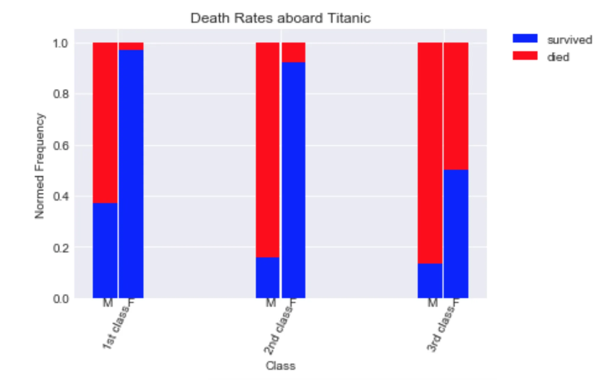
有没有一种使用pandas内置绘图功能来完成这个任务的方法?
我已经尝试过以下代码:
import pandas as pd
import matplotlib.pyplot as plt
df = pd.read_csv('train.csv')
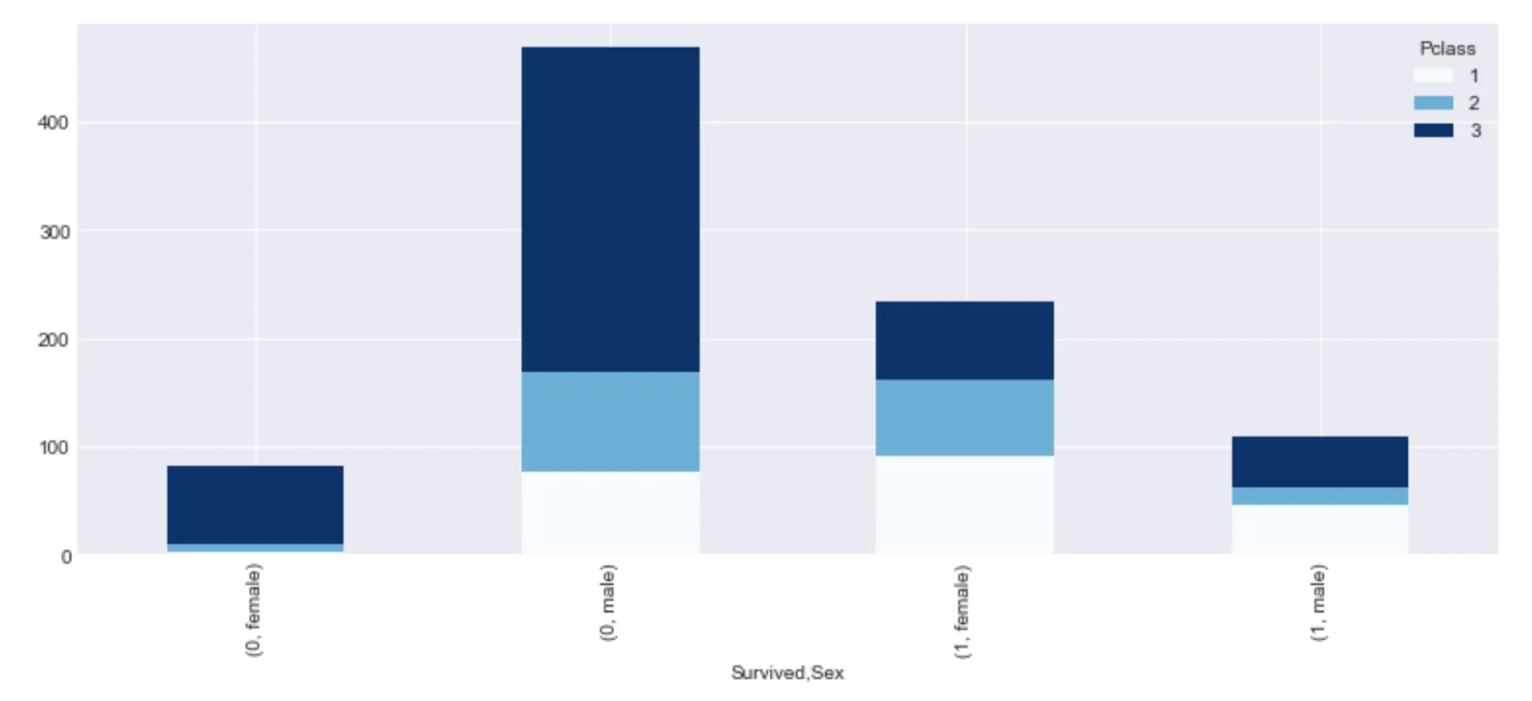
df_grouped = df.groupby(['Survived','Sex','Pclass'])['Survived'].count()
df_grouped.unstack().plot(kind='bar',stacked=True,  colormap='Blues', grid=True, figsize=(13,5));

这里输入图片描述

这不是我想要的结果。有没有办法使用Pandas绘图产生第一个图?谢谢。

1个回答

13

生成的条形图不会像您第一个图中那样相邻,但除此之外,Pandas可以按照以下方式实现您想要的效果:

df_g = df.groupby(['Pclass', 'Sex'])['Survived'].agg([np.mean, lambda x: 1-np.mean(x)])
df_g.columns = ['Survived', 'Died']
df_g.plot.bar(stacked=True)

enter image description here

在这里,补丁的水平分组由于需要堆叠而变得复杂。例如,如果我们只关心“Survived”的值,那么Pandas可以直接处理。

df.groupby(['Pclass', 'Sex'])['Survived'].mean().unstack().plot.bar()

enter image description here

如果一个临时解决方案足以用于后处理图形,那么这样做也不是非常复杂:
import numpy as np
from matplotlib import ticker

df_g = df.groupby(['Pclass', 'Sex'])['Survived'].agg([np.mean, lambda x: 1-np.mean(x)])
df_g.columns = ['Survived', 'Died']
ax = df_g.plot.bar(stacked=True)

# Move back every second patch
for i in range(6):
    new_x = ax.patches[i].get_x() - (i%2)/2
    ax.patches[i].set_x(new_x)
    ax.patches[i+6].set_x(new_x)

# Update tick locations correspondingly
minor_tick_locs = [x.get_x()+1/4 for x in ax.patches[:6]]
major_tick_locs = np.array([x.get_x()+1/4 for x in ax.patches[:6]]).reshape(3, 2).mean(axis=1)
ax.set_xticks(minor_tick_locs, minor=True)
ax.set_xticks(major_tick_locs)

# Use indices from dataframe as tick labels
minor_tick_labels = df_g.index.levels[1][df_g.index.labels[1]].values
major_tick_labels = df_g.index.levels[0].values
ax.xaxis.set_ticklabels(minor_tick_labels, minor=True)
ax.xaxis.set_ticklabels(major_tick_labels)

# Remove ticks and organize tick labels to avoid overlap
ax.tick_params(axis='x', which='both', bottom='off')
ax.tick_params(axis='x', which='minor', rotation=45)
ax.tick_params(axis='x', which='major', pad=35, rotation=0)

enter image description here


感谢您提供如此详尽的代码。我更喜欢您的第二个答案:
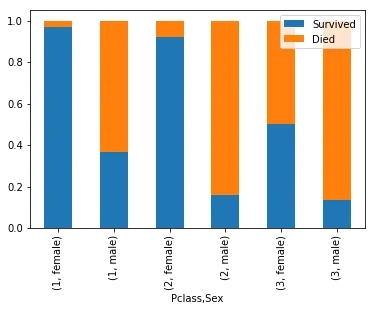
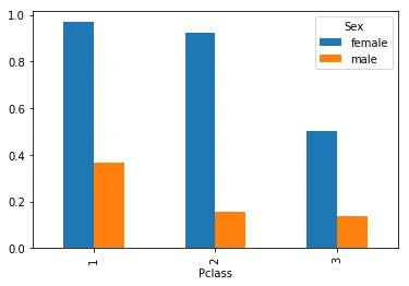
df.groupby(['Pclass', 'Sex'])['Survived'].mean().unstack().plot.bar(),它更简洁、优雅。 - PyRsquared

网页内容由stack overflow 提供, 点击上面的
可以查看英文原文,
原文链接