我正在尝试基于频繁/常用单词创建直方图,但运行代码时仅收到错误提示。我已经成功找到了10个最常见的单词,但无法将其可视化为直方图。
description_list = df['description'].values.tolist()
from collections import Counter
Counter(" ".join(description_list).split()).most_common(10)
#histogram
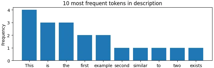
plt.bar(x, y)
plt.title("10 most frequent tokens in description")
plt.ylabel("Frequency")
plt.xlabel("Words")
plt.show