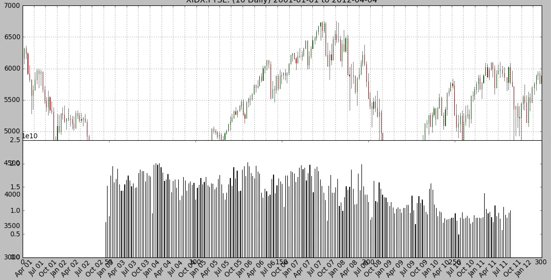
我正在使用 Ubuntu 10.0.4 上的 matplotlib 1.2.x 和 Python 2.6.5。我正在尝试创建一个包含顶部图表和底部图表的单一图表。
X 轴是时间序列的日期。顶部图表包含数据的蜡烛图,底部图表应该包含柱形图——带有自己的 Y 轴(也在左侧——与顶部图表相同)。这两个图表不应重叠。
这是我迄今为止所做的一小部分代码片段。
X 轴是时间序列的日期。顶部图表包含数据的蜡烛图,底部图表应该包含柱形图——带有自己的 Y 轴(也在左侧——与顶部图表相同)。这两个图表不应重叠。
这是我迄今为止所做的一小部分代码片段。
datafile = r'/var/tmp/trz12.csv'
r = mlab.csv2rec(datafile, delimiter=',', names=('dt', 'op', 'hi', 'lo', 'cl', 'vol', 'oi'))

mask = (r["dt"] >= datetime.date(startdate)) & (r["dt"] <= datetime.date(enddate))
selected = r[mask]
plotdata = zip(date2num(selected['dt']), selected['op'], selected['cl'], selected['hi'], selected['lo'], selected['vol'], selected['oi'])

# Setup charting
mondays = WeekdayLocator(MONDAY)        # major ticks on the mondays
alldays    = DayLocator()               # minor ticks on the days
weekFormatter = DateFormatter('%b %d')  # Eg, Jan 12
dayFormatter = DateFormatter('%d')      # Eg, 12
monthFormatter = DateFormatter('%b %y')

# every Nth month
months = MonthLocator(range(1,13), bymonthday=1, interval=1)

fig = pylab.figure()
fig.subplots_adjust(bottom=0.1)
ax = fig.add_subplot(111)
ax.xaxis.set_major_locator(months)#mondays
ax.xaxis.set_major_formatter(monthFormatter) #weekFormatter
ax.format_xdata = mdates.DateFormatter('%Y-%m-%d')
ax.format_ydata = price
ax.grid(True)

candlestick(ax, plotdata, width=0.5, colorup='g', colordown='r', alpha=0.85)

ax.xaxis_date()
ax.autoscale_view()
pylab.setp( pylab.gca().get_xticklabels(), rotation=45, horizontalalignment='right')

# Add volume data
# Note: the code below OVERWRITES the bottom part of the first plot
# it should be plotted UNDERNEATH the first plot - but somehow, that's not happening
fig.subplots_adjust(hspace=0.15)
ay = fig.add_subplot(212)
volumes = [ x[-2] for x in plotdata]
ay.bar(range(len(plotdata)), volumes, 0.05)

pylab.show()
使用上述代码,我已经成功地显示了两个图,但是有关于底部图的两个问题:
它完全覆盖了第一个(顶部)图的底部 - 好像第二个图是在同一'画布'上绘制的。我不知道为什么会发生这种情况。
它用自己的索引替换了现有的X轴,两个图之间应该共享X轴值(日期)。
我的代码哪里出了问题?有人能找出第二个(底部)图覆盖第一个(顶部)图的原因吗?如何解决呢?
以下是由上述代码创建的图的屏幕截图:
[[编辑]]
按照hwlau的建议修改代码后,产生了新的图。与第一个图相比,它更好,因为两个图是分开的,然而以下问题仍然存在:
两个图之间应该共享X轴(即仅显示第二个[底部]图的X轴)
第二个图的Y值似乎格式不正确
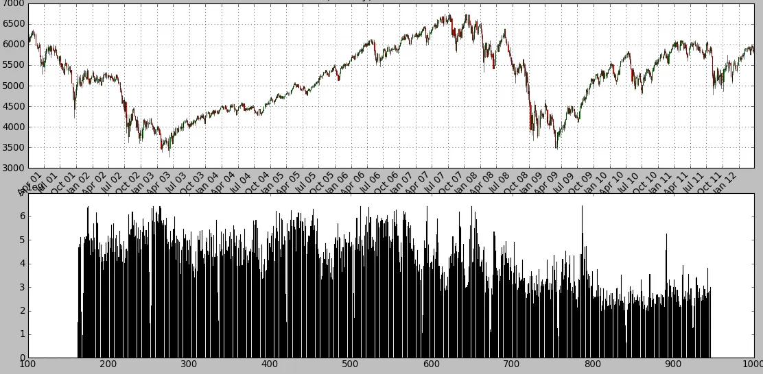
我认为这些问题应该很容易解决,但是我的matplotlib技能目前不太好,因为我最近才开始使用matplotlib进行编程。非常感谢任何帮助。
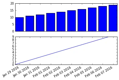
subplots中的sharex和sharey属性非常方便,感谢您的发布。这比从一个子图读取并在另一个子图中设置共同限制要好得多:当通过交互式缩放来检查结果时,如果共享,则所有子图都将一起缩放。 - Bonlenfumsharex=first_axis_instance这是一个axes实例,对吗? - Adam Wheeler