我有两个图表,它们的x轴相同,但y轴的刻度不同。
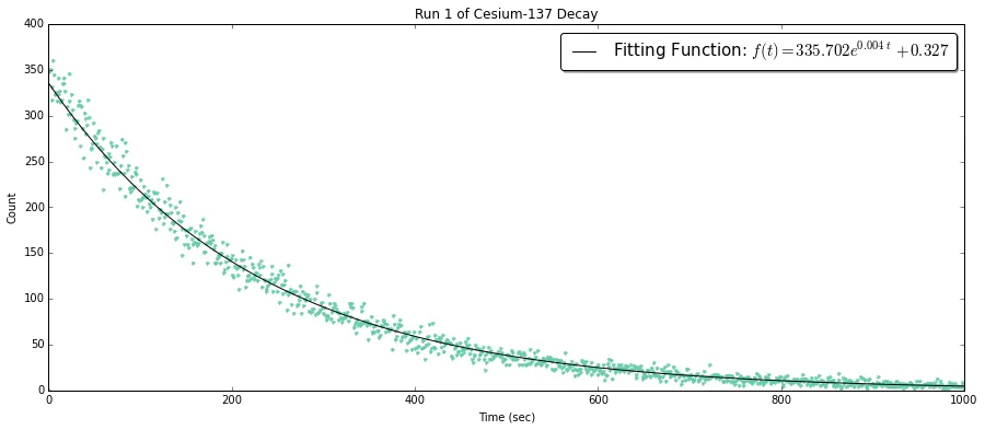
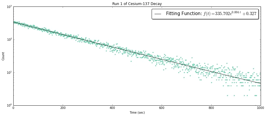
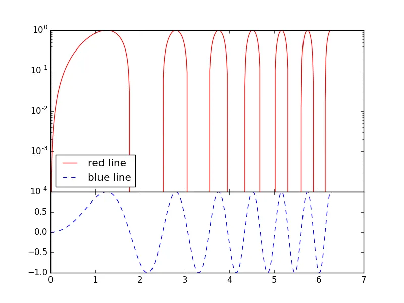
常规坐标轴的图表显示了一条衰减趋势的数据,并使用y半对数刻度来表示拟合的准确性。
特别是这个。
1)以不同的比例缩放坐标轴
2)保持指数衰减图的图形大小不变,但使线图的y轴大小较小,x轴大小相同。
例如:
非常感谢任何帮助。
常规坐标轴的图表显示了一条衰减趋势的数据,并使用y半对数刻度来表示拟合的准确性。
fig1 = plt.figure(figsize=(15,6))
ax1 = fig1.add_subplot(111)

# Plot of the decay model
ax1.plot(FreqTime1,DecayCount1, '.', color='mediumaquamarine')

# Plot of the optimized fit
ax1.plot(x1, y1M, '-k', label='Fitting Function: $f(t) = %.3f e^{%.3f\t} \
         %+.3f$' % (aR1,kR1,bR1))

ax1.set_xlabel('Time (sec)')
ax1.set_ylabel('Count')
ax1.set_title('Run 1 of Cesium-137 Decay')

# Allows me to change scales
# ax1.set_yscale('log')
ax1.legend(bbox_to_anchor=(1.0, 1.0), prop={'size':15}, fancybox=True, shadow=True)
特别是这个。
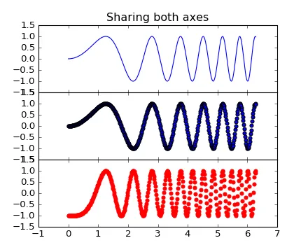
1)以不同的比例缩放坐标轴
2)保持指数衰减图的图形大小不变,但使线图的y轴大小较小,x轴大小相同。
例如:
非常感谢任何帮助。
plt.plot(),我可以指定sharex,那么这是可能的。但在Pandas中,我无法接触到底层的sharex,我必须创建一个新的轴来传递给DataFrame.plot()。这就是为什么我喜欢你的答案! - Yushan ZHANGfig, (ax0, ax1) = plt.subplots(2,1, sharex=True, gridspec_kw=dict(height_ratios=[2, 1]))。在此调用中,参数2,1表示将创建两个行和一个列的子图网格,sharex=True表示共享x轴刻度线,dict(height_ratios=[2,1])是用于指定子图高度比例的字典参数。 - normanius