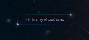
我需要创建一个带有渐变边框和角落高亮的按钮。我尝试使用伪元素来实现,但只有2/4个边框边缘。提前感谢您!
.fly--btn {
  background: rgba(0, 0, 0, 0.5);
  color: #A9A9A9;
  margin-top: 12%;
  position: relative;
  border: none;
  padding: 5px 20px;
}

.fly--btn:before,
.fly--btn:after {
  content: "";
  position: absolute;
  bottom: -1px;
  left: -1px;
}

.fly--btn:before {
  top: -1px;
  width: 1px;
  background-image: -webkit-gradient(linear, left top, left bottom, from(#101f2d), to(#3263a3));
  background-image: -webkit-linear-gradient(#101f2d, #3263a3);
  background-image: -o-linear-gradient(#101f2d, #3263a3);
  background-image: linear-gradient(#101f2d, #3263a3);
}

.fly--btn:after {
  right: -1px;
  height: 1px;
  background-image: -webkit-gradient(linear, left top, right top, from(#3263a3), to(#101f2d));
  background-image: -webkit-linear-gradient(left, #3263a3, #101f2d);
  background-image: -o-linear-gradient(left, #3263a3, #101f2d);
  background-image: linear-gradient(left, #3263a3, #101f2d);
}<button type="button" class="fly--btn">
Начать путешествие
</button>