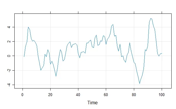
使用 lattice::xyplot 简化的时间序列图中,有没有一种简便的方法,在红色中显示负值,在绿色中显示其他值?
set.seed(0)
xyplot(zoo(cumsum(rnorm(100))), grid=T)
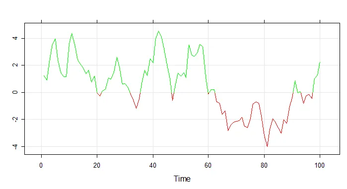
grid,因此您可以使用grid的裁剪功能。library(lattice)
library(grid)
set.seed(0)
x <- zoo(cumsum(rnorm(100)))
xyplot(x, grid=TRUE, panel = function(x, y, ...){
panel.xyplot(x, y, col="red", ...)
grid.clip(y=unit(0,"native"),just=c("bottom"))
panel.xyplot(x, y, col="green", ...) })
set.seed(0); require(zoo); require(lattice)
vals <- zoo(cumsum(rnorm(100)))
png()
xyplot(vals, type=c("l","p"), col=c("red", "green")[1+( vals>0)], grid=T)
dev.off()
approx的结果)。可以在这里看到:http://r.789695.n4.nabble.com/shading-under-the-lines-in-a-lattice-xyplot-td793875.html。我没有给封闭区域上色,而是给多边形的边框涂上所需的颜色,并将内部保留“透明”。lpolygon <- function (x, y = NULL, border = NULL, col = NULL, ...) {
require(grid, TRUE)
xy <- xy.coords(x, y)
x <- xy$x
y <- xy$y
gp <- list(...)
if (!is.null(border)) gp$col <- border
if (!is.null(col)) gp$fill <- col
gp <- do.call("gpar", gp)
grid.polygon(x, y, gp = gp, default.units = "native")
}
find.zero <- function(x, y) {
n <- length(y)
yy <- c(0, y)
wy <- which(yy[-1] * yy[-n - 1] < 0)
if(!length(wy)) return(NULL)
xout <- sapply(wy, function(i) {
n <- length(x)
ii <- c(i - 1, i)
approx(y[ii], x[ii], 0)$y
})
xout
}
trellis.par.set(theme = col.whitebg())
png();
xyplot(vals, panel = function(x,y, ...) {
x.zero <- find.zero(x, y)
y.zero <- y > 0
yy <- c(y[y.zero], rep(0, length(x.zero)))
xx <- c(x[y.zero], x.zero)
ord <- order(xx)
xx <- xx[ord]
xx <- c(xx[1], xx, xx[length(xx)])
yy <- c(0, yy[ord], 0)
lpolygon(xx, yy, col="transparent", border = "green")
yy <- c(y[!y.zero], rep(0, length(x.zero)))
xx <- c(x[!y.zero], x.zero)
ord <- order(xx)
xx <- xx[ord]
xx <- c(xx[1], xx, xx[length(xx)])
yy <- c(0, yy[ord], 0)
lpolygon(xx, yy, col = "transparent", border = "red")
panel.abline(h = 0) ;panel.grid(v=-1, h=-1 )
}); dev.off()
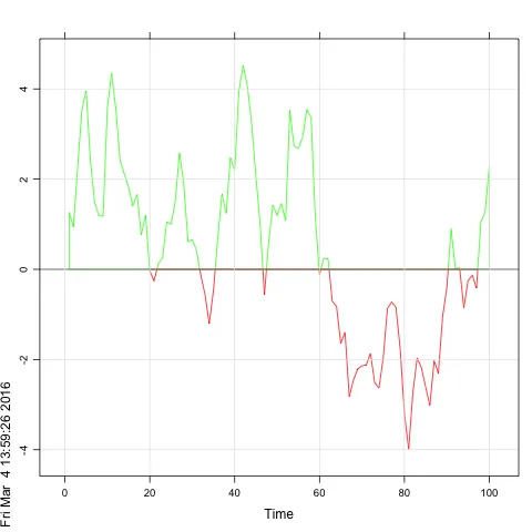
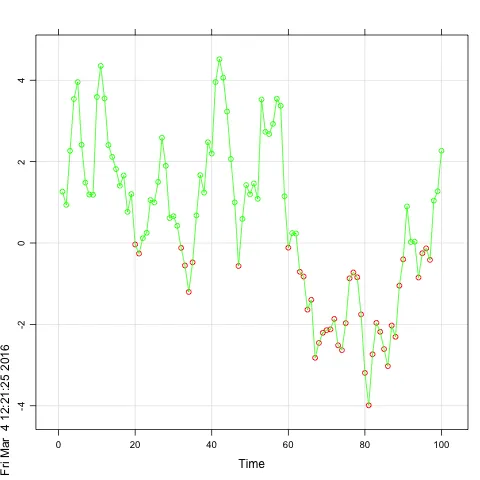
panel.breakline <- function(x,y,breakat=0,col.line,upper.col="red",lower.col="green",...){
    f <- approxfun(x,y)
    ff <- function(x) f(x)-breakat
    psign <- sign(y-breakat)
    breaks <- which(diff(psign) != 0)
    interp <- sapply(breaks, function(i) uniroot(ff,c(x[i], x[i+1]))$root)
    starts <- c(1,breaks+1)
    ends <- c(breaks, length(x))

    Map(function(start,end,left,right) {
        x <- x[start:end]
        y <- y[start:end]
        col <- ifelse(y[1]>breakat,upper.col,lower.col)
        panel.xyplot(c(left, x, right) ,c(breakat,y,breakat), col.line=col,...)
    }, starts, ends, c(NA,interp), c(interp,NA))
}
library(zoo)
library(lattice)
set.seed(0)
zz<-zoo(cumsum(rnorm(100)))

xyplot(zz, grid=T, panel.groups=panel.breakline)
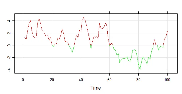
你还可以更改断点或颜色
xyplot(zz, grid=T, panel.groups=panel.breakline,
    breakat=2, upper.col="blue", lower.col="orange")
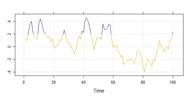
如果不使用点,我建议使用plot(而不是lattice),并使用clip,就像这里的一个答案中所示:
绘制根据值条件着色的折线图dat<- zoo(cumsum(rnorm(100)))
plot(dat, col="red")
clip(0,length(dat),0,max(dat) )
lines(dat, col="green")
plotrix::color.scale.line 也是一个不错的选择。 - IRTFM
xyplot(z, type = "h", col = ifelse(z > 0, "green", "red"))- G. Grothendieck