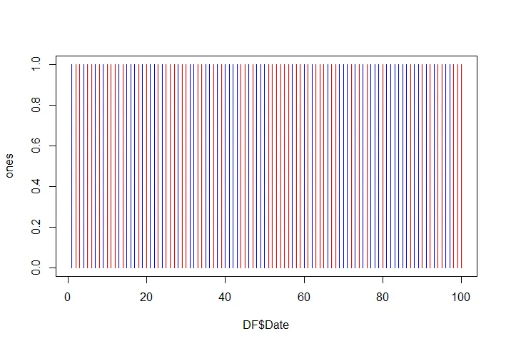
我有一个数据集,其中在时间轴上有一个二进制值。 例如:
Date, Event

January-29-2014, 1
January-29-2014, 0
January-29-2014, 1
January-29-2014, 1
January-30-2014, 0
我希望能够在时间轴上(按日期)用颜色呈现1、0(红色代表1,蓝色代表0),请问如何实现这一目标?这种方法被称为什么?例如:二进制时间轴绘图。抱歉并感谢您的帮助。
n = 100
x = seq(n)
y = sample(0:1, n, replace=TRUE)

DF = data.frame(Date=x, Event=y)

ones = rep(1, nrow(DF))

colors = c("blue", "red")
plot(DF$Date, ones, type="h", col=colors[DF$Event +1],
     ylim=c(0,1))
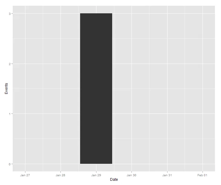
我不是很确定你想要什么。你是想按天汇总数据,就像流行病学曲线一样吗?
library(lubridate)
library(plyr)
library(ggplot2)

dat = read.table(header=TRUE, text='Date Event

January-29-2014, 1
January-29-2014, 0
January-29-2014, 1
January-29-2014, 1
January-30-2014, 0 ')

dat$Date = mdy(dat$Date)

agg = ddply(dat, 'Date', summarise, Events = sum(Event))

ggplot(data=agg, aes(x = Date, y = Events)) + geom_bar(stat='identity') + scale_x_datetime(expand=c(1,0))