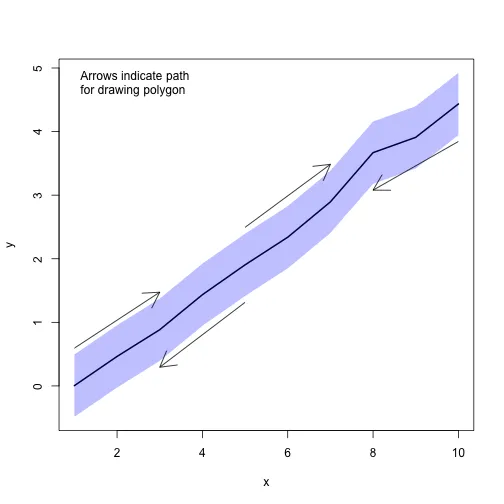
这里是一个使用
graphics 包(随 R 一起发行的图形库)的答案。我尝试解释了如何创建
polygon(用于生成CI)。这可以重新应用于解决你的问题,但我没有准确的数据。
s.e. <- 0.25
interval <- s.e.*qnorm(0.975)
x <- 1:10
y <- (x-1)*0.5 + rnorm(length(x), mean=0, sd=s.e.)
ylim <- c(min(y)-interval, max(y)+interval)
plot(x, y, type="l", lwd=2, ylim=ylim)
CI.x.top <- x
CI.x.bot <- rev(x)
CI.x <- c(CI.x.top, CI.x.bot)
CI.y.top <- y+interval
CI.y.bot <- rev(y)-interval
CI.y <- c(CI.y.top,CI.y.bot)
CI.col <- adjustcolor("blue",alpha.f=0.25)
polygon(CI.x, CI.y, col=CI.col, border=NA)
arrows(CI.x.top[1], CI.y.top[1]+0.1, CI.x.top[3], CI.y.top[3]+0.1)
arrows(CI.x.top[5], CI.y.top[5]+0.1, CI.x.top[7], CI.y.top[7]+0.1)
arrows(CI.x.bot[1], CI.y.bot[1]-0.1, CI.x.bot[3], CI.y.bot[3]-0.1)
arrows(CI.x.bot[6], CI.y.bot[6]-0.1, CI.x.bot[8], CI.y.bot[8]-0.1)
legend("topleft", legend="Arrows indicate path\nfor drawing polygon", xjust=0.5, bty="n")
这是最终结果:
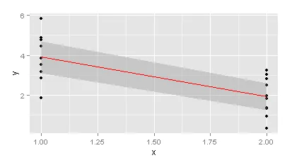
ggplot2::geom_smooth()吗? - majgeom_smooth正是你所需要的,可以在这里查看最后一个图表:http://docs.ggplot2.org/0.9.3.1/geom_smooth.html - mts