我在ggplot2软件包中有一组时间序列数据,并进行了移动平均操作,现在我想将移动平均的结果添加到时间序列图中。
数据集示例(p31):
ambtemp dt
-1.14 2007-09-29 00:01:57
-1.12 2007-09-29 00:03:57
-1.33 2007-09-29 00:05:57
-1.44 2007-09-29 00:07:57
-1.54 2007-09-29 00:09:57
-1.29 2007-09-29 00:11:57
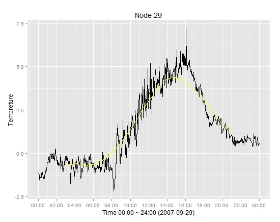
用于呈现时间序列的代码:
  Require(ggplot2)
  library(scales)
  p29$dt=strptime(p31$dt, "%Y-%m-%d %H:%M:%S")
  ggplot(p29, aes(dt, ambtemp)) + geom_line() +
     scale_x_datetime(breaks = date_breaks("2 hour"),labels=date_format("%H:%M")) + xlab("Time 00.00 ~ 24:00 (2007-09-29)") + ylab("Tempreture")+
     opts(title = ("Node 29"))
时间序列展示样例
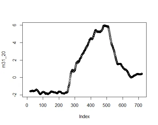
移动平均线图样例
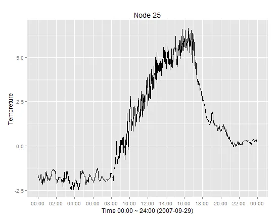
 预期结果样例
挑战在于时间序列数据来自包含时间戳和温度的数据集,而移动平均数据仅包括平均值列而不是时间戳。将这两者匹配可能导致不一致性。