由于每当我在谷歌上搜索多个y轴时,Steve Tjoa's answer总是第一个且大多数情况下孤立无援,因此我决定添加他的答案的稍微修改版本。这是来自this matplotlib example的方法。
原因:
- 他的模块有时会在未知情况和神秘的内部错误中失败。
- 我不喜欢加载我不知道的奇异模块(
mpl_toolkits.axisartist,mpl_toolkits.axes_grid1)。
- 下面的代码包含更多明确的命令,解决人们经常遇到的问题(如多个轴的单个图例,使用viridis等),而不是隐含的行为。
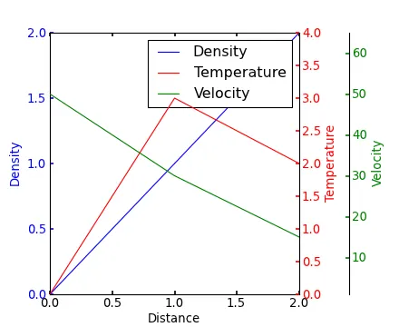
import matplotlib.pyplot as plt
fig, host = plt.subplots(figsize=(8,5), layout='constrained')
ax2 = host.twinx()
ax3 = host.twinx()
host.set_xlim(0, 2)
host.set_ylim(0, 2)
ax2.set_ylim(0, 4)
ax3.set_ylim(1, 65)
host.set_xlabel("Distance")
host.set_ylabel("Density")
ax2.set_ylabel("Temperature")
ax3.set_ylabel("Velocity")
color1, color2, color3 = plt.cm.viridis([0, .5, .9])
p1 = host.plot([0, 1, 2], [0, 1, 2], color=color1, label="Density")
p2 = ax2.plot( [0, 1, 2], [0, 3, 2], color=color2, label="Temperature")
p3 = ax3.plot( [0, 1, 2], [50, 30, 15], color=color3, label="Velocity")
host.legend(handles=p1+p2+p3, loc='best')
ax3.spines['right'].set_position(('outward', 60))
host.xaxis.set_ticks([])
host.yaxis.label.set_color(p1[0].get_color())
ax2.yaxis.label.set_color(p2[0].get_color())
ax3.yaxis.label.set_color(p3[0].get_color())
plt.savefig("pyplot_multiple_y-axis.pdf", bbox_inches='tight')